The Undecorated Room - It's A Thing And Harder To Achieve Than You Might Think!

How's that for a blog post with a long name?

Today I want to take a closer look at rooms in an "undecorated" style that I find so appealing. It's harder to successfully pull one of these spaces together than you might think, because traditionally there is some sort of jumping off point for a room's design that dictates the all of the remaining selections.

decor.jpg

The image above comes from Thibaut, and everything in this bedroom is perfectly coordinated. The floral print on the settee is the jumping off point for the entire room. The colors of the wallpaper, the trim on the drapes, the lamp and the pillows are all found in the floral fabric. This room is looks very decorated - perhaps a little too perfect!

By contrast, the "undecorated" room is a space where coordinating colors and furniture styles are not the highest priority. Instead, it's about bringing the unrelated pieces together as a whole - where comfort and mood trump everything else.

Below is one of my favorite living rooms of all time. It's Kristen Buckingham's living room, and it's perfectly undecorated.

decor2.jpg

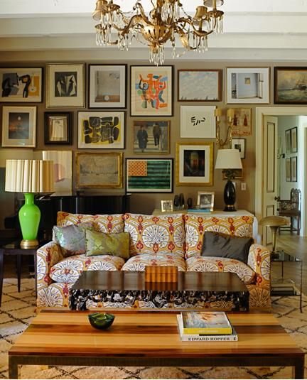
What makes it so hard to break this down is that there is no particular style, color palette, or common thread that unites these pieces. And somehow it all works.

The two rooms below are by Ben Pentreath.

decor3.jpg
decor4.jpg

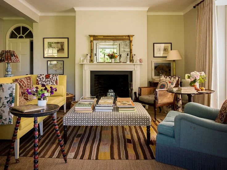
Again, there's no obvious color palette that was adhered to, no period or particular style of furniture that can pinpointed - just collections of unrelated elements that speak to each other.

The undecorated room is more about the feeling it evokes. Nothing is too precious, and it wouldn't matter if something was moved from it's original location in the room. Each piece brings something special to the room's design, and it's ultimately about how the unique pieces come together as a whole. Undecorated rooms feel timeless because they usually incorporate a broad range of furniture styles and a fluid color palette, so there's no pinpointing exactly when the room was created.

decor5.jpg

Want to try this at home? My advice would be to start small - maybe work in a few pillows that broaden your current color palette. Keep the big picture in mind (as in don't get too obsessed with finding the exact shade of green to match the leaves on your curtain fabric). And mix in a few timeworn accessories - old books, a vintage footstool, a framed piece of art or an antique occasional table.

If you're in the Chattanooga and feeling overwhelmed with decorating your home, give Kim a call at 423.653.3186. I can cut through the all confusion and create a home you'll be thrilled to come home to!

From The Archives - Historic Restoration On Lookout Mountain

Just so you know, this is kind of long post, but it has lots of good pictures so I hope you can take the time to read it through to the end. Today we're going way back to a project we completed 8 years ago. It involved the total restoration of an historic home at the top of Lookout Mountain. Here's how it looked upon completion. From start to finish restoration of this house took about 8 months.

Isn't she lovely? This home was built in the 1920's. When we bought it, it had the original slate roof but it was in poor condition. We replaced the slate shingles with a asphalt and then we replaced the original terra cotta accents to stay as true to the original design as possible.

archive.JPG
Here's a small, not-so-great photo of the house when we purchased it. Not our most horrific beginning, but definitely a house in need of a little love. The biggest change we made was returning this house to a single family home. When we purchased it…

Here's a small, not-so-great photo of the house when we purchased it. Not our most horrific beginning, but definitely a house in need of a little love. The biggest change we made was returning this house to a single family home. When we purchased it, it was divided into an upstairs apartment and a downstairs apartment.

You can't see it in the photo above, but the window on the far right of the lower level had been replaced with a door that led to a stairway to the upstairs apartment.

Another big change we made to the exterior was the redesign and replacement of the front porch. We removed the obsolete brick columns and rebuilt the porch with wood columns, balusters, newel posts and steps. The windows and other architectural details were given more depth with some strategic painting in a cream, olive and black color scheme.

archive3.JPG
archive4.JPG

Yikes! Check out the mold from the old leaky windows and leaky roof on the right side wall. This is what the staircase looked like upon entering from the modified door on the porch. The steps led to the upstairs apartment. We opened up the wall to the left and turned the bottom portion of the staircase, as it was when the home was built in the 1920's. Here's what it looks like now - with the staircase restored and put back in its original location.

archive5.JPG

Most of the other rooms looked like the "before" staircase photo above in terms of damage and neglect. I'll spare you the agony of looking at a bunch of ugly before photos. Instead, feast your eyes on these "After" photos of the completed downstairs rooms.

archive6.JPG

The walls in the main living area are painted Benjamin Moore Grant Beige, one of my favorite neutral colors!

archive7.JPG

The mantel and tile seen here are original to the home. Most of the lighting is antique - it was restored and rewired for safety. Can you see where the original pocket doors slide out of sight in between the living room and dining rooms?

Here is the dining room with it's bank of four giant windows. Although these windows are replacements, they are wood and they were custom made to fit the original openings. Using wood replacement windows in the same size as the original maintains integrity of the home's architecture while making it a little more energy efficient. Isn't the natural light gorgeous in here? The walls are painted Benjamin Moore Hollingsworth Green. I love this color!

archive8.JPG

You can catch a small glimpse of the kitchen through the doorway. More kitchen photos below:

archive9.jpg

The kitchen was completely redesigned with a new layout, cabinetry, flooring, counter tops, and appliances. As you can see the wall oven had not yet arrived when we took these photos. To the right is a small addition we put on the back of the house with a pantry, mud room and laundry room.

In the photo below you can see where the addition begins by looking at the floor of cased opening. Lindsay replicated the original woodwork for a seamless look throughout the house. Walk-in pantry is on the right.

archive10.jpg

In the photo below you can see the addition on the back of the house. Rafter tails, windows, and trim are painted in contrasting earthy colors to bring out the outstanding architectural details.

archive11.JPG

Back inside the kitchen, antique lighting coexists with recessed lighting, modern cabinetry and appliances. Walls are painted Benjamin Moore Man on the Moon.

archive12.JPG

Upstairs, the biggest change we made was the creation of a huge master suite. We redesigned three rooms to include a master bedroom, a master bathroom, a walk-in closet and a sitting room.

Seriously. This is the "Before". (#ohmy!)

archive13.JPG
archive14.jpg

A wider shot is of the space is seen above. This is taken from what is now the master bedroom looking into the master sitting room. The arched opening was eliminated in favor of a wider cased opening. The photo below was taken from the same perspective, after renovation was complete.

archive15.jpg

How's that for an improvement? Floors on the upper level are Heart Pine.

archive16.jpg

This shot was taken inside the sitting area of the master bedroom. Another spectacular original mantel and original tiles were restored.

See those windows across the front of the house? Here's the view from this room:

archive17.jpg

The photo below was taken right inside the entrance to the master bedroom from the hallway. The name of the color I used in the Master Bedroom and the Sitting Room is Benjamin Moore Sweet Dreams. I think it's a perfect name for a perfect bedroom color! The entrance into the master bathroom is on your right. The sitting room entrance is out of range on the left. The chandelier is antique and I bought it on eBay.

archive18.jpg

And below you see the master bathroom we created from another room, which if I recall was being used as the upstairs apartment kitchen when we bought the house. The entrance to the master closet is just out of view on the right.

archive19.jpg

The bathtub is antique and is not original to the home. The sinks are reproduction and sadly no longer available. Lindsay did all of the tile work in this bathroom and throughout the home. This floor tile is available at both Lowe's and Home Depot. It's budget friendly and looks great with gray grout. I use this tile all the time! The lighting is antique and was rewired before it was installed. I love those big antique milk glass shades on the sconces.

archive20.jpg

The final shot from the Master Suite was taken from the entrance of the sitting room through the Master Bedroom and looking into the Master Bathroom.

And here's one last exterior shot:

archive21.JPG

I hope you enjoyed this little house tour as much as we enjoyed transforming this historic beauty!

I wanted write this post to demonstrate how much change is possible and to show of some of the work we have done, the quality of that work, and what we are capable of doing. If you live in the Chattanooga area have a renovation, home improvement or decorating project you're thinking about - large or small - we would love to talk to you about it! Call Kim at 423.653.3186.

It's Fall Y'all!

Fall is probably my favorite time of year. Summers in Chattanooga are long and hot - so when the temperatures and humidity finally begin to fall in late September, it's such a welcome change!

fall.jpg

Is there anything cozier than the first fire of the season?

fire fall.jpg

Would you be surprised to know that I'm not a big seasonal decorator? I really don't do much to change my decor at home with the seasons, but there is one thing I love to incorporate into my decor -particularly when fall rolls around.

fall 2.jpg

Tree branches. I love how they bring a little of the outside in.

fall 3.jpg
fall4.jpg

In the image above I gathered the bare branches from my clients' property on installation day. I love how sculptural branches are - nature always gets it right!

fall5.jpg

Branches in a vase are even prettier with their fall leaves still attached. I love that shot of vibrant yellow!

fall6.jpg

About this time last year I made over my guest bathroom as part of the One Room Challenge (an online decorating event). At the end of the makeover, when money was tight (gone), I shopped my house for accessories and added a much needed touch of nature with the red maple leaves. Not only were they free (!!!), they were the perfect counterpoint some of the formal design elements. It's all about the mix!

So what do you think? It might be nice to take a break from college football this weekend to take a walk in the woods and gather up some branches for your home. I think you might be surprised by how much impact they have in your space.

I hope some beautiful autumn weather is happening wherever you are.

Happy Fall!

***Hey Chattanooga! You know what comes right after fall? Yep - Holiday entertaining season! If you'd like to give your home an update before company comes, you need to get on my schedule asap! Call me at 423.653.3186 for an appointment or email me for a copy of my rate sheet.

Completed Interior Design Project In Chattanooga - An Open Living And Dining Room

Hello friends!

Today I'm thrilled to share a project that I recently had photographed. We (mostly) completed this installation over a year ago, but due to scheduling conflicts and a few last minute projects that were added, photography was delayed. Finally, I have pictures to share!

Sadly, there are no "before" photos. Well, I took some photos with my phone and when I changed phones I forgot to transfer the photos! What I can do is give you a little background on where we started and what we planned to accomplish.

The condo is located in downtown Chattanooga, and it's home to a lovely, energetic couple. They are empty nesters, and they were craving a big change (music to my ears). When I first visited, the rooms were painted a rich gold and decorated with browns and reds - and while there's nothing wrong with those colors, it just didn't feel right for a space that's flooded with light and offers scenic views of the river and surrounding mountains.

We all agreed that we should try and capture some of the outdoors with a lighter, brighter and more youthful color palette. That being said, my clients still wanted some sophistication - nothing rustic. As is common, there were also some family antiques to be incorporated into the design. This was a bit of a challenge because the antiques are dark and somewhat formal in style, but it was my job to make it all work.

Below you see my clients' antique china cabinet I styled with their Asian figurines (I love them!) and a mint and gold platter (also theirs).

open1.jpg

The main living area is completely open and features a wall of windows, so there is an abundance of natural light - my absolute favorite design element to work with. In order to continue the feel of the sky and water right outside the windows, I chose Benjamin Moore's Gray Wisp for the walls.

open2.jpg

My clients requested sophistication, but they wanted to live casually in this space, so we chose a comfortable sectional with clean, classic lines in a neutral color. Sunbrella fabric was specified so they don't have to worry about stains or fading. A mix of prints on the pillows keeps the mood light. Also, take note of the nesting tables at the end of the sectional. I recommend a set of nesting tables for all of my clients because they're so handy for entertaining.

open3.jpg

The dining area got a new round table in an updated finish. A few leafs can be added to accommodate dinner parties, but for daily use, the small size is perfect for two. We went with an oversize wood bead chandelier over the table. I absolutely love statement lighting and this one certainly delivers! The dark and light tones of the chandelier repeat the dark and light tones in the table and chairs. And speaking of the chairs, my client has had these for years. We gave them an update with new fabric - the chair fronts are outdoor (spill and fade resistant) fabric in a subtle green and blue woven pattern. My client loves red and I accommodated her preferences by using varied shades of red throughout the living area.

open4.jpg

In the photo above, the mint and gold combination seen on the platter in the first image is repeated on the buffet lamps. It's hard to tell in this image, but instead of using a traditional sofa table behind the sectional, I moved my clients' antique sideboard (originally placed in front of the windows) to do double duty as a sofa table and as a sideboard.

open5.jpg

You probably didn't see this coming. A modern concrete console with leopard print stools underneath? It's fun, it's functional (those benches pull out lickety split for parties), and very unexpected - and that's a good thing.

Thanks for taking the tour of the main living area. I hope you like what you saw today, and if you did, you'll want to come back next week when I'll share the master bedroom, guest bedroom and guest bathroom makeovers.

If you're in the Chattanooga area and thinking about changing things up at your house, give me a call at 423.653.3186. I'd love to help!

How'd You Come Up With That?

Would you believe that one of the most frequently asked questions I get from new clients is about my company name, The Green Room Interiors? Everyone wants to know the story behind the name, so I thought I would address that here and now. I can't promise that it's the most interesting story, but since you asked...

First of all, green is and has always been my favorite color - and I don't expect that to change any time soon. Observe:

green1.JPG

This is a downtown Chattanooga historic home we restored and lived in over 10 years ago. I chose green for the exterior (Benjamin Moore's Nantucket Gray, which I think should be called Nantucket Green for obvious reasons.)

green2.jpg

Flash forward to now. This is our current kitchen with Scalamandre wallpaper in an apple green colorway. I love this particular green because it's so fresh!

green3.jpg

Here is our current master bedroom with jade green walls. Benjamin Moore Spruce Green to be exact. I don't discriminate - clearly I love ALL shades of green!

green4.JPG

And here's our current living room. Okay the walls are blue but the lamp fills my need for green. And so does my amazing vintage velvet sofa in a deep dark hunter green.

green5.JPG

And speaking of vintage, that's where the other part of "green" comes in. I love to decorate with found items. So I'm "green" not so much in the hipster, low VOC way, but in the rescue it from the Goodwill because it's so cool kind of way.

And no, just because I'm The Green Room Interiors doesn't mean I only decorate rooms in green. Unless you want me to. Then I'm all in.

So that's my story!

If you're in the Chattanooga area and you would like some design assistance, please don't hesitate to contact me at 423.653.3186. I'll work with your favorite colors too!