The Junior League Of Chattanooga Designer Showhouse

Today I have some very exciting news to share. The Junior League of Chattanooga is hosting it's first ever Designer Showhouse here in Chattanooga! Are you familiar with the Junior League and the work they do?

The Junior League is a volunteer group made up exclusively of women whose mission is to have a positive impact within the community through their volunteer efforts. The Junior League of Chattanooga was founded in 1917, and it's the second oldest Junior League in the southeast. The Junior League hosts several fundraisers throughout the year, and to date our local chapter has put nearly $2,000,000 and 425,000 volunteer hours back into our community. Those are some impressive numbers and quite a testament to the compassion, leadership and capability of this group of women. In years past they have hosted local kitchen and garden tours, but this will be the inaugural year for their Designer Showhouse, and it should be their biggest fundraiser of the year! I'd call this a pretty big deal!

Want to see the house?

jl exterior.jpg

It's a 1925 Mediterranean style home that sits on 6 acres on historic Missionary Ridge. If you're not familiar with "The Ridge", it's a geographic feature that surrounds a portion of downtown Chattanooga. Missionary Ridge was also site of the Civil War Battle of Missionary Ridge.

Here's a view of downtown Chattanooga taken from the Showhouse:

jl view.jpg

And more photos of the house and surrounding property:

jl pool.jpg

There's a pool and a cute poolhouse.

jl poolhouse.jpg

The surrounding gardens

jl entrance hall.jpg

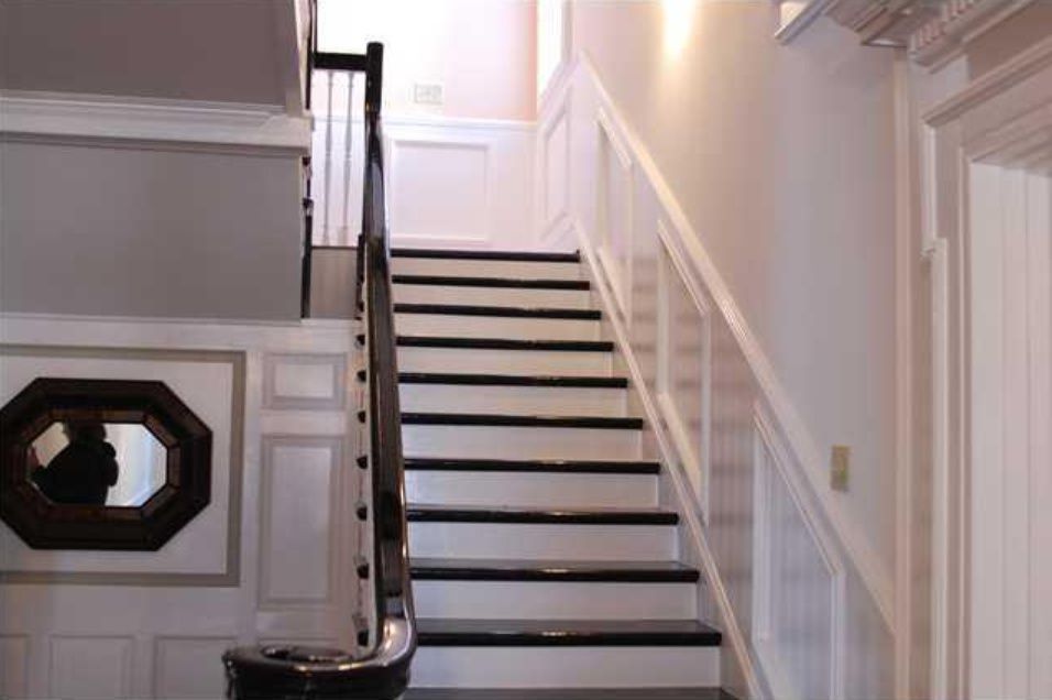
And the grand entrance hall.

What I haven't mentioned yet is that I've been selected to decorate a bedroom!

jl exterior 2.jpg

See that massive porte cochere on left side of the photo? The bedroom I'm doing is located where the bay window is right above the covered porch! Full disclosure - I've already got a plan for my room and have started to implement the design. I haven't gotten very far yet - just painted the walls and I have some custom items in the works. Next week I'll share the before photos of my room as well as the design plan and a few progress shots. I'll be updating weekly from now until when the Showhouse opens to the public. And speaking of that, the Showhouse will open June 4, 2016 and will be open every Friday, Saturday, and Sunday during the month of June. There will also be a marketplace where local goods can be purchased, and lots of fun activities that tie into this event.

Check back next Wednesday for more updates, and make plans to attend the Showhouse in June!!

You can also learn more about The Junior League by visiting them on the web or calling 423 267-5053.

Don't Neglect This When Designing Your Space

When designing a room, most people focus their attention on the color palette, furniture, fabrics, rugs, and window treatments. Granted, these are all important design elements that deserve careful consideration. But there's one design element that is often overlooked - something that adds ambiance and greater functionality to any space.

It's lighting. And it's not just important for utilitarian purposes.

lighting.jpg

In the dining room above by designer Jenny Komenda, the mid century inspired chandelier is a major contributor to the eclectic feel of this dining room.

But a more refined fixture can be just as effective, as seen below in our Signal Mountain dining room project:

lighting2.jpg

In the bedroom, why not consider removing your "builder's special" ceiling fan for a chandelier? (I have to admit that this one's a hard sell in this part of the country due to our long, sultry summers!)

Bedroom above by Sarah Richardson

Bedroom above by Sarah Richardson

And you don't have to limit your lighting options to ceiling fixtures and lamps. Swing arm lamps are wonderful for reading in bed and they free up space on your night stands.

Bedroom above by Lindsay Speace

Bedroom above by Lindsay Speace

In the image below, we used swing arm lamps on these bookcases in our Alabama living room project in lieu of table lamps.

Image above via my Instagram account (The Green Room Interiors)

Image above via my Instagram account (The Green Room Interiors)

I also love seeing lamps in the kitchen!

lighting6.jpg
lighting7.jpg

The lamps in the two images above stand in for pendant lighting. They're just as functional, but an unexpected choice for lighting. Lamp light feels more intimate, too!

So, when it comes to selecting lighting for your home, give it the time and care it deserves. Choose something that feels right for the mood you're going for in your space - and never settle for builder basic!

The Green Room Interiors provides Interior Decorating Services in the greater Chattanooga area. If you'd like some help turning your house into your haven, call Kim at 423.653.3186

My Best Tips For Selecting Art For Your Home

Art can be intimidating. Because art is subjective, there are no rules to follow (mostly) and what appeals to one may not appeal to someone else. And so we get paralyzed. Mostly because we don't want anyone to think we have bad "taste", so in most cases we go with something safe (as in, the colors in this painting go with the colors in my pillows). Where's the joy in that? The art in your home should be so much more! Art should elevate how you live. A favorite piece of art will bring a smile to your face every time you see it, so it's worth taking a step outside of your comfort zone to go with something unique that really speaks to you. Choose art that touches you.

And so that leads us to the subject of today's post. Today I'm going to give you my favorite tips and suggestions for selecting art for your home.

1. Create Tension with Art.

I'm talking about the good kind of tension. Where opposing design styles are used together to bring out the best in each other.

art.jpg

This traditional living room by Lindsay Coral Harper features a modern abstract painting over the fireplace. Unexpected and beautiful!

art2.jpg

My favorite is modern art with traditional furnishings or antiques. What appeals to me in the image above is how simple the abstract painting is in contrast to the ornate French writing desk.

By the way, this also works in reverse:

art3.jpg

Antique painting in a modern bathroom. Opposites truly attract.

art4.jpg

Here's more of that good tension in the image above. The ornate frame and classically styled portrait provide such amazing contrast to the minimalist decor.

2. A collection of related framed art makes a beautiful statement.

art5.jpg

It can be framed maps, as above

art6.jpg

Botanical prints

Or black and white photography.

art7.jpg

When installing an art wall of related subject matter, hang them close together in a grid pattern with same sized simple frames and mats. If you like things neat and orderly, a grid wall of art is a good option for you.

3. Create Your Own Art

Truly. This is personalization at it's best. Observe:

In the image below I hung a wall of oversized family photos taken by my client. Not only is it a great and colorful way to add interest to this large wall, but it's an ever present reminder of the the good times they shared when the photos were taken.

art8.jpg

Children's art is another great way to personalize your space with meaningful and colorful art. Children don't have the inhibitions we adults carry, and it shows in their paintings. The image below is an iphone photo I took of some children's art we used in a powder room makeover

art9.jpg

And more framed children's art below found via Pinterest

art10.png

4. Think Outside the Box

I hate overused expressions like that, but it's late and I couldn't think of a better way to say it. It simply means that wall art doesn't have to be a picture or a painting. In the image below we used a framed flag in my clients' family room. It's graphic and it references their love of sailing.

art11.jpg

Fast forward to their new home, and the framed flag has found a home over their fireplace.

art12.jpg

Image above via my Instagram (The Green Room Interiors).

5. Create a Random Gallery Wall

My taste in art is diverse and I love to collect vintage art. I also have a very white very long wall in my family room that is the perfect candidate for displaying said diverse art collection. All of this combined adds up to the perfect scenario for a floor to ceiling gallery wall of collected art. This approach to wall art is collected, quirky and organic.

white2.jpg

I think diverse is the key word here, don't you? A few of the pieces are original paintings. The black horse portrait was a Christmas gift from my horse's former owner (over 20 years ago). There are framed vintage posters and Picasso print that was the first piece of art my parents bought as a young married couple.

art13.jpg

I don't know who to credit for the image above, but it's a stellar execution of a gallery wall. It's collected, interesting and nicely laid out.

I hope this has been helpful to you if you're struggling with what type of art to hang on your walls or the best way to install it. The most important tip is to always buy what you love and it will bring you happiness for year to come!

The Green Room Interiors provides Interior Decorating and Design Services in Chattanooga, TN. If you'd like some help turning your house into your haven, contact Kim at 423.653.3186 or email thegreenroominteriors@gmail.com

What I'm Working On Now - Signal Mountain Bathroom Update

Today I'm sharing a Design Plan for a bathroom that we'll be starting in the next few weeks. For this project, we are handling the design of the space, as well as implementing the renovation. It's a children's/guest bathroom we'll be transforming by simply updating the finishes. The takeaway here is that if the layout of the space works and you don't need to reconfigure or expand the existing layout, you can effectively create a whole new look and feel to your bathroom on a modest budget.

Here's some background info and a few "befores". The house was built in the late 80's/early 90's and the finishes reflect that time period. Size-wise, it's a generous space, particularly since it's a guest/children's bath. The main problems we'll address are the tired finishes and the lack of adequate lighting. As I mentioned earlier, the layout works well, and there is no need to expand the bathroom's current footprint.

bath before.jpg
bath before2.jpg
bath before3.jpg

During our initial interview, my client was very clear on her vision for the new bathroom. (This is huge! It makes my job so much easier if you have a vision in mind and you have the confidence to share it!) She told me she favors classic, timeless finishes and light, neutral colors. Her career includes working within the natural world, and I got some style clues from touring her home. I noticed nature themed art - such as botanical prints and bird-themed design motifs, all set against an updated light and neutral paint color palette. My client also communicated that although this bathroom is to be primarily for her children, she wasn't after anything "kiddish".

There's one more piece to our puzzle. Once this bathroom renovation is complete, we'll move on the renovation of the master bathroom. She and her husband discussed budget before I met with them and had pre-determined the level of investment they wished to make in both spaces. Again, this is HUGE! It makes my job so much easier if I know up front what I have to work with, because I can gear the selections to fit the budget.

Functionally, the biggest change to be made is that the tub/shower combination will be removed and a large, walk-in shower will replace it (same size, same location - no plumbing to be added or relocated) Normally I don't recommend removing a tub from a guest bathroom for resale purposes, but after much thought, my clients decided it would fit their family's needs best to remove the tub. And that's good enough for me. It's my job to guide rather than dictate, and so the tub will be removed and a large shower will go in its place. We'll also be adding an overhead light fixture, adding a shower light/fan combo, and reconfiguring the lighting on the vanity wall.

Keeping my client's wishes in mind, here are my selections for this bathroom makeover:

new bath collage.jpg

I decided to run with a classic meets nature vibe. The flooring is a charcoal-colored porcelain that mimics (and quite well) the look of a natural slate. It even has a bit of glitter embedded in the design, giving it a real natural stone feel. The dark color and matte finish should make it very forgiving, and it will provide a bit of contrast to the lighter finishes. My client's favorite selection is the pebble flooring we'll use on the shower floor. It has creams, grays, and mushroom tones, which tie in perfectly to the double vanity in a weathered oak finish. I love the warmth the wood vanity brings to this space!

We also opted for polished chrome fixtures - which are timeless and never go out of style. The walls will be painted out in Benjamin Moore's Balboa Mist, a balanced true light gray that doesn't skew beige or blue.

Too add a touch of whimsy and to bring in another nod to the natural world, we'll do a simple tailored roman shade for the window in this fabric:

fabric bath.jpg

Finally, a simple white shower curtain will continue the feeling of clean, classic simplicity that my client envisions.

I'm happy to report my client has enthusiastically approved the Design, and we'll begin to transform this bathroom over the next few weeks. Check for updates and photos along the way!

The Green Room Interiors provides Interior Decorating and Design Services in Chattanooga, TN. If you'd like some help turning your house into your haven, contact Kim at 423.653.3186 or email thegreenroominteriors@gmail.com

Pretty Kitchens That Are NOT White + Gray + Marble

Honestly, I do understand the appeal of a white kitchen! They're timeless, simple, bright, and clean looking, so I would never say it's "wrong". But with the saturation of the white/gray cabinets +white marble countertops + brass hardware + subway tile formula, I feel like there's a bit of a herd mentality going on where kitchens are concerned. Today we'll look at the colorful side of kitchens.

kitchen1.jpg

I love the warm, collected feel of this kitchen. The lower cabinets look like pine, which I love. And it proves you don't have to have all color everywhere to make an impact.

kitchen2.jpg

Above, a favorite kitchen by Andrea Schumacher. Yes, there's white cabinetry and marble countertops here, but there's also an infusion of color and personality!

kitchen3.jpg

I featured this HGTV kitchen last week when I blogged about scallops (note vent hood). I came back to it this week because the color palette is not the norm for a kitchen, and I like that.

kitchen4.jpg

I think yellow and kitchens are perfect together. Again, a little bit of color goes a long way!

kitchen5.jpg

Here is mostly white/marble kitchen with a very unexpected green painted floor, which takes it from sterile to friendly. And fresh.

kitchen6.jpg

Love the mint colored cabinetry with the rustic beams and chrome fixtures. Feels farmy and sophisticated at the same time.

kitchen7.jpg

Kitchen above by Nick Olsen. No white or gray cabinetry, marble countertops OR white subway tile to be found, and it's a little bit city mouse and a little bit country mouse. AND it doesn't look like every other kitchen on Pinterest.

kitchen8.jpg

Kathryn Ireland's kitchen. Mint cabinetry with touches of pink and mismatched lighting. Feels approachable,doesn't it?

kitchen9.jpg

I'll leave you with this image, because it proves that kitchens don't have to be all white and gray to feel modern.

The point I'm trying to make here is there is no right or wrong (mostly) when it comes to the design of your kitchen/home. If you love a gray/white/marble kitchen, by all means, you should have one! However, if you're happier surrounded by color, don't let what is trending on Pinterest dictate what you have in your home! Make it your own with no apologies!

The Green Room Interiors provides Interior Decorating and Design Services in Chattanooga, TN. If you would like some help turning your house into your haven, call Kim at 423.653.3186 or email thegreenroominteriors@gmail.com

Pretty Little Details - Scallops

I'm sure you've heard it over and over again, but it bears repeating.

scallop.jpg

Details are the fun, unexpected touches that can take a space from run of the mill to noteworthy. The details are not always the first thing you notice, but they reveal themselves upon closer inspection, allowing you to experience their unique moments of brilliance a little at a time.

Today we're going to look at scallops - a fun detail that adds interest, movement and whimsy to a space.

scallop2.jpg

The pink and orange color palette seen above is so crisp against the white walls and white upholstery, and the scalloped edge along the top of the side table adds movement and charm to an otherwise boxy design.

scallop3.jpg

The scalloped edges on the bedding above don't immediately jump out at you, but they add another layer of interest to this eclectic bedroom.

scallop4.jpg

In the image above, I love the softness the chandelier's scalloped form brings to this neutral bedroom.

scallop5.jpg

These whimsical chandelier shades are from Chattanooga-based Stray Dog Designs and they come in a rainbow of colors. This lively kelly green is my favorite!

scallop6.jpg

Above, the scalloped hood is the perfect finishing touch for this charming cottage style kitchen. (Extra points if you noticed the scalloped edges on the ends of the upper cabinets.) If I'm not mistaken, it looks like the cabinet hardware is scalloped too!

scallop7.jpg

Finally, a scalloped matelasse slipcover relaxes the formality of this antique sofa. Other noteworthy details are the white piping and buttons inset into each one of the scallops.

If you're in the Chattanooga area and would like some help creating a home that celebrates the details and makes your life a little bit sweeter, call Kim at 423.653.3186 or email thegreenroominteriors@gmail.com

What I'm Working On Now - Home Office In Signal Mountain, TN

Good day!

Today I want to share a project I'm working on for a busy family in Signal Mountain. They recently purchased their home, which was built in 1972, and it has kind of a lodge-y rustic meets Brady Bunch feel to it. If you know me at all, you know that I love unique, quirky spaces and this home definitely fits those categories. I love the house, and the surrounding property is just gorgeous!

The first room they selected to undergo a transformation is their home office. As far as the interior spaces go, the office is quite simple. It's basically a rectangle with a window and a few doors, so the layout is pretty straightforward. From a functionality standpoint, there are 4 children who will use the space as well as the parents, so there needed to be at least two separate workstations. Aesthetically speaking, we agreed that the office should have a casual, classic feel that takes the surrounding landscape into consideration.

The layout allows for 2 separate workstations with some separation in between. Have you ever had a few kids working in the same space at the same time on different things? We felt the separation was key in allowing the children to work harmoniously at the same time and also to provide a little display space for meaningful keepsakes.

And the direction:

The Green Room Interiors, Chattanooga, TN Interior Design of Home Office

The Green Room Interiors, Chattanooga, TN Interior Design of Home Office

We decided to go with the Original Home Office from Ballard Designs for the cabinetry. It's a modular system that allows you to order individual pieces to fit your space and suit your style. We chose to create a mix of painted and stained finishes, because we wanted to keep a light feel (white cabinetry), but my clients are also drawn to the warmth of wood, and the stained wood relates back to other wood elements throughout the home - mainly the kitchen, which is just off of the home office.

I selected Benjamin Moore's Edgecomb Gray for the walls. It's such a great, warm neutral gray. The room has been painted and we love the color!

We considered tucking an additional desk across the room to add one more workstation, but ultimately my clients decided to go with a comfortable chair that could be used for reading or just hanging out while the kids are working.

Did you notice the art above the desks? I was so happy to find these prints. My clients are originally from Louisiana and the wife mentioned early on that the Brown Pelican was a favorite of hers. It just made sense to incorporate Louisiana's Brown Pelican with Tennessee's state Mockingbird. It's really these personal touches that make a space meaningful, isn't it?

Last week I brought them to my favorite frame shop and we nailed down the mat and frame selections.

mat and frame 1.jpg
mat and frame 2.jpg

Side note: Even though these prints are going in the same space, we are going with different color bottom mats. I think each piece of art should stand on its own and you should use whatever matting brings out the best of the individual piece. The subject matter, frames and black top mat will provide the continuity.

And, upon closer look you can see that the bird designs are made from state maps. I can't wait to see these installed in the office.

And speaking of installation, the cabinetry has arrived, but unfortunately one of the stained pieces was damaged and the stain color was much different than the other stained pieces, so it had to be returned and the replacement piece shipped. The custom drapery is in progress and we should be ready to install the rest of the office within a week!

Thanks for stopping by - I'll post updates for the office installation and the pending kitchen updates soon!

If you're in the Chattanooga, TN area and need some help turning your house into your haven, I'd love to hear from you! Call Kim at 423.653.3186 or email thegreenroominteriors@gmail.com

In The Kitchen: Statement Hoods

Today I thought I would do an inspirational post about kitchen hoods. Although utilitarian by nature, hoods can also be decorative and can add lots of personality to your kitchen.

hood.jpg

First, let me just say this kitchen by Rebekah Zaveloff is a favorite! The black, white and wood finishes are timeless. But that hood?!? Total scene stealer. I love the simple, strong shape and that band of brass around the bottom takes it to the next level. Side note: if you're still on the fence about mixing metals, this image should give you the confidence to forge ahead! (chrome/brass/copper)

hood2.jpg

Another gorgeous black and white kitchen from Rebekah Zaveloff. This time the tapered hood is covered in subway tile. The white tile lends a tidy, orderly feel to a kitchen. I love this look and we recently created a custom hood for a client that was covered in subway tile. Below is a photo taken during renovation:

hood3.jpg
hood4.jpeg

Just the addition of the wood on this kitchen hood above (from HGTV Magazine) adds a wonderful textural contrast to all of the slick surfaces in the kitchen above. I probably would have chosen a different stain color for the wood, but I do appreciate the softness and warmth the wood brings to the space.

hood5.jpeg

Another thing to keep in mind that statement hoods don't have to be loud and showy. I adore the simplicity of the hood above, and it's tapered, curvy form is nice contrast to the surrounding boxy cabinetry.

hood6.jpg

In the image above, the hood is simple in form, but the copper makes a strong statement and the weathered finish underscores the rustic feel of the kitchen. This is such a warm, comfortable kitchen!

hood7.jpg

I could not love this hood or this entire kitchen from Design Manifest more! The shape of the hood reminds me of a pagoda, and the brass band around the bottom is a little unexpected. I love how a classic material like brass feels so modern in this application.

Planning a kitchen renovation? I say forego the conventional microwave /fan combo and upgrade to a custom hood - and have some fun with it. Whether it's with shape, scale, materials used or a combination of these options, a great looking hood will add interest and personality to your kitchen.

The Green Room Interiors provides Interior Decorating Services in the Chattanooga, TN area. If you'd like some assistance with the design of your interiors, call Kim Lemmon at 423.653.3186 or email thegreenroominteriors@gmail.com.