Project Reveal - Chattanooga Master Suite - The Bedroom

This post has been in the works for quite a while, and I’m so happy to finally share it with all of you.

Here’s a synopsis of the project:

The Challenge: Take a 1990’s master suite and bring it into today while retaining the home’s character and honoring the homeowners’ style preferences.

Pain Points: 1. The clients are busy with careers, classes, and a new baby on the way. They simply didn’t have the time to make a new plan for these spaces and do all of the leg work involved. 2. Although they have style preferences, they weren’t sure how to pull it all together to create a master suite they could enjoy for this phase of their lives.

Style Preferences: The clients were smart in that the highest priority was to blend the new design with the architectural style of the home and their mountaintop location. They love the outdoors and kayaking and wanted some nature inspired touches in their new suite.

The Plan: We decided to work within the existing footprint of the bedroom while updating the decor and a few of the architectural features. They wanted refined but not formal, clean lines, and a few rustic touches to speak to their love of nature.

The Before: Well, let’s just say the 90’s were looking a little tired in here, and definitely not a reflection of my clients preferences or lifestyle. Observe:

What we Did: My client wanted a pretty bedroom, but not necessarily girly or feminine. She wanted a handsome room that felt quiet and restful. Nothing sets the tone quite like the perfect paint color, and we landed on a rich, dark charcoal/brown for the walls. See that fireplace? It got a major makeover with some gorgeous marble slabs that make a statement in the most simple form. The brown cabinet behind the wing chair was removed and a custom built in cabinet was installed to display personal collections and cherished family photos. We kept the rice carved bed - it is such a high quality piece and will be forever stylish, so it was an easy decision.

The Result:

Hello, tall dark and handsome! The bedroom is restorative, timeless and restful for a busy couple with a new baby. To further meet the clients’ needs for functionality, we added natural linen blackout lined curtains trimmed in a luxe navy velvet to provide the perfect sleeping environment.

Mixing a few modern design elements with classic pieces always nets a curated and personalized look. Bed linens are neutral and textural, with a playful infusion of color and nature found in the bunny tapestry pillow.

Remember the old fireplace? It’s been replaced with this stunner in the most chic marble imaginable!. The simplicity of the design allows the veining to shine - and it does just that. The antique chair is a family piece that was updated with a watercolor floral fabric.

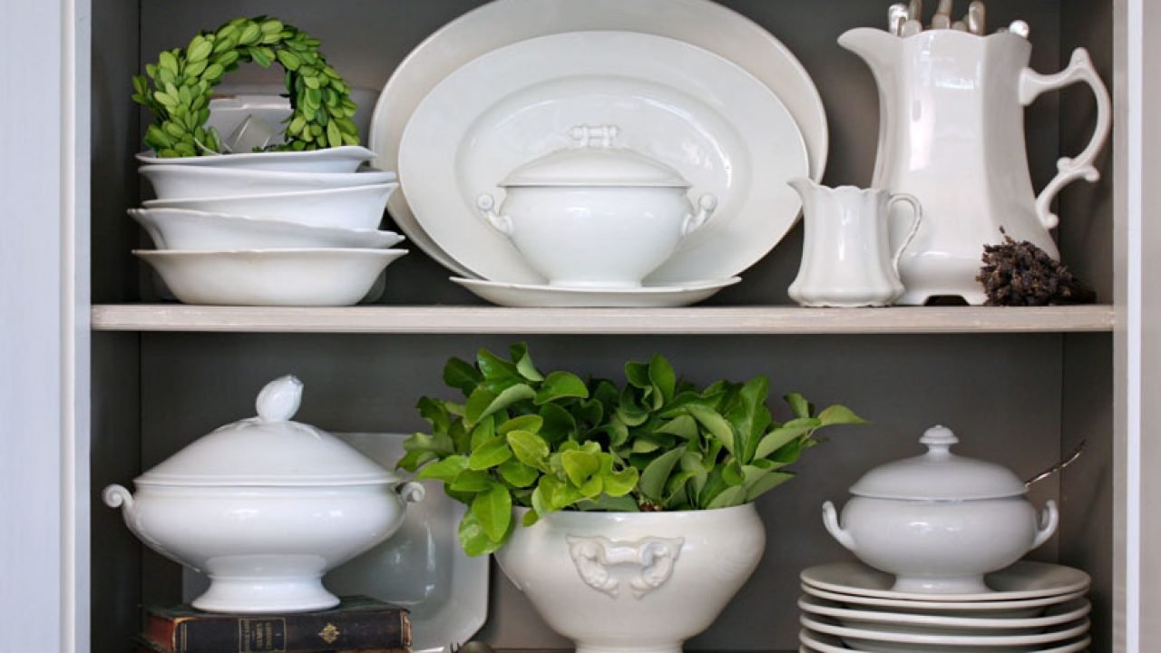
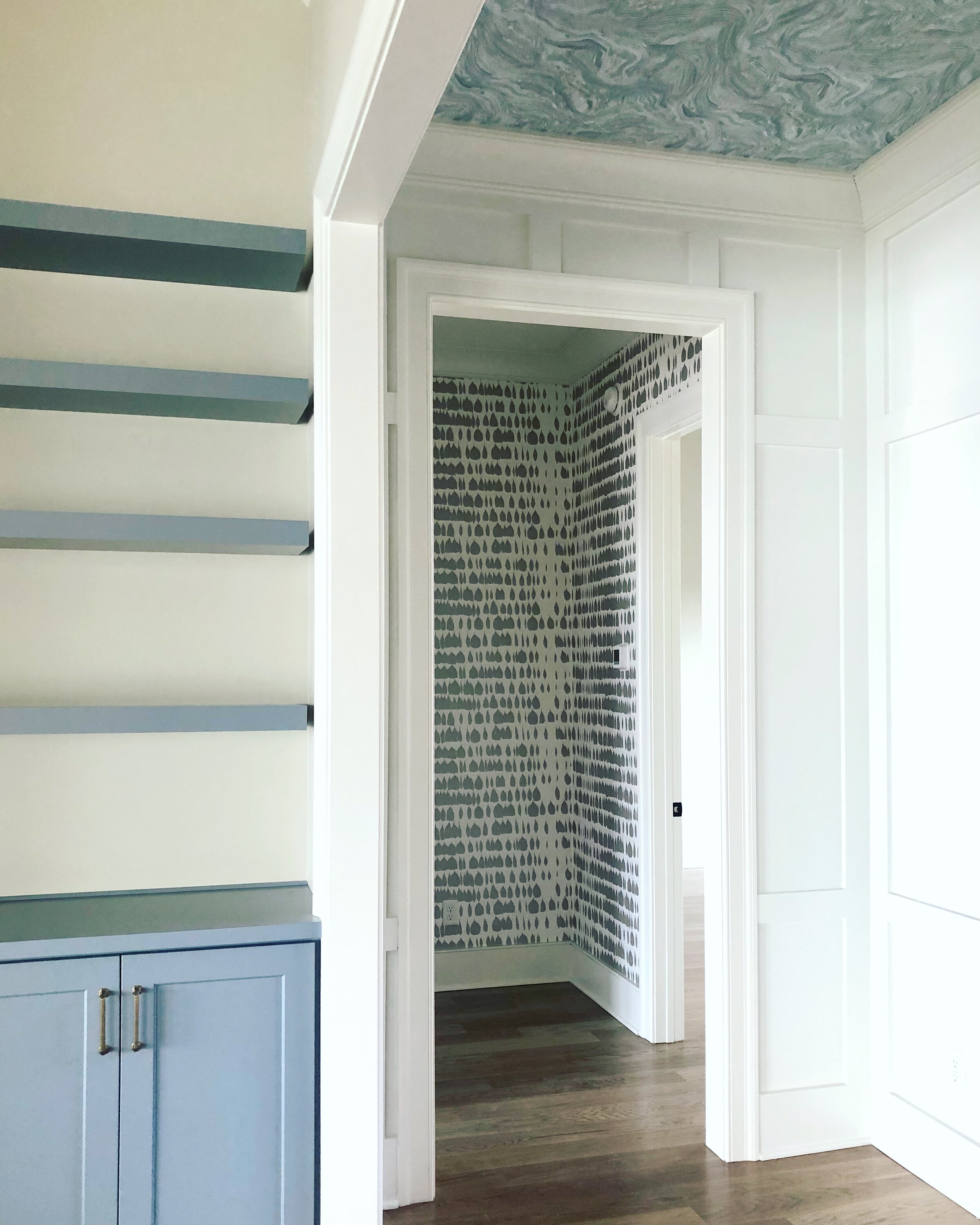
We had so much fun styling the new bookshelves. We made no new purchases for this area - everything we used was already in the client’s home!

And just for fun, here is an iphone shot from photography day. We brought in some greenery to add life to the fireplace photo.

In my next post, we’ll take a look at the attached sunroom/office space. You’ll want to be sure and check it out - it’s so good!


The Green Room Interiors is currently accepting new work for early 2023. We’d love to help you live joyfully through great design. Email us at thegreenroominteriors@gmail.com and tell us about your project!

Yes, I Use Banded Curtains all the Time and Here's Why

Let me start off by saying that window treatment installation day is one of my absolute favorite days in the Design Process. There’s something about custom made and beautifully executed window treatments that really transform a space. When new window treatments are installed, everything feels more luxe and elevated - and definitely more cozy!

Here’s a lovely office we created for the lady of the house that features custom window treatments. We made them with a simple creamy white linen blend fabric, a small band of green grosgrain ribbon, and a wide blue band of navy velvet to finish them off.

More often than not, I opt to go with a simple banded or color blocked design for drapery panels and/or Roman shades.

In this project, we added a simple band of orange to these custom drapery panels and valance to add another layer of detail and unify the room’s color palete.

So, why, you might ask, do I favor banded or color blocked curtains?

There are few reasons. First of which is that they feel fresh and streamlined. As a person who likes to decorate with antiques, pattern and color, banded window treatments inject a modern element that firmly places a mostly traditional room in the “now”.

How beautiful are these blue banded linen curtains? The client had blinds installed within her windows during construction but the transom windows above were letting too much light in. We added a wall of blackout lined curtains on a traverse rod for function and beauty!

Here’s an iphone image of a recently completed powder room. The simple white linen shade with a band of orange is the perfect complement to the Chinoiserie wallpaper, and facilitates a feeling of clean - which is a good thing in a powder room!


Another iphone shot on installation day. This room is so pretty it almost hurts. We created a very fashion forward look on the window treatments by applying a few bands of white linen to these blush linen drapery panels. This touch of modernity is wonderful in such a pretty and feminine space. And bonus - they’re blackout lined and fully operational with a decorative traversing rod that neatly opens and closes them with a cord draw that is located behind one of the curtain panels. Function and beauty and well considered details make me happy!

Another reason I like to go with a simple banded or color blocked window treatment over a patterned fabric is that the patterns can get pretty obscured by the pleats on the curtains.

This is not my work, but you can see how the floral print on the curtains is not shown to its best because the folds and pleats are breaking up the pattern. And overall, the window treatments feel heavy - and dare I say - dated? They are obviously impeccably made, but I prefer something that feels simple and fresh.

And finally, it’s pretty easy to work with simple window treatments. Goodness knows custom window treatments are a substantial investment, so going with a style that lends itself to a number of different directions will serve you well as your personal style evolves.

How gorgeous is my clients’ Master Bedroom? Again, simple white linen fabric is punched up with brilliant blue banding, and that keeps the room feeling fresh and crisp. Simple dashes of bold color can be impactful without being overwhelming!

And so now you know why I go to banded curtain styles over and over again. And I’m not saying that I never use a patterned fabric for curtains, because I certainly do, but I will never not love the style and simplicity of banded window treatments!

Looking to refresh the feel of your home? The Green Room Interiors is accepting new clients for late fall/winter of 2022. Contact us and tell us about your project and how we can help!

The Role of White

If you’re new here, let me start off by welcoming you (Hello!), and also to let you know I don’t typically do a ton of neutral/spaces. I adore working with color and pattern and layering on the pretties - without being too over the top.

Today I want to talk about white. Instagram, Pinterest and Houzz are brimming with images of rooms that are painted white. We love them, don’t we? After all, they feel so airy and refreshing! One thing you should know about doing white walls is that it works best in rooms that are big and receive tons of natural light.

Here’s a perfect example. This is a room I worked on a few years ago with double height ceilings and lots of windows/French doors to help further that bright and airy feel.

So what’s a decorator to do when working with a smaller room that doesn’t get a good amount of natural light and you’re craving a bright and fresh look?

I suggest you start with a wall color or wall covering in a medium depth. Too light and the wall color just fades into dinginess. Too dark and the room will be eternally dark and moody - which is a look unto itself and pretty popular right now.

And now we’re getting to the part where the Role of White comes in.

Adding white to a room in the form of window treatments and accessories is a great way to move your room a little closer to those bright and airy rooms we love so much!

I think this image of a completed Chattanooga dining room project from a few years ago shows how effective the white window treatments are in creating a light and fresh feeling. Try to imagine the room instead with a busy pattern on the drapes. The room would feel much different and maybe even a little stale.

Another thing I like about using lots of white as an accent is that it’s a palette cleanser and it makes the colors you’re using feel cleaner and brighter.

See how the navy pillow and the sky blue headboard feel so crisp against the white bed linens? Hard to believe but this master bedroom has only 8’ ceilings and does not get a lot of natural light. The white linens really help to brighten things up!

White curtains, white chairs and white blossoms create an airy and relaxed feel to this dining room against a medium depth wall color.

This trick also works well for styling bookcases and china cabinets. White accessories look more dramatic and elevated against a darker backdrop. And they make your room feel lighter and fresher.

This image is from Romantic Homes Magazine and it shows the beauty of white ironstone against a darker backdrop.

A budget friendly way to get this look is by using Milk glass pieces for styling bookshelves and China cabinets. Its pretty plentiful at local antique malls and thrift stores, and most of it is reasonably priced.

And never underestimate the beauty of a sculptural white lamp against a colorful backdrop.

So there you have it. I hope you’ll try some of these easy ways to get the bright and airy look of white rooms by adding lots of white to your rooms!

Are you ready to live more joyfully in your home? Contact us at thegreenroominteriors@gmail.com and let us know how we can serve you!


The Order of Things when Planning a Room's Design

This may be a lengthy post but I’m going to do my best to cover all the bases without being too lengthy.

Do you know the biggest mistake people make when designing a new space in their home? It’s failure to plan. Unless you have a great eye and clear vision for your new room, the last thing you should do is start randomly buying pieces without knowing what the overall goal/feel/design style you’re working toward is.

There is more than one process that can be used to create a design for your space, but today I’m going to share my process with you.

Step 1: Sketch out the footprint of your room and measure each wall’s width and height. You’ll also want to note any architectural features such as windows, doors, mantels, etc. Tip: Using graph paper to sketch out your room’s footprint will make it easy to stay on track. Typically, each square on your graph paper represents 1 square foot.

If you’re incorporating existing furniture into the design of your new room, measure each of those pieces too.

Step 2: Create your furniture layout. Start with the existing pieces you’re reusing and place them to scale in your room’s footprint. Then you can begin filling in with furniture you need to add that is properly scaled for your space. Tip: Make sure you leave adequately sized walkways between furniture pieces. Ideally you’d like 30” -36” walk space.

Step 3: Determine the style goals for your room. This can be a specific design style, such as Grand Millennial (my personal favorite), Eclectic, Cottage, etc. Or your style goals can be more of a mood. (Vibrant and happy, quiet and restful, collected and cozy).

It’s helpful to create a mood board or look book for your space with images that reflect your color palette, style or mood. You can also add textural elements you love such as velvet, bamboo, linen, or shells. Your mood board can be a bulletin board, photos and materials gathered up into a tray, or on a Pinterest board, Houzz look book, or a file of Instagram photos.

Example of a physical mood board

Added bonus: Mood boards are a great way to flex your creative muscles with little to no risk. You can try out design elements and easily eliminate them.

Step 4: Let the shopping begin! If you’ve gone through steps 1-3 as described above, you will be able to confidently select furnishings that will properly fit your space and be in line with the look or mood you’re trying to create.

If you’re shopping locally, be sure and bring your measurements with you so you’re sure everything will fit as expected.

Step 5: Putting it all together. If you’ve measured properly and stayed true to your big picture for your new room, you should be in a very good place with the design of your room.

All that remains are those personalized finishing touches. This is where the room really begins to take on your personality. Display your favorite collections, family heirlooms and artifacts of your travels. Add in some favorite vintage pieces and your room should be a true reflection of your life and your style!

Ready to fall in love with your home? The Green Room Interiors is accepting new clients for late summer 2022. Email us at thegreenroominteriors@gmail.com and tell us about your project!

Currently....

Today I’m sharing some photos of a project that is currently in progress. Covid has played a major role in the speed at which things are progressing (or not progressing).

But we forge ahead and we’re so grateful for the little victories/deliveries that come our way after months of anticipation.

This is a Chattanooga master bedroom, bath and sunroom project that is shaping up to be the ultimate sophisticated retreat for grownups.

Here’s the bedroom before:

A view of the wall opposite the bed.

This beautiful home is in a gorgeous mountaintop setting with incredible views of the Tennessee River gorge below. It was built in the 1990’s and the owners are updating the interiors in stages.

Here’s a progress photo showing the new marble fireplace surround and paint color. I have to say, this turned out even better than we had expected. Kudos to local stone provider Stone Source for hearing our vision and bringing it to life!

We also removed the ill fitting and dated cabinet in the little niche at the end of the fireplace wall. The clients opted to fill this area with open shelves to display family photos and cherished mementos.

We chose to paint out the cabinet in the same color as the wall paint to create quiet unity in that area and to allow the marble fireplace to be the stronger focal point.

This is what we’re working toward for the fireplace wall.

Want to see the sunroom before?

This is a favorite room of the homeowners. It offers amazing views of the property and beyond. The room has great bones and the transformation is nearly complete!

Almost there!

We installed new wood floors to match the existing wood floors in the bedroom and to follow the lines of the octagonal shape of the room. A new loveseat and work station provide a cozy spot to connect at the end of their busy days and -and work from home as needed.

The bedroom is getting a glow up too, but back orders are delaying installation. Here’s a look at where we’re going with the bedroom.

We’re keeping the poster bed - it’s timeless and heirloom quality. New night stands in a painted finish will update the room and textural pillows will help keep the feel quiet and comfortable. Linen drapery panels with blackout lining and navy velvet trim will be both functional and beautiful.

Can’t wait to share more of this stunning master suite upon completion. Bathroom photos coming too!

Paint Color of the Year - 2022 Edition

It’s that time of year again - when color forecasters unveil what they perceive will be the hot paint colors for the year ahead.

It’s kind of fun to learn about what the color gurus are predicting, but I would NOT recommend running out and changing everything in your home to anyone’s pick for the 2022 color of the year.

The color selections you should make in your own home are colors that

  1. you absolutely love, or

  2. create the mood you’d like your home to convey.

I think we’ve all noticed that the tide is turning and gray is very slowly being replaced with color and warm tones. This is a trend I can get behind!

Beautiful living room by McGrath 2 featuring warm colors and classic furniture. Perfect balance of comfort and sophistication!

It’s no secret that color blue has been hot for a few years, and blue is a perennial favorite of home decor enthusiasts, but lately we’re seeing a renewed interest in the color green.

Master bedroom at the Kips Bay Showhouse by Brittney Bromley features a nature inspired feel that is underscored with shades of green.

And with good reason. Green is the color of growth, renewal and nature. And with everything we’ve been through over the past 2 years, I think a little renewal is in order.

For their 2022 color of the year, Benjamin Moore has named “October Mist” from their collection of Classic colors.

October Mist is a silvery shade of green that would be very easy to work with - acting as a neutral in most cases.

Baby steps away from gray, I guess. Lots of gray to be found in this shade of green.

I’ve never used October Mist myself, but here is what Google is showing me as examples of the color in room situations.

Looks gorgeous in this bedroom, particularly combined with the honey gold tones as accent colors.

October Mist by Benjamin Moore. Definitely gives a calming effect.

Sherwin Williams has also selected a gray/green as their 2022 Color of the Year - Evergreen Fog. It’s very similar to Ben Moore’s October Mist but a shade darker.

Sherwin Williams Evergreen Fog is a good starting point for an earthy color scheme.

Evergreen Fog kitchen cabinets. I love this color on cabinets - it’s a little unexpected yet very easy to live with.

So while we’re slowly weaning ourselves off of the all gray everything, both October Mist and Evergreen Fog are very much neutral and grayed out versions of the color green, so I think they’re great transition colors for anyone who wants to dip a toe into the color pool in baby steps.

Oh, and if you’re feeling adventurous, take a look at Pantone’s color of the year, Very Peri - as in winkle.

Wowza, don’t really see this one taking off in a big way.

Periwinkle is blue with red undertones, which creates blue-ish purple-ish color.

Image found via Houzz. Not for the faint of heart.

If the idea of this color in an understated way appeals to you, then I highly recommend you take a look at Benjamin Moore’s Eternity. It’s a lovely blue/gray with the slightest, and I mean slightest, lavender undertone.

Benjamin Moore Eternity

The image above is from an Interior Design/Renovation project on Signal Mountain we completed about 4 years ago. The color on the walls is Benjamin Moore Eternity and it’s the perfect blue/gray/periwinkle. Very calming and sophisticated!

So, to recap, take those Color of the Year forecasts for what they are. Opinions of others that have nothing to do with what appeals to you or creates the Wow factor you’re looking for in your own home. Stick with what you love and it will always spark joy!

Wallpaper - We're Here for It

Who’s ready to step away from the gray on gray on greige with a “pop” of ____________ rooms that have been dominating the design world for - well, far too long in my opinion.

Wallpaper is back and better than ever! And it doesn’t have to be as imposing as it was in the late 80’s - 90’s when every surface of a room was adorned with busy patterns and riotous color.

Here is a custom mural wallpaper we used as a dramatic backdrop to a beautiful dining room in Ooltewah.  The earthy color scheme and quiet furnishings keep the space from feeling busy.

Here is a custom mural wallpaper we used as a dramatic backdrop to a beautiful dining room in Ooltewah. The earthy color scheme and quiet furnishings keep the space from feeling busy.

Here’s a laundry room from a custom lake house that is nearing completion with just a few finishing touches left to install.

Joyful colors make for joyful living.  I love this nature inspired paper combined with the blue cabinets!

Joyful colors make for joyful living. I love this nature inspired paper combined with the blue cabinets!

Here is another image from the same house.  Blue marbleized wallpaper on the ceiling complements the graphic silver print on the vestibule outside the master and guest bedrooms.  This is much more dynamic than just paint!

Here is another image from the same house. Blue marbleized wallpaper on the ceiling complements the graphic silver print on the vestibule outside the master and guest bedrooms. This is much more dynamic than just paint!

In my own home, I went with a classic stripe and upped the drama by painting all of the wainscoting and trim in a similar shade of blue.

IMG-0105.jpg

Want to stretch your budget? Below we used a high end Chinoiserie wallpaper in a smaller quantity and framed and hung 3 panels above a sofa.

And for those who wish to proceed more cautiously, I would point you to grasscloth.

This is a  sisal grass cloth with a texture that is more refined than the grass cloth of the 70’s.  The color is amazing and the texture provides an extra layer of beautiful detail.

This is a sisal grass cloth with a texture that is more refined than the grass cloth of the 70’s. The color is amazing and the texture provides an extra layer of beautiful detail.

This is another dining room we swathed in grass cloth. This time in lovely shade of teal to coordinate with the clients’ existing rug.  It’s even more cozy in person!

This is another dining room we swathed in grass cloth. This time in lovely shade of teal to coordinate with the clients’ existing rug. It’s even more cozy in person!

Here’s a preview of a few wallpaper patterns we’re incorporating in a new custom home on Signal Mountain.

This classic Rose and Hollyhock paper will be installed in the mud room with blue trim.  Can’t wait!

This classic Rose and Hollyhock paper will be installed in the mud room with blue trim. Can’t wait!

Butler’s pantry wallpaper.  Built in cabinets will be blue and an Italian Murano glass chandelier will hang above it.

Butler’s pantry wallpaper. Built in cabinets will be blue and an Italian Murano glass chandelier will hang above it.

And here’s a little mockup of what’s in store in the powder room.  This timeless beauty will really add some interest and I’m in love with this direction!  It’s the combination of old with new, traditional with modern that really makes it unique and timeless.

And here’s a little mockup of what’s in store in the powder room. This timeless beauty will really add some interest and I’m in love with this direction! It’s the combination of old with new, traditional with modern that really makes it unique and timeless.

Considering wallpaper for your home? If you’re in the Chattanooga area, contact me! I’d love to help you build a room around your favorite wallpaper!

Project Reveal - Luxury Interior Design in a New Construction Chattanooga Home - Master

Today I’m sharing the design of a master bedroom suite in a new construction home in Chattanooga.

I have worked with these fine people in their last residence, and we had completed their master bedroom just a year or two before they purchased their new home. Because we still loved this room and it fit the direction of the new house, we decided to reuse the majority of their furnishings in their new home.

Here’s the previous master bedroom completed just a few years prior to purchasing the new home:

The furnishings used to create this master suite are beautiful, timeless,  and will transition perfectly into their new home.

The furnishings used to create this master suite are beautiful, timeless, and will transition perfectly into their new home.

Here’s another look at the bedroom in their former home -so beautiful and restful!

Stone+Point+Ln+1_Web_3.jpg

And for reference, below are photos of the new construction home prior to move-in.

There is an amazing view of Chattanooga and soaring hawks to be enjoyed through the French doors and the deck beyond. The wood clad barrel vault ceiling is a gorgeous detail provided by the builder.

There is an amazing view of Chattanooga and soaring hawks to be enjoyed through the French doors and the deck beyond. The wood clad barrel vault ceiling is a gorgeous detail provided by the builder.

Here is the master bedroom in the new home.

Their furniture works perfectly here, although the layout has slightly changed.  The gold Louis Phillipe mirror is no longer placed over the dresser, but has found a home beside the French doors.  Wall art from their previous home was also reshuffled allowing this beautiful landscape reinforce the color palette and the mood of the room.

Their furniture works perfectly here, although the layout has slightly changed. The gold Louis Phillipe mirror is no longer placed over the dresser, but has found a home beside the French doors. Wall art from their previous home was also reshuffled allowing this beautiful landscape reinforce the color palette and the mood of the room.

We were not able to repurpose the former room’s cobalt silk drapes in the new space, so in the spirit of keeping the feel restful, we went with a simple linen drapery - but we punched it up with cobalt blue ribbon trim. I love a meaningful shot of bold color!

This shot of bold color was repeated in the water closet of the bathroom with this magical wallpaper installation.

To me, this is like being in an enchanted forest at night.  I love those gold stars and the drama of the white trees against the blue backdrop.

To me, this is like being in an enchanted forest at night. I love those gold stars and the drama of the white trees against the blue backdrop.

Pro tip: If you’re considering a bold wallpaper but concerned it may be too much to live with, consider using it in a small area, such as a water closet, powder room, on the ceiling, or even in a closet. You won’t tire of it quickly and it will be an exciting departure from the surrounding areas.

Thank you for taking the tour of these lovely rooms. I’ll share more on my next post!

The Green Room Interiors is now accepting new projects for mid fall of 2021. Contact us if you’re ready to experience the joy of a well designed home!