
Paint Color of the Year - 2022 Edition
It’s that time of year again - when color forecasters unveil what they perceive will be the hot paint colors for the year ahead.
It’s kind of fun to learn about what the color gurus are predicting, but I would NOT recommend running out and changing everything in your home to anyone’s pick for the 2022 color of the year.
The color selections you should make in your own home are colors that
you absolutely love, or
create the mood you’d like your home to convey.
I think we’ve all noticed that the tide is turning and gray is very slowly being replaced with color and warm tones. This is a trend I can get behind!

Beautiful living room by McGrath 2 featuring warm colors and classic furniture. Perfect balance of comfort and sophistication!
It’s no secret that color blue has been hot for a few years, and blue is a perennial favorite of home decor enthusiasts, but lately we’re seeing a renewed interest in the color green.
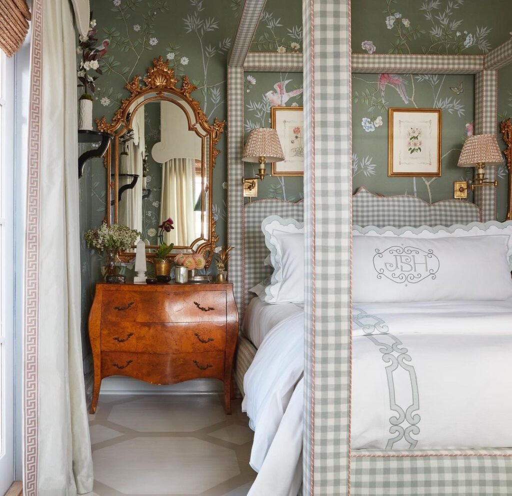
Master bedroom at the Kips Bay Showhouse by Brittney Bromley features a nature inspired feel that is underscored with shades of green.
And with good reason. Green is the color of growth, renewal and nature. And with everything we’ve been through over the past 2 years, I think a little renewal is in order.
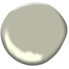
For their 2022 color of the year, Benjamin Moore has named “October Mist” from their collection of Classic colors.
October Mist is a silvery shade of green that would be very easy to work with - acting as a neutral in most cases.
Baby steps away from gray, I guess. Lots of gray to be found in this shade of green.
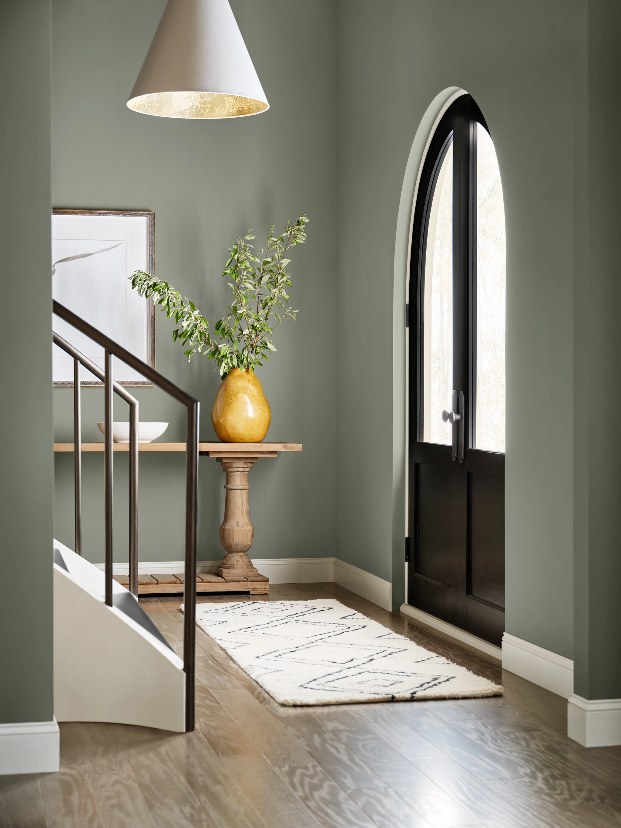
I’ve never used October Mist myself, but here is what Google is showing me as examples of the color in room situations.

Looks gorgeous in this bedroom, particularly combined with the honey gold tones as accent colors.

October Mist by Benjamin Moore. Definitely gives a calming effect.
Sherwin Williams has also selected a gray/green as their 2022 Color of the Year - Evergreen Fog. It’s very similar to Ben Moore’s October Mist but a shade darker.
Sherwin Williams Evergreen Fog is a good starting point for an earthy color scheme.
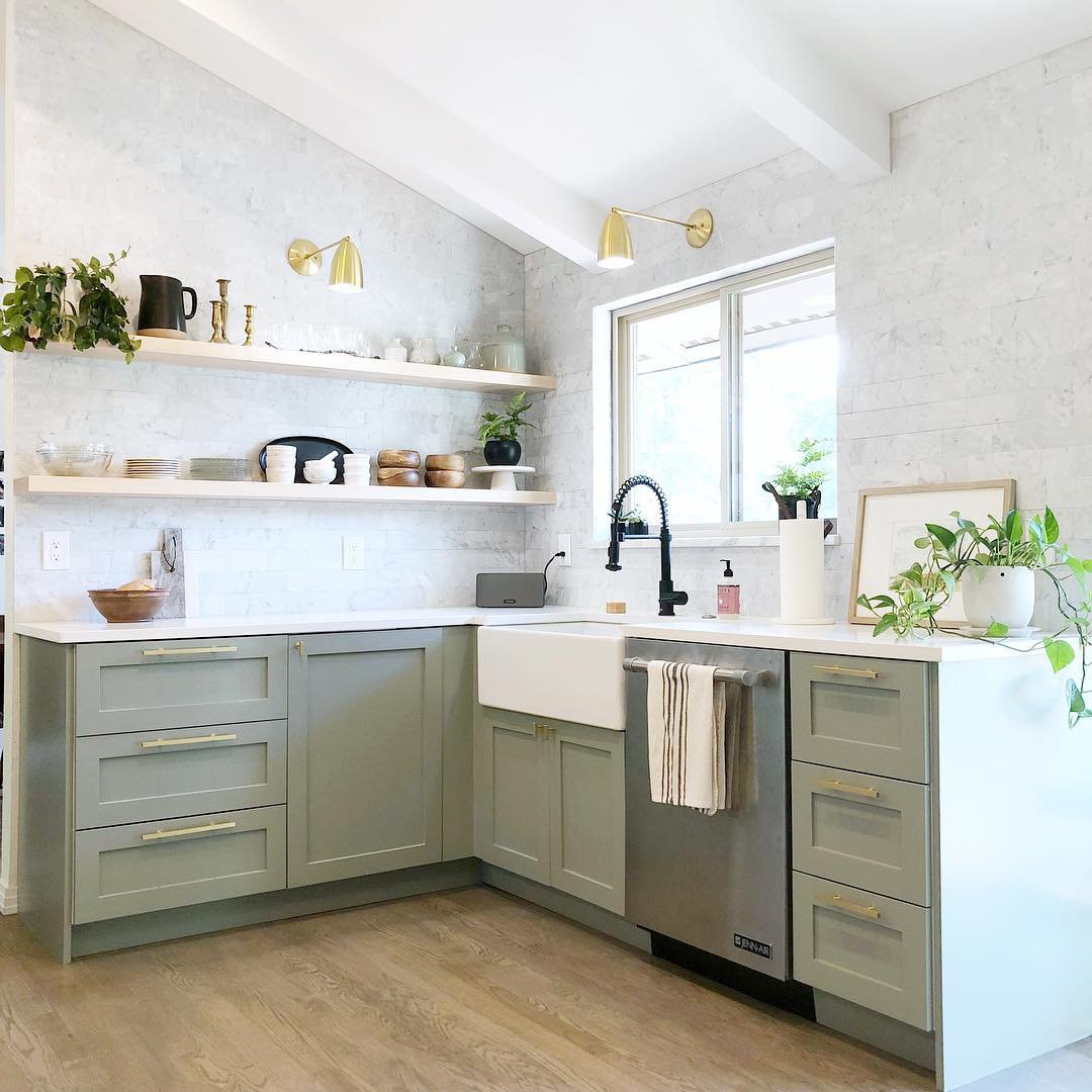
Evergreen Fog kitchen cabinets. I love this color on cabinets - it’s a little unexpected yet very easy to live with.
So while we’re slowly weaning ourselves off of the all gray everything, both October Mist and Evergreen Fog are very much neutral and grayed out versions of the color green, so I think they’re great transition colors for anyone who wants to dip a toe into the color pool in baby steps.
Oh, and if you’re feeling adventurous, take a look at Pantone’s color of the year, Very Peri - as in winkle.
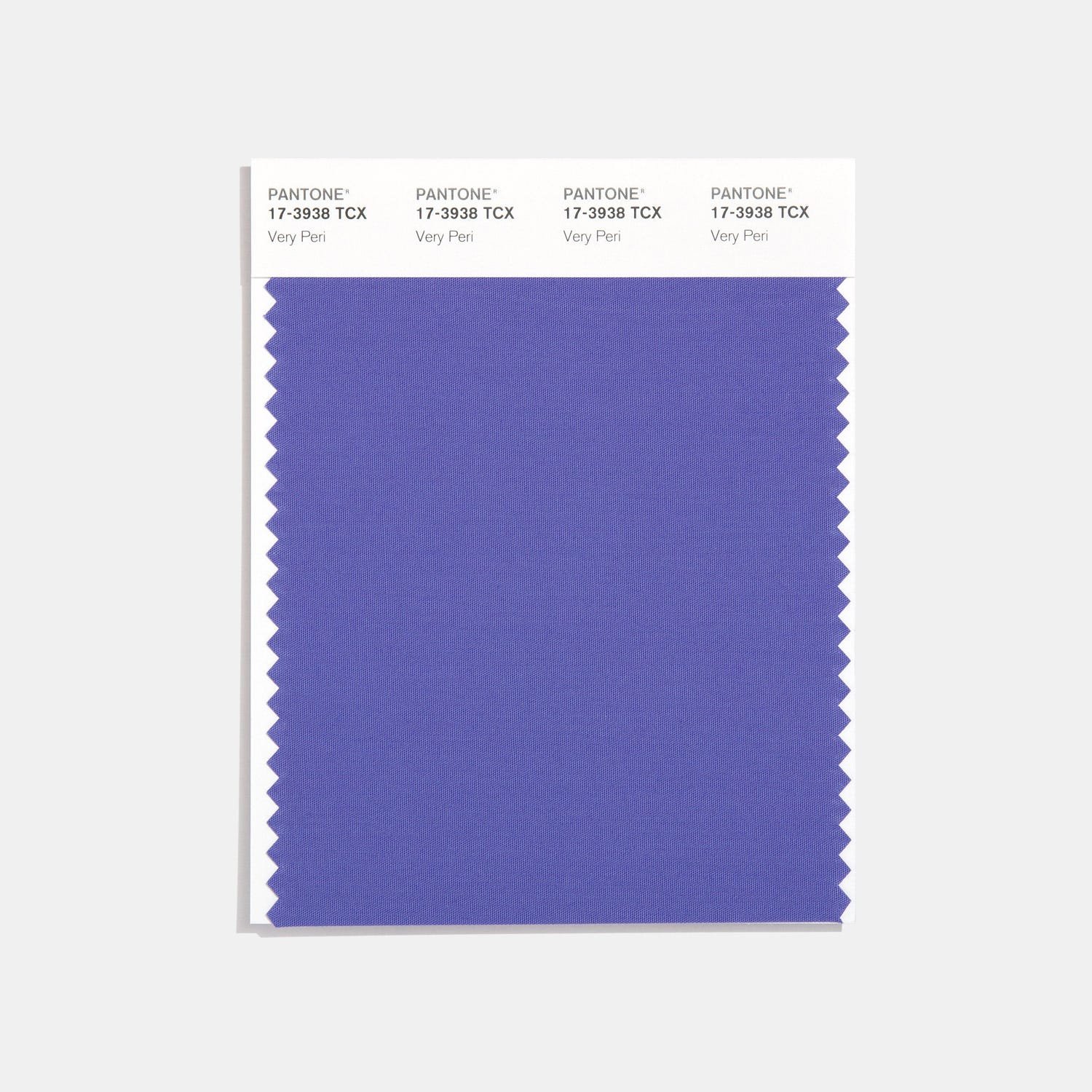
Wowza, don’t really see this one taking off in a big way.
Periwinkle is blue with red undertones, which creates blue-ish purple-ish color.
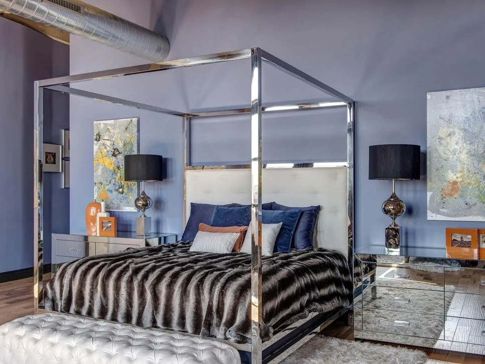
Image found via Houzz. Not for the faint of heart.
If the idea of this color in an understated way appeals to you, then I highly recommend you take a look at Benjamin Moore’s Eternity. It’s a lovely blue/gray with the slightest, and I mean slightest, lavender undertone.
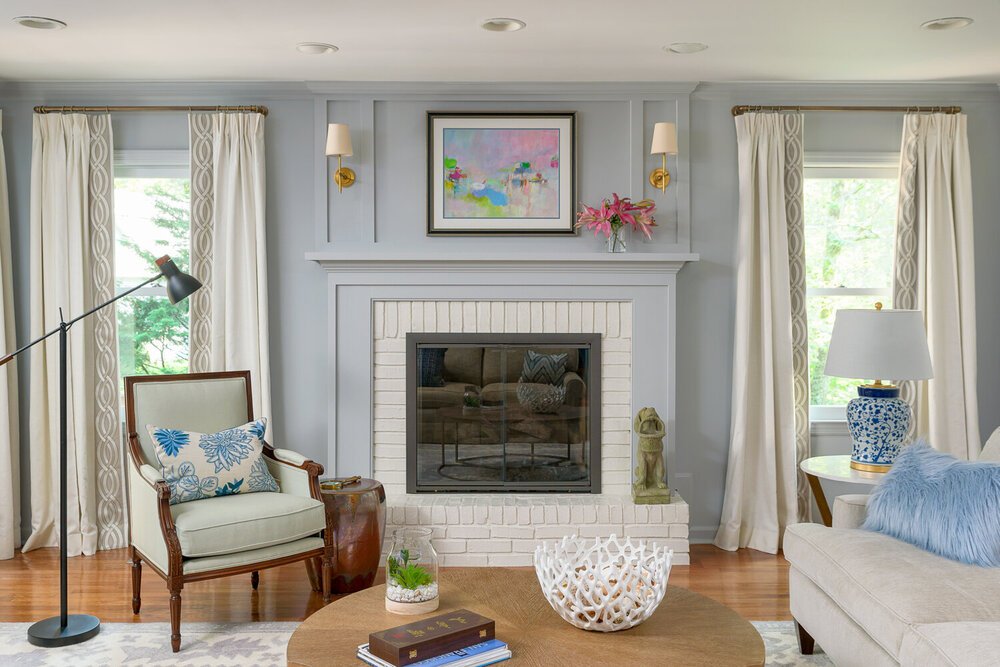
Benjamin Moore Eternity
The image above is from an Interior Design/Renovation project on Signal Mountain we completed about 4 years ago. The color on the walls is Benjamin Moore Eternity and it’s the perfect blue/gray/periwinkle. Very calming and sophisticated!
So, to recap, take those Color of the Year forecasts for what they are. Opinions of others that have nothing to do with what appeals to you or creates the Wow factor you’re looking for in your own home. Stick with what you love and it will always spark joy!