Decorating - How to Stretch the Budget

Decorating or redecorating your home is a sizeable investment. If you haven’t shopped home furnishings or done any type of renovation work over the past few years, you might be a little bit surprised at what things cost these days.

But, there are things you can do to make each of your decorating dollars go a little further, so you can splurge on that fabulous velvet sofa with the 8-way hand tied construction or the mahogany dining table of your dreams.

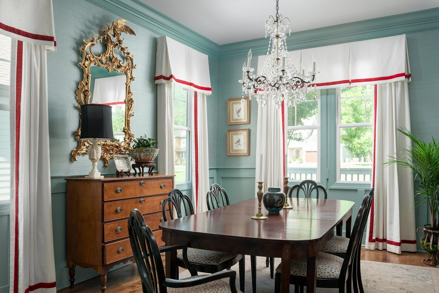
Chattanooga dining room - a project we completed in late 2019, just before Covid reared it’s ugly head.

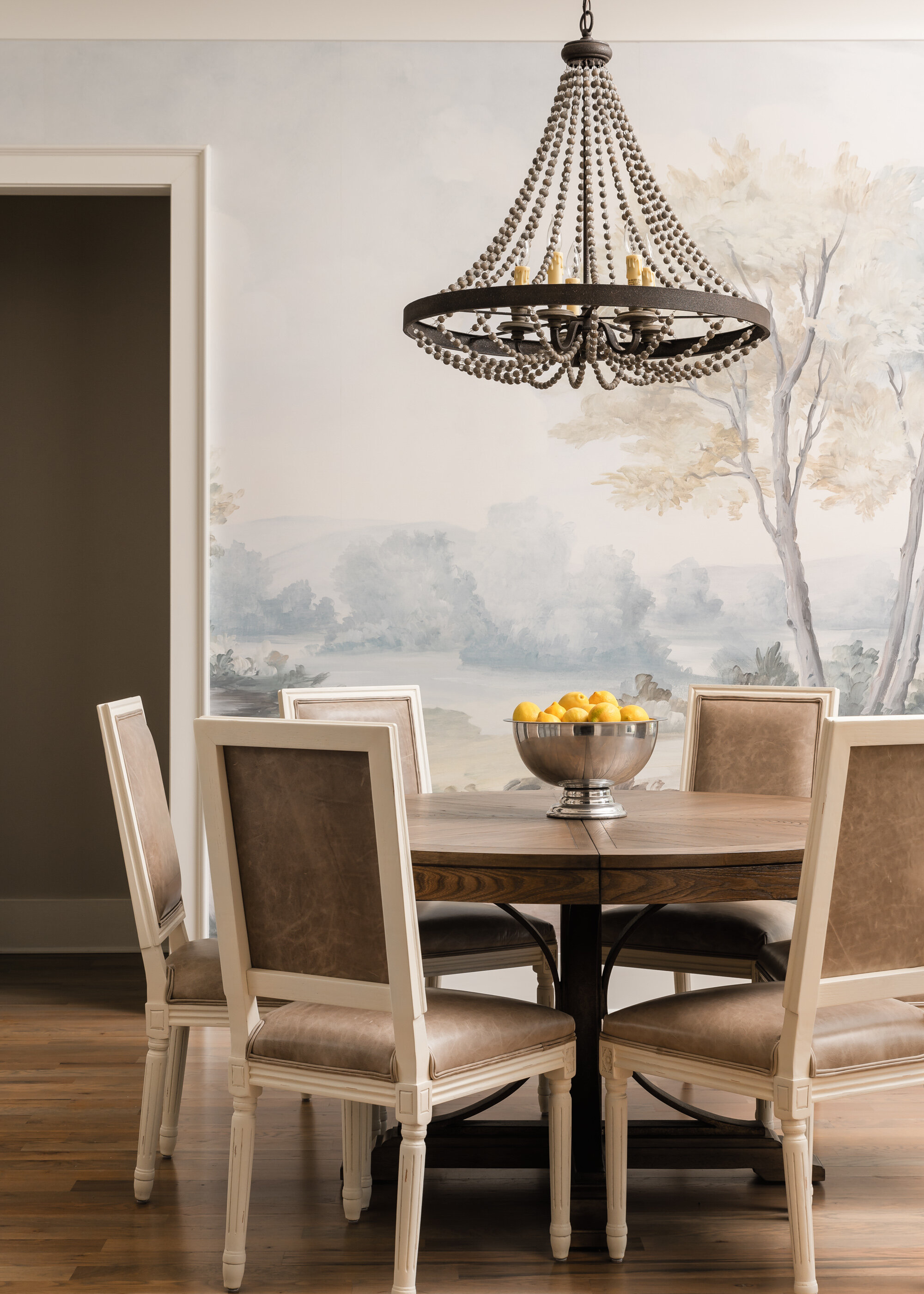
  1. Try to reuse as much as you can. Not exactly ground breaking information, but it really works! These clients already owned the antique French dining set. It’s been in the family for several generations. We had the the caning repaired where needed on the chairs and added new fabric to the seats. The glorious crystal chandelier was existing, and the antique mirror over the console was part of my client’s collection.

Here is the dining room “before”. Same dining set, same chandelier, but the space got a whole new attitude!

Same dining room with the French antique chairs and antique table from client’s collection.

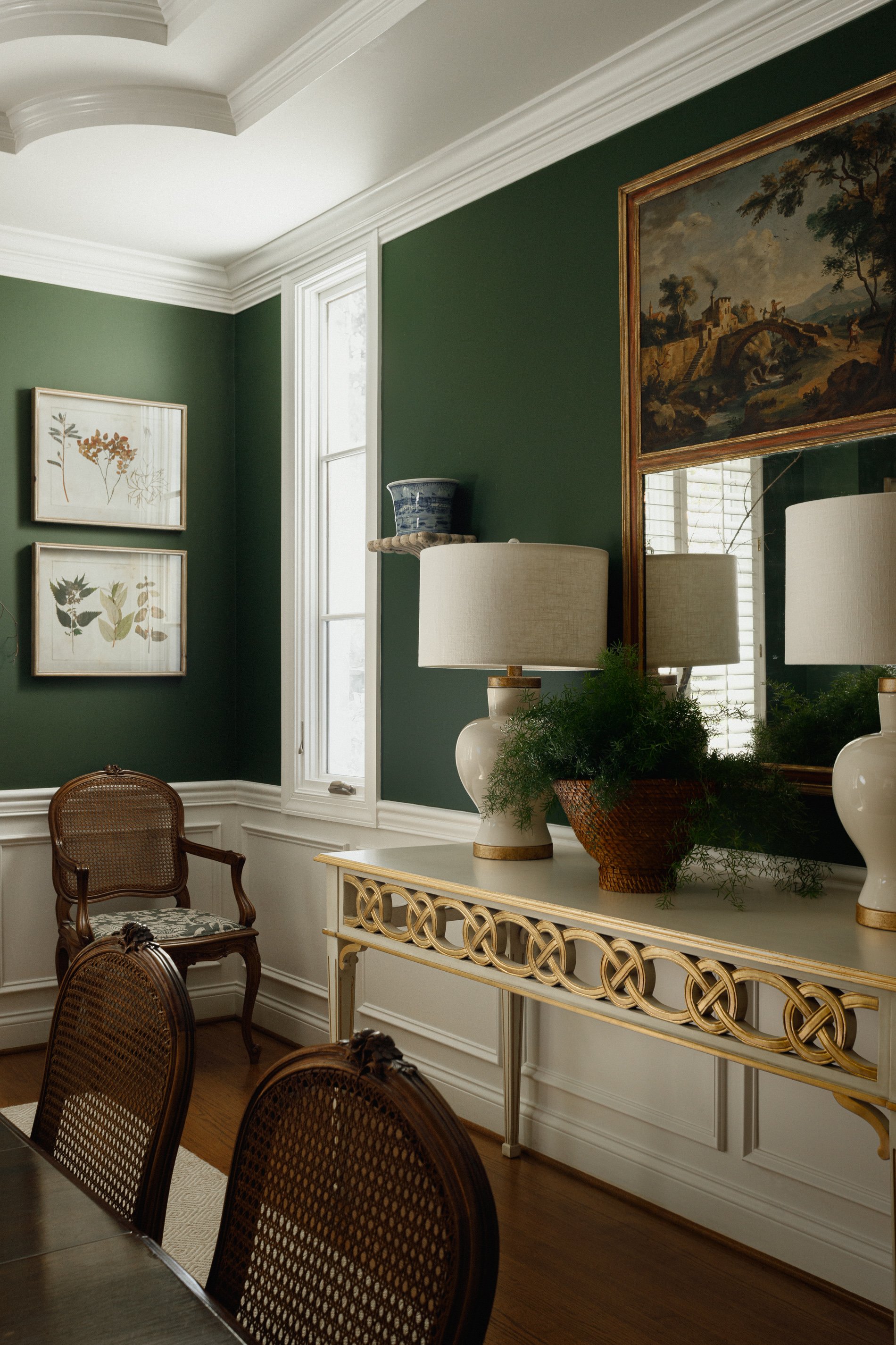
A new rug, contemporary console table with gilt accents and simple beefy lamps take this dining room from old fashioned to fresh and chic!

So take a good luck at the pieces you have and see if you can imagine them in a new location or with a new role. You can still get a whole new look if you make smart choices!

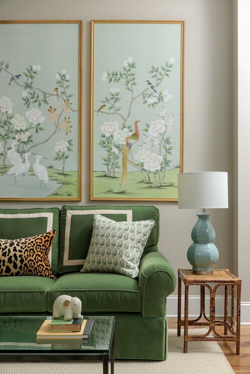
2. Shop vintage. This is quite possibly my most favorite tip. I love vintage. Lamps, art, accessories, furniture, mirrors. There is honestly so much goodness to be found out there and in most cases the prices you pay for the quality you receive makes the whole thing a win/win.

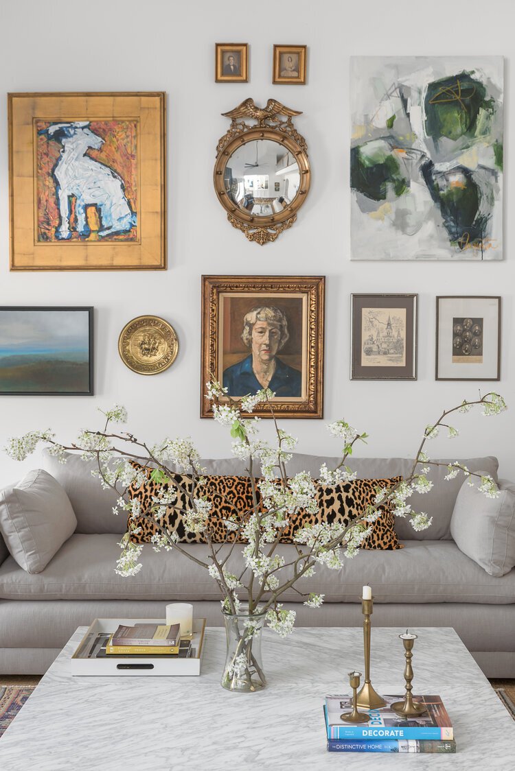
We created this gallery wall in a Chattanooga living room with a mix of vintage finds and newly acquired art pieces. What a unique and fabulous statement it makes. And the brass candleholders on the coffee table. Also vintage.

Entryway of same house in the photo above. This is a 2-for because the little wooden bench is antique AND it was part of the client’s collection. It was made by her grandfather and was the most perfect counterpoint to the modern art!

Same house, same entryway. Vintage bust, vase and candlesticks finish off the modern entryway table.

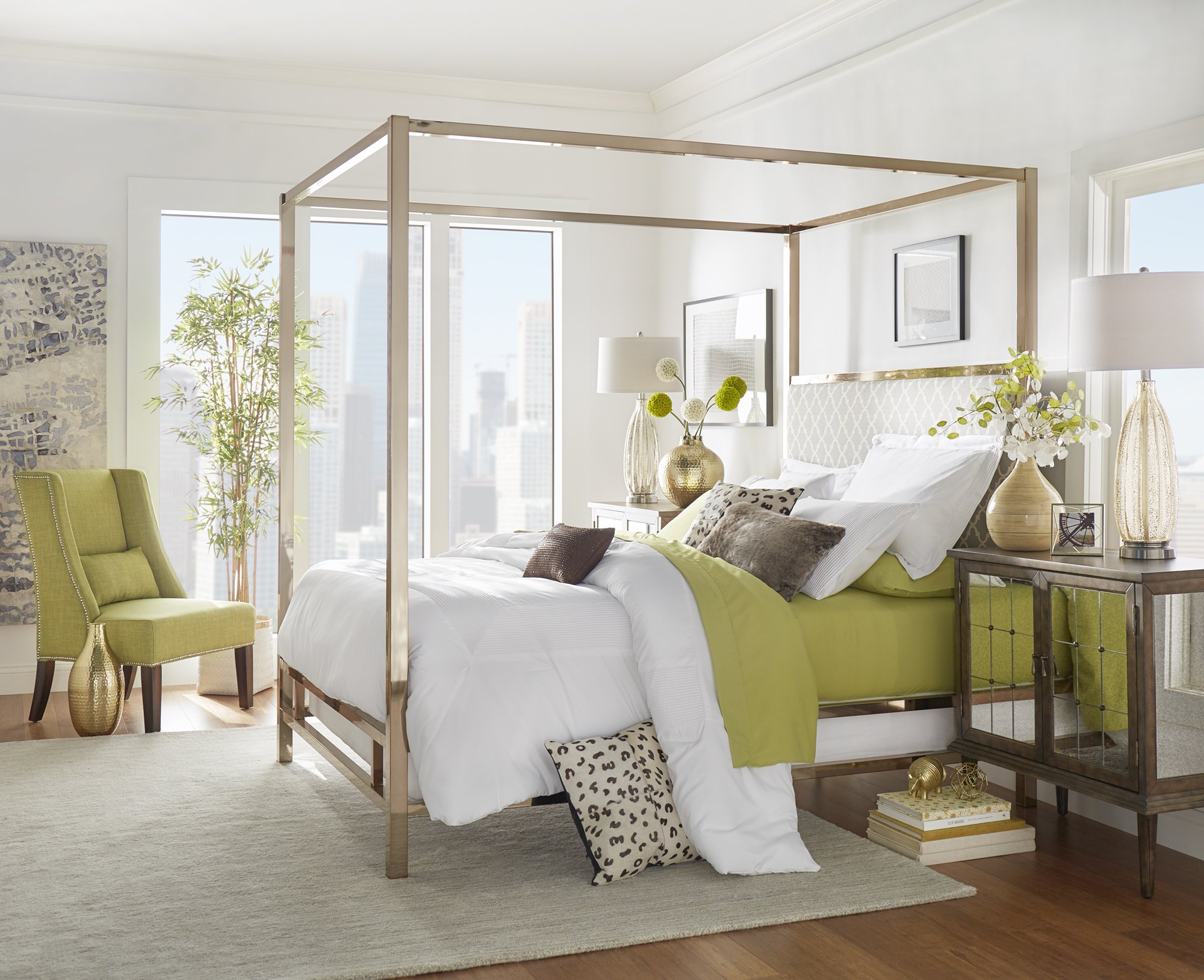
3. Natural Fiber Rugs Seagrass, jute, sisal - all provide a casual element to a room’s design that is also very easy on the checkbook!

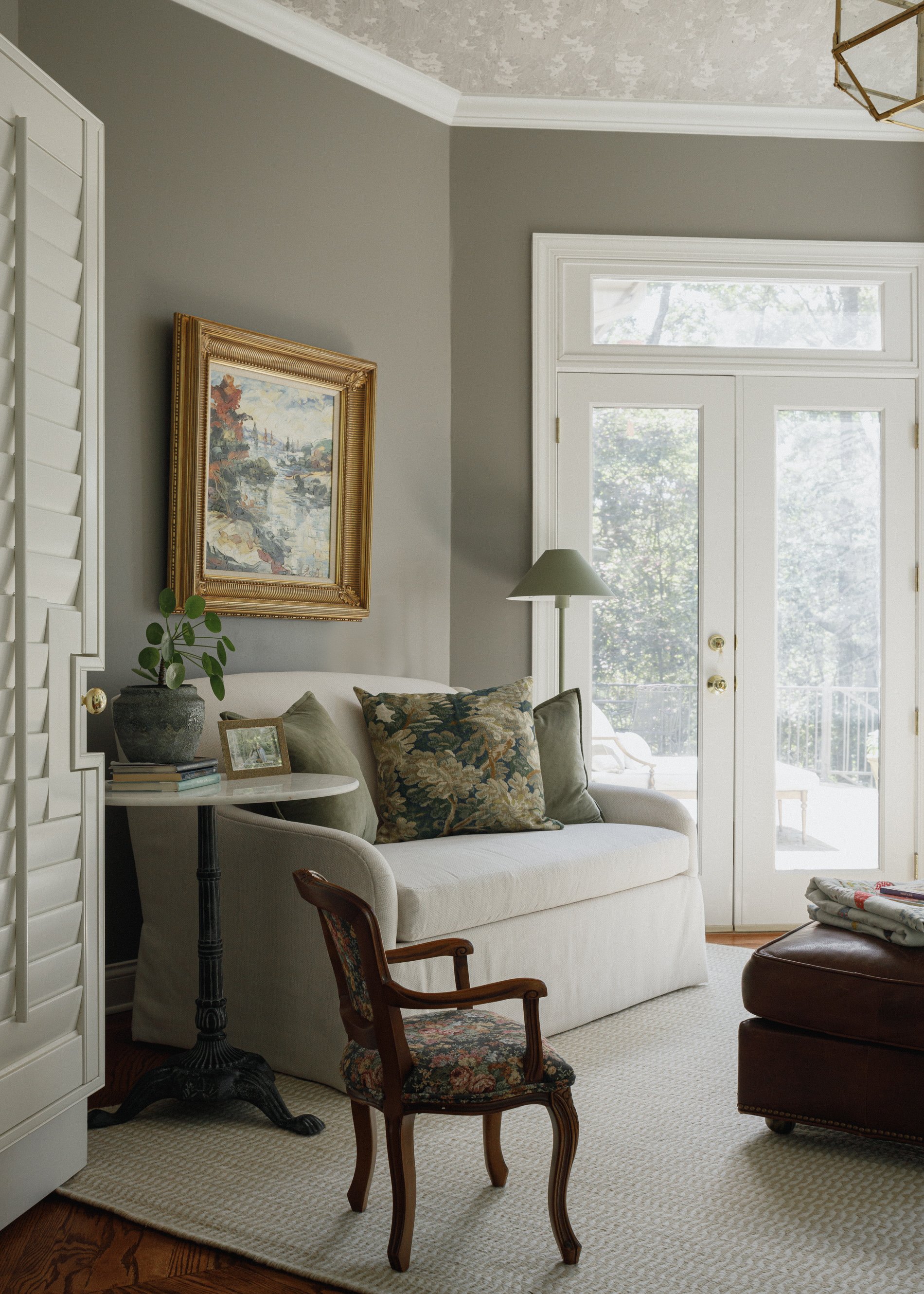
Chattanooga lake house interiors project - master bedroom. A seagrass rugs anchors furnishings of a higher pedigree. (Lots of vintage here as well). I practice what I preach!

Same lake house. Here’s an indoor-outdoor seagrass rug we used in the loft area. Love the casual feel of a natural fiber rug!

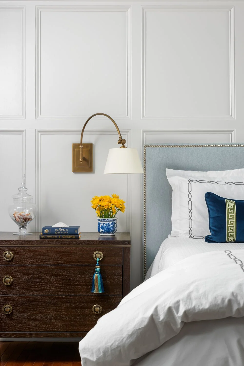
4. Dress your windows simply. Ok it’s no secret that I love a luxe drapery at the windows, but there are ways to create chic windows on a budget.

One of my favorite way to create stylish and chic windows is with a simple bamboo shade. You can order them cordless and with liners if you need privacy and light control. It’s the seagrass rug of windows!

From the Southern Living Idea house in Louisville, KY 2021.

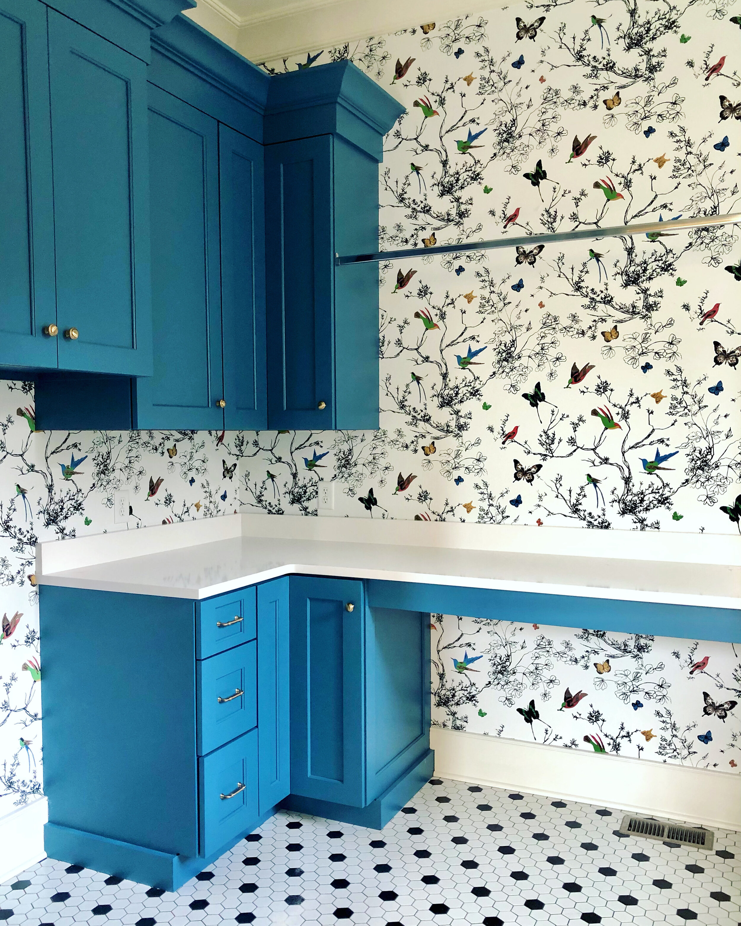
Cafe curtains are back and a great way to stretch the window treatment budget. Very little fabric is required and they’re just so charming. Perfect in kitchen, powder room, laundry room, mud room - you name it!

I hope these tips help you get the most out of your next decorating project. Will you try any of them?

Dreaming of creating a special place to come home to at the end of a busy day? We can help! Contact Kim at thegreenroominteriors@gmail.com and tell us how we can help!

Favorite Vendors and Why

Did you know that as designers we have tons of resources at our disposal that may not be well known but are of the highest quality? Yup, there are literally hundreds (thousands?) makers of quality furnishings that you may not have ever heard of.

When we source furnishings for our clients, here are the priorities:

  1. First and foremost, the piece has to be appropriate for it’s intended use. No brainer, but it’s a box we need to check.

  2. The piece needs to be made from good quality materials and with attention to detail during fabrication. Selecting good-looking furniture is a given, but we also want to be sure it was made to last. (I’m currently working with clients who have a wonderful quality 20 year-old sofa that we’re reinventing with new upholstery and fresh cushions.) This not only helps keep costs down, but keeps these great pieces out of the landfill.

    AND… This is where I insert my blurb about using classic and timeless furniture styles. Traditional is never wrong and will never be out of style. It just needs a few tweaks and updates from time to time. The aforementioned 20-year old sofa is still relevant to today’s design styles, and that’s why investing in simple and timeless pieces that are made with quality materials and great craftsmanship will serve you well throughout your life.

  3. Is it made in the USA? We want to support our American makers and manufacturers! I’m proud to source American made products that put our citizens to work and provide job security. Extra points if it’s a family owned business.

  4. It needs to be a fair price for the quality of the piece. So while we’re not looking for the “best price” to furnish your home, we want to be sure the quality is in line with the price tag.

  5. Style. The styling and overall vibe of each piece should work well with our preferred design style - which is “fresh traditional”. This is not your grandmom’s traditional, it’s a cleaner, simpler aesthetic with less ornamentation.

  6. Can I customize? 99% of the time we order upholstered pieces in specific fabrics to get the exact look we want. We also like the ability to specify the seat depth, back height, arm style, and cushion fill.

  7. Is there a real person I can call to address any problems that may have occurred somewhere along the line? And I’m not talking about a random person who answers an 800 number halfway across the world that will most likely not even be working there 30 days from now. We actually know the person we’re dealing with and that they stand behind their products.

Here’s a lovely classicly styled and clean lined sofa. The bench cushion and tight back keep the look clean and current.

More beautiful and classic styling. This chair has a lovely waterfall skirt which is super chic. This one brings the beauty but leaves the frills in the past.

You can never go wrong with and English arm sofa with turned legs on casters. It’s a classic that will look good decades into the future.

Here are some custom pieces we’ve used in recent projects:

Here are a pair of custom swivel chairs we had made in our client preferred print by a small furniture maker in North Carolina that works with design professionals. Construction includes 8-way hand tied suspension for comfort and longevity.

Same custom furniture maker made this classic love seat for us in a performance fabric we selected for durability and easy cleanability.

The sofa? Custom. We were able to select our own fabric and trim and specify how we wanted it applied. Rug is also custom from a trade resource in Nashville. It’s 100% wool, can be made to whatever size we need, and is reversible for twice the wear. That’s what I call good value. The art over the sofa is wallpaper we ordered from a trade source. We had the panels custom framed locally - they are spectacular!

To recap, this is why working with a designer who is loyal to her preferred vendors nets the best results. We have the resources that we have personally vetted, have the ability to customize so your home is uniquely “you”, and have confidence in leaving with you pieces we know will stand the test of time.

Ready to take your home to a whole new level of fabulous? We’d love be your design advocate to help make your home the very best it can be! Tell us about your project by filling out our contact form, or email Kim at thegreenroominteriors@gmail.com.

angled walls? Add wallpaper!

It’s no secret that I love to use color and pattern when designing a space, but there’s one prospect makes me completely giddy, and that’s installing wallpaper on sloped walls!

Angled walls can be challenging to work with, because in many cases the ceiling starts to angle just a few feet above the floor, making it feel short and awkward.

Wallpaper to the rescue! Applying wallpaper to the entire wall - angle and all - creates an illusion of space and a feeling of intimacy at the same time. A design high-five for sure!

I love a cozy space, especially a cozy bedroom! Love the layers of pattern in this room - and the headboard is absolutely dreamy!

Toile is timeless, and is enjoying a resurgence in popularity. As seen in this photo, layering on the toile creates maximal impact.

How absolutely charming is this attic bathroom? The block printed wallpaper is beautiful - but that’s just the beginning! Love the penny tile striped floor and the beautiful shape of the marble backsplash behind the sink.

Stripes are an easy choice for a sloped ceiling. They lift your eye upward creating a feeling of height and openness.

This wallpaper is by Schumacher and it’s called “a-twitter”. It’such a great choice for an attic bedroom - feels like you’re in a treehouse!

The toile! So pretty on the walls, the ceiling, and at the windows. Wallpaper covers every wall and ceiling surface in this charming attic bedroom and I love it!

Life is short and at times difficult. The right wallpaper in the right place can bring joy and contentment to the daily grind, especially in unexpected places!


Usung Color Heroes - Chartreuse

“It is an explosive green, that if one could watch it moment by moment throughout the day, would grow in every dimension.” - Amy Seidl

Chartreuse is one of those colors that most people have a strong opinion about. And the majority of those opinions are not favorable.

Chartreuse straddles the fence between green and yellow. It’s an acid-y color - and yes, it can be a little bossy.

Chartreuse is the color of the freshest spring bud, sprigs of baby grass, and in our neck of the woods, the pollen that wreaks havoc with our sinuses and coats every surface during March and April.

No other color enlivens a space like chartreuse can - even a small dose of chartreuse will energize a calm space!

A few accents of chartreuse freshen up this mostly blue bedroom.

Just look how stunning those silk chartreuse drapes are against the navy velvet settee in this room by Paloma Contreras Design.

Accents of chartreuse are like little punctuation points in the layered and colorful room by Richard Keith Langham.

For those of you willing to throw caution to the wind and “go big”, you can take inspiration from this incredible room from Matthew Carter. It’s one of my favorite rooms of all time and the chartreuse walls are just brilliant.

Modern chartreuse. It’s an unexpected color selection for this bedroom but it works so well!

Bravo fans will have no trouble recognizing this breathtaking chartreuse room that was done by Mario Buatta for Pat Altschul. If I’m not mistaken, the wall color is Benjamin Moore Chic Lime.

AND, if you’re looking for a more toned down Chartreuse paint color, give Benjamin Moore’s Castleton Mist a look.

Photo by Emily Folowill for Atlanta Homes & Lifestyles magazine.

Would you add chartreuse to your list of unexpected and chic colors?

Are you ready to live more joyfully at home? The Green Room Interiors is adding new projects to our schedule for late spring of 2023. Contact us at thegreenroominteriors@gmail.com and tell us about your project!

Yes, I Use Banded Curtains all the Time and Here's Why

Let me start off by saying that window treatment installation day is one of my absolute favorite days in the Design Process. There’s something about custom made and beautifully executed window treatments that really transform a space. When new window treatments are installed, everything feels more luxe and elevated - and definitely more cozy!

Here’s a lovely office we created for the lady of the house that features custom window treatments. We made them with a simple creamy white linen blend fabric, a small band of green grosgrain ribbon, and a wide blue band of navy velvet to finish them off.

More often than not, I opt to go with a simple banded or color blocked design for drapery panels and/or Roman shades.

In this project, we added a simple band of orange to these custom drapery panels and valance to add another layer of detail and unify the room’s color palete.

So, why, you might ask, do I favor banded or color blocked curtains?

There are few reasons. First of which is that they feel fresh and streamlined. As a person who likes to decorate with antiques, pattern and color, banded window treatments inject a modern element that firmly places a mostly traditional room in the “now”.

How beautiful are these blue banded linen curtains? The client had blinds installed within her windows during construction but the transom windows above were letting too much light in. We added a wall of blackout lined curtains on a traverse rod for function and beauty!

Here’s an iphone image of a recently completed powder room. The simple white linen shade with a band of orange is the perfect complement to the Chinoiserie wallpaper, and facilitates a feeling of clean - which is a good thing in a powder room!


Another iphone shot on installation day. This room is so pretty it almost hurts. We created a very fashion forward look on the window treatments by applying a few bands of white linen to these blush linen drapery panels. This touch of modernity is wonderful in such a pretty and feminine space. And bonus - they’re blackout lined and fully operational with a decorative traversing rod that neatly opens and closes them with a cord draw that is located behind one of the curtain panels. Function and beauty and well considered details make me happy!

Another reason I like to go with a simple banded or color blocked window treatment over a patterned fabric is that the patterns can get pretty obscured by the pleats on the curtains.

This is not my work, but you can see how the floral print on the curtains is not shown to its best because the folds and pleats are breaking up the pattern. And overall, the window treatments feel heavy - and dare I say - dated? They are obviously impeccably made, but I prefer something that feels simple and fresh.

And finally, it’s pretty easy to work with simple window treatments. Goodness knows custom window treatments are a substantial investment, so going with a style that lends itself to a number of different directions will serve you well as your personal style evolves.

How gorgeous is my clients’ Master Bedroom? Again, simple white linen fabric is punched up with brilliant blue banding, and that keeps the room feeling fresh and crisp. Simple dashes of bold color can be impactful without being overwhelming!

And so now you know why I go to banded curtain styles over and over again. And I’m not saying that I never use a patterned fabric for curtains, because I certainly do, but I will never not love the style and simplicity of banded window treatments!

Looking to refresh the feel of your home? The Green Room Interiors is accepting new clients for late fall/winter of 2022. Contact us and tell us about your project and how we can help!

The Role of White

If you’re new here, let me start off by welcoming you (Hello!), and also to let you know I don’t typically do a ton of neutral/spaces. I adore working with color and pattern and layering on the pretties - without being too over the top.

Today I want to talk about white. Instagram, Pinterest and Houzz are brimming with images of rooms that are painted white. We love them, don’t we? After all, they feel so airy and refreshing! One thing you should know about doing white walls is that it works best in rooms that are big and receive tons of natural light.

Here’s a perfect example. This is a room I worked on a few years ago with double height ceilings and lots of windows/French doors to help further that bright and airy feel.

So what’s a decorator to do when working with a smaller room that doesn’t get a good amount of natural light and you’re craving a bright and fresh look?

I suggest you start with a wall color or wall covering in a medium depth. Too light and the wall color just fades into dinginess. Too dark and the room will be eternally dark and moody - which is a look unto itself and pretty popular right now.

And now we’re getting to the part where the Role of White comes in.

Adding white to a room in the form of window treatments and accessories is a great way to move your room a little closer to those bright and airy rooms we love so much!

I think this image of a completed Chattanooga dining room project from a few years ago shows how effective the white window treatments are in creating a light and fresh feeling. Try to imagine the room instead with a busy pattern on the drapes. The room would feel much different and maybe even a little stale.

Another thing I like about using lots of white as an accent is that it’s a palette cleanser and it makes the colors you’re using feel cleaner and brighter.

See how the navy pillow and the sky blue headboard feel so crisp against the white bed linens? Hard to believe but this master bedroom has only 8’ ceilings and does not get a lot of natural light. The white linens really help to brighten things up!

White curtains, white chairs and white blossoms create an airy and relaxed feel to this dining room against a medium depth wall color.

This trick also works well for styling bookcases and china cabinets. White accessories look more dramatic and elevated against a darker backdrop. And they make your room feel lighter and fresher.

This image is from Romantic Homes Magazine and it shows the beauty of white ironstone against a darker backdrop.

A budget friendly way to get this look is by using Milk glass pieces for styling bookshelves and China cabinets. Its pretty plentiful at local antique malls and thrift stores, and most of it is reasonably priced.

And never underestimate the beauty of a sculptural white lamp against a colorful backdrop.

So there you have it. I hope you’ll try some of these easy ways to get the bright and airy look of white rooms by adding lots of white to your rooms!

Are you ready to live more joyfully in your home? Contact us at thegreenroominteriors@gmail.com and let us know how we can serve you!


Paint Color of the Year - 2022 Edition

It’s that time of year again - when color forecasters unveil what they perceive will be the hot paint colors for the year ahead.

It’s kind of fun to learn about what the color gurus are predicting, but I would NOT recommend running out and changing everything in your home to anyone’s pick for the 2022 color of the year.

The color selections you should make in your own home are colors that

  1. you absolutely love, or

  2. create the mood you’d like your home to convey.

I think we’ve all noticed that the tide is turning and gray is very slowly being replaced with color and warm tones. This is a trend I can get behind!

Beautiful living room by McGrath 2 featuring warm colors and classic furniture. Perfect balance of comfort and sophistication!

It’s no secret that color blue has been hot for a few years, and blue is a perennial favorite of home decor enthusiasts, but lately we’re seeing a renewed interest in the color green.

Master bedroom at the Kips Bay Showhouse by Brittney Bromley features a nature inspired feel that is underscored with shades of green.

And with good reason. Green is the color of growth, renewal and nature. And with everything we’ve been through over the past 2 years, I think a little renewal is in order.

For their 2022 color of the year, Benjamin Moore has named “October Mist” from their collection of Classic colors.

October Mist is a silvery shade of green that would be very easy to work with - acting as a neutral in most cases.

Baby steps away from gray, I guess. Lots of gray to be found in this shade of green.

I’ve never used October Mist myself, but here is what Google is showing me as examples of the color in room situations.

Looks gorgeous in this bedroom, particularly combined with the honey gold tones as accent colors.

October Mist by Benjamin Moore. Definitely gives a calming effect.

Sherwin Williams has also selected a gray/green as their 2022 Color of the Year - Evergreen Fog. It’s very similar to Ben Moore’s October Mist but a shade darker.

Sherwin Williams Evergreen Fog is a good starting point for an earthy color scheme.

Evergreen Fog kitchen cabinets. I love this color on cabinets - it’s a little unexpected yet very easy to live with.

So while we’re slowly weaning ourselves off of the all gray everything, both October Mist and Evergreen Fog are very much neutral and grayed out versions of the color green, so I think they’re great transition colors for anyone who wants to dip a toe into the color pool in baby steps.

Oh, and if you’re feeling adventurous, take a look at Pantone’s color of the year, Very Peri - as in winkle.

Wowza, don’t really see this one taking off in a big way.

Periwinkle is blue with red undertones, which creates blue-ish purple-ish color.

Image found via Houzz. Not for the faint of heart.

If the idea of this color in an understated way appeals to you, then I highly recommend you take a look at Benjamin Moore’s Eternity. It’s a lovely blue/gray with the slightest, and I mean slightest, lavender undertone.

Benjamin Moore Eternity

The image above is from an Interior Design/Renovation project on Signal Mountain we completed about 4 years ago. The color on the walls is Benjamin Moore Eternity and it’s the perfect blue/gray/periwinkle. Very calming and sophisticated!

So, to recap, take those Color of the Year forecasts for what they are. Opinions of others that have nothing to do with what appeals to you or creates the Wow factor you’re looking for in your own home. Stick with what you love and it will always spark joy!

Wallpaper - We're Here for It

Who’s ready to step away from the gray on gray on greige with a “pop” of ____________ rooms that have been dominating the design world for - well, far too long in my opinion.

Wallpaper is back and better than ever! And it doesn’t have to be as imposing as it was in the late 80’s - 90’s when every surface of a room was adorned with busy patterns and riotous color.

Here is a custom mural wallpaper we used as a dramatic backdrop to a beautiful dining room in Ooltewah.  The earthy color scheme and quiet furnishings keep the space from feeling busy.

Here is a custom mural wallpaper we used as a dramatic backdrop to a beautiful dining room in Ooltewah. The earthy color scheme and quiet furnishings keep the space from feeling busy.

Here’s a laundry room from a custom lake house that is nearing completion with just a few finishing touches left to install.

Joyful colors make for joyful living.  I love this nature inspired paper combined with the blue cabinets!

Joyful colors make for joyful living. I love this nature inspired paper combined with the blue cabinets!

Here is another image from the same house.  Blue marbleized wallpaper on the ceiling complements the graphic silver print on the vestibule outside the master and guest bedrooms.  This is much more dynamic than just paint!

Here is another image from the same house. Blue marbleized wallpaper on the ceiling complements the graphic silver print on the vestibule outside the master and guest bedrooms. This is much more dynamic than just paint!

In my own home, I went with a classic stripe and upped the drama by painting all of the wainscoting and trim in a similar shade of blue.

IMG-0105.jpg

Want to stretch your budget? Below we used a high end Chinoiserie wallpaper in a smaller quantity and framed and hung 3 panels above a sofa.

And for those who wish to proceed more cautiously, I would point you to grasscloth.

This is a  sisal grass cloth with a texture that is more refined than the grass cloth of the 70’s.  The color is amazing and the texture provides an extra layer of beautiful detail.

This is a sisal grass cloth with a texture that is more refined than the grass cloth of the 70’s. The color is amazing and the texture provides an extra layer of beautiful detail.

This is another dining room we swathed in grass cloth. This time in lovely shade of teal to coordinate with the clients’ existing rug.  It’s even more cozy in person!

This is another dining room we swathed in grass cloth. This time in lovely shade of teal to coordinate with the clients’ existing rug. It’s even more cozy in person!

Here’s a preview of a few wallpaper patterns we’re incorporating in a new custom home on Signal Mountain.

This classic Rose and Hollyhock paper will be installed in the mud room with blue trim.  Can’t wait!

This classic Rose and Hollyhock paper will be installed in the mud room with blue trim. Can’t wait!

Butler’s pantry wallpaper.  Built in cabinets will be blue and an Italian Murano glass chandelier will hang above it.

Butler’s pantry wallpaper. Built in cabinets will be blue and an Italian Murano glass chandelier will hang above it.

And here’s a little mockup of what’s in store in the powder room.  This timeless beauty will really add some interest and I’m in love with this direction!  It’s the combination of old with new, traditional with modern that really makes it unique and timeless.

And here’s a little mockup of what’s in store in the powder room. This timeless beauty will really add some interest and I’m in love with this direction! It’s the combination of old with new, traditional with modern that really makes it unique and timeless.

Considering wallpaper for your home? If you’re in the Chattanooga area, contact me! I’d love to help you build a room around your favorite wallpaper!