What I'm Working On Now - Signal Mountain Bathroom Update

Today I'm sharing a Design Plan for a bathroom that we'll be starting in the next few weeks. For this project, we are handling the design of the space, as well as implementing the renovation. It's a children's/guest bathroom we'll be transforming by simply updating the finishes. The takeaway here is that if the layout of the space works and you don't need to reconfigure or expand the existing layout, you can effectively create a whole new look and feel to your bathroom on a modest budget.

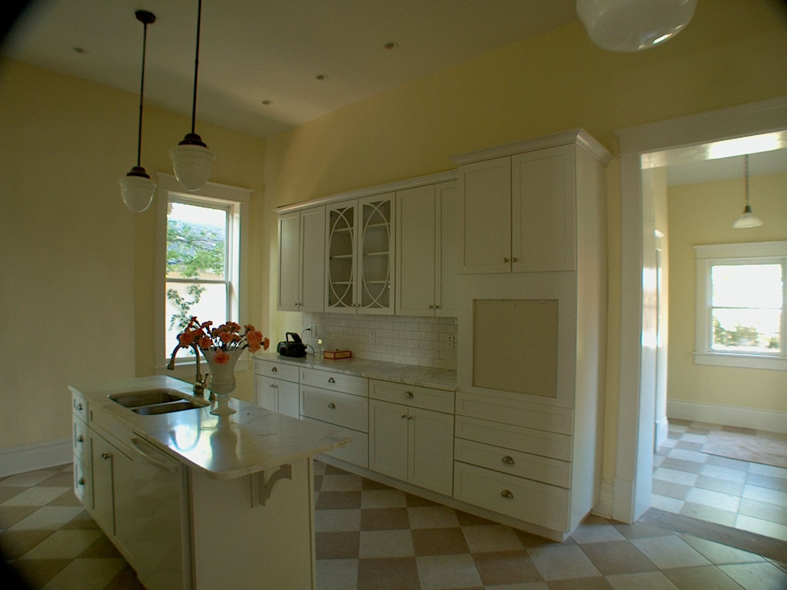
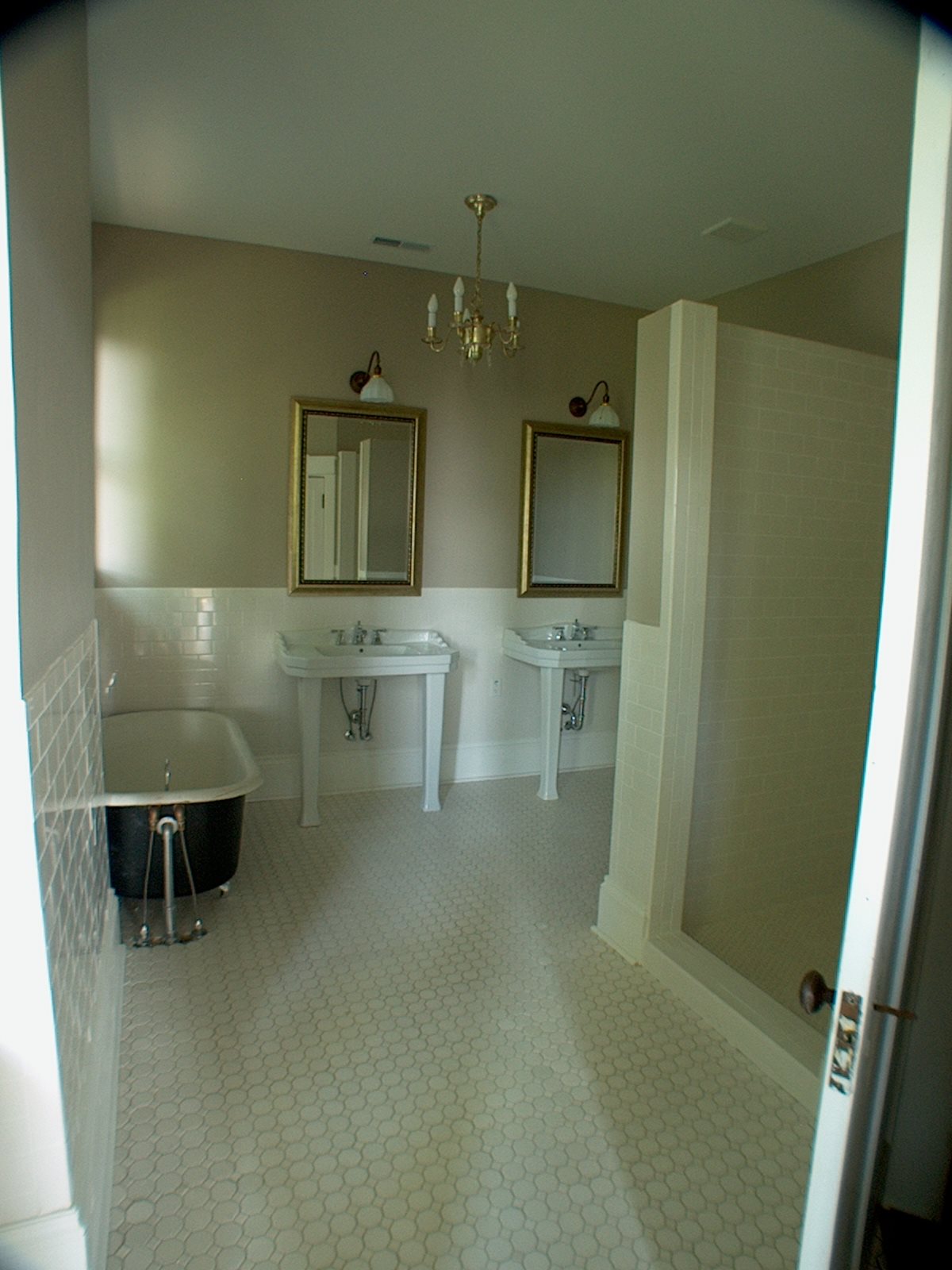
Here's some background info and a few "befores". The house was built in the late 80's/early 90's and the finishes reflect that time period. Size-wise, it's a generous space, particularly since it's a guest/children's bath. The main problems we'll address are the tired finishes and the lack of adequate lighting. As I mentioned earlier, the layout works well, and there is no need to expand the bathroom's current footprint.

bath before.jpg
bath before2.jpg
bath before3.jpg

During our initial interview, my client was very clear on her vision for the new bathroom. (This is huge! It makes my job so much easier if you have a vision in mind and you have the confidence to share it!) She told me she favors classic, timeless finishes and light, neutral colors. Her career includes working within the natural world, and I got some style clues from touring her home. I noticed nature themed art - such as botanical prints and bird-themed design motifs, all set against an updated light and neutral paint color palette. My client also communicated that although this bathroom is to be primarily for her children, she wasn't after anything "kiddish".

There's one more piece to our puzzle. Once this bathroom renovation is complete, we'll move on the renovation of the master bathroom. She and her husband discussed budget before I met with them and had pre-determined the level of investment they wished to make in both spaces. Again, this is HUGE! It makes my job so much easier if I know up front what I have to work with, because I can gear the selections to fit the budget.

Functionally, the biggest change to be made is that the tub/shower combination will be removed and a large, walk-in shower will replace it (same size, same location - no plumbing to be added or relocated) Normally I don't recommend removing a tub from a guest bathroom for resale purposes, but after much thought, my clients decided it would fit their family's needs best to remove the tub. And that's good enough for me. It's my job to guide rather than dictate, and so the tub will be removed and a large shower will go in its place. We'll also be adding an overhead light fixture, adding a shower light/fan combo, and reconfiguring the lighting on the vanity wall.

Keeping my client's wishes in mind, here are my selections for this bathroom makeover:

new bath collage.jpg

I decided to run with a classic meets nature vibe. The flooring is a charcoal-colored porcelain that mimics (and quite well) the look of a natural slate. It even has a bit of glitter embedded in the design, giving it a real natural stone feel. The dark color and matte finish should make it very forgiving, and it will provide a bit of contrast to the lighter finishes. My client's favorite selection is the pebble flooring we'll use on the shower floor. It has creams, grays, and mushroom tones, which tie in perfectly to the double vanity in a weathered oak finish. I love the warmth the wood vanity brings to this space!

We also opted for polished chrome fixtures - which are timeless and never go out of style. The walls will be painted out in Benjamin Moore's Balboa Mist, a balanced true light gray that doesn't skew beige or blue.

Too add a touch of whimsy and to bring in another nod to the natural world, we'll do a simple tailored roman shade for the window in this fabric:

fabric bath.jpg

Finally, a simple white shower curtain will continue the feeling of clean, classic simplicity that my client envisions.

I'm happy to report my client has enthusiastically approved the Design, and we'll begin to transform this bathroom over the next few weeks. Check for updates and photos along the way!

The Green Room Interiors provides Interior Decorating and Design Services in Chattanooga, TN. If you'd like some help turning your house into your haven, contact Kim at 423.653.3186 or email thegreenroominteriors@gmail.com

What I'm Working On Now - New Project In Alabama

Most of the clients I work with are in the greater Chattanooga area, but a few weeks ago I got an email inquiry from a potential client that lives in a small town in Alabama - about an hour's drive from Chattanooga. My first instinct was that I probably would have to turn it down, but after a phone conversation with her I knew it was a project I very much wanted to take on. You see, during our conversation my client was so enthusiastic and excited about working with me, and the portfolio photos she saw that spoke to her the most were the ones of my own house.

green4.JPG

Naturally, photos of my own home are the truest reflection of my personal style - a classic/modern mix that is achieved by combining layers of design elements from different time periods.

green3.jpg

I'm very much drawn to the whimsy of Chinoiserie (Asian) design elements, as is my adorable client. How could I resist the opportunity to work with a perfectly lovely gal that shares a similar design style? The short answer is : I couldn't!

And so we agreed to meet. Imagine how delighted I was to see this when I pulled into the driveway:

alabama.jpg

Hello gorgeous!

And while the inside is a blank slate, it's just full of potential! We're starting in the living room, seen below.

alabama2.jpg

Another plus is that my client has really has a vision for the look and mood she wants to create in the space. Well intentioned friends have encouraged her to keep the palette light and neutral, but the heart wants what the heart wants. And her heart wants a rich, moody space with navy walls, built-in bookcases (they have a huge collection!) mid century modern accents, original art, and a little leopard.

Here's the mood board I created for her:

alabama3.jpg

And we've already made our first purchase! I spotted this Chippendale sofa while doing some local vintage shopping and it's currently getting reupholstered in a durable, neutral fabric.

alabama4.jpg

And yes, there will be leopard pillows.

I'll be excited to share our progress here on my blog (and on Instagram (thegreenroominteriors) as work moves forward.

I hope you'll check back in and watch it unfold!

If you're in the greater Chattanooga area and would like some help with the design of your home's interiors, give Kim a call at 423.653.3186 or email thegreenroominteriors@gmail.com

From The Archives - Historic Restoration On Lookout Mountain

Just so you know, this is kind of long post, but it has lots of good pictures so I hope you can take the time to read it through to the end. Today we're going way back to a project we completed 8 years ago. It involved the total restoration of an historic home at the top of Lookout Mountain. Here's how it looked upon completion. From start to finish restoration of this house took about 8 months.

Isn't she lovely? This home was built in the 1920's. When we bought it, it had the original slate roof but it was in poor condition. We replaced the slate shingles with a asphalt and then we replaced the original terra cotta accents to stay as true to the original design as possible.

archive.JPG
Here's a small, not-so-great photo of the house when we purchased it. Not our most horrific beginning, but definitely a house in need of a little love. The biggest change we made was returning this house to a single family home. When we purchased it…

Here's a small, not-so-great photo of the house when we purchased it. Not our most horrific beginning, but definitely a house in need of a little love. The biggest change we made was returning this house to a single family home. When we purchased it, it was divided into an upstairs apartment and a downstairs apartment.

You can't see it in the photo above, but the window on the far right of the lower level had been replaced with a door that led to a stairway to the upstairs apartment.

Another big change we made to the exterior was the redesign and replacement of the front porch. We removed the obsolete brick columns and rebuilt the porch with wood columns, balusters, newel posts and steps. The windows and other architectural details were given more depth with some strategic painting in a cream, olive and black color scheme.

archive3.JPG
archive4.JPG

Yikes! Check out the mold from the old leaky windows and leaky roof on the right side wall. This is what the staircase looked like upon entering from the modified door on the porch. The steps led to the upstairs apartment. We opened up the wall to the left and turned the bottom portion of the staircase, as it was when the home was built in the 1920's. Here's what it looks like now - with the staircase restored and put back in its original location.

archive5.JPG

Most of the other rooms looked like the "before" staircase photo above in terms of damage and neglect. I'll spare you the agony of looking at a bunch of ugly before photos. Instead, feast your eyes on these "After" photos of the completed downstairs rooms.

archive6.JPG

The walls in the main living area are painted Benjamin Moore Grant Beige, one of my favorite neutral colors!

archive7.JPG

The mantel and tile seen here are original to the home. Most of the lighting is antique - it was restored and rewired for safety. Can you see where the original pocket doors slide out of sight in between the living room and dining rooms?

Here is the dining room with it's bank of four giant windows. Although these windows are replacements, they are wood and they were custom made to fit the original openings. Using wood replacement windows in the same size as the original maintains integrity of the home's architecture while making it a little more energy efficient. Isn't the natural light gorgeous in here? The walls are painted Benjamin Moore Hollingsworth Green. I love this color!

archive8.JPG

You can catch a small glimpse of the kitchen through the doorway. More kitchen photos below:

archive9.jpg

The kitchen was completely redesigned with a new layout, cabinetry, flooring, counter tops, and appliances. As you can see the wall oven had not yet arrived when we took these photos. To the right is a small addition we put on the back of the house with a pantry, mud room and laundry room.

In the photo below you can see where the addition begins by looking at the floor of cased opening. Lindsay replicated the original woodwork for a seamless look throughout the house. Walk-in pantry is on the right.

archive10.jpg

In the photo below you can see the addition on the back of the house. Rafter tails, windows, and trim are painted in contrasting earthy colors to bring out the outstanding architectural details.

archive11.JPG

Back inside the kitchen, antique lighting coexists with recessed lighting, modern cabinetry and appliances. Walls are painted Benjamin Moore Man on the Moon.

archive12.JPG

Upstairs, the biggest change we made was the creation of a huge master suite. We redesigned three rooms to include a master bedroom, a master bathroom, a walk-in closet and a sitting room.

Seriously. This is the "Before". (#ohmy!)

archive13.JPG
archive14.jpg

A wider shot is of the space is seen above. This is taken from what is now the master bedroom looking into the master sitting room. The arched opening was eliminated in favor of a wider cased opening. The photo below was taken from the same perspective, after renovation was complete.

archive15.jpg

How's that for an improvement? Floors on the upper level are Heart Pine.

archive16.jpg

This shot was taken inside the sitting area of the master bedroom. Another spectacular original mantel and original tiles were restored.

See those windows across the front of the house? Here's the view from this room:

archive17.jpg

The photo below was taken right inside the entrance to the master bedroom from the hallway. The name of the color I used in the Master Bedroom and the Sitting Room is Benjamin Moore Sweet Dreams. I think it's a perfect name for a perfect bedroom color! The entrance into the master bathroom is on your right. The sitting room entrance is out of range on the left. The chandelier is antique and I bought it on eBay.

archive18.jpg

And below you see the master bathroom we created from another room, which if I recall was being used as the upstairs apartment kitchen when we bought the house. The entrance to the master closet is just out of view on the right.

archive19.jpg

The bathtub is antique and is not original to the home. The sinks are reproduction and sadly no longer available. Lindsay did all of the tile work in this bathroom and throughout the home. This floor tile is available at both Lowe's and Home Depot. It's budget friendly and looks great with gray grout. I use this tile all the time! The lighting is antique and was rewired before it was installed. I love those big antique milk glass shades on the sconces.

archive20.jpg

The final shot from the Master Suite was taken from the entrance of the sitting room through the Master Bedroom and looking into the Master Bathroom.

And here's one last exterior shot:

archive21.JPG

I hope you enjoyed this little house tour as much as we enjoyed transforming this historic beauty!

I wanted write this post to demonstrate how much change is possible and to show of some of the work we have done, the quality of that work, and what we are capable of doing. If you live in the Chattanooga area have a renovation, home improvement or decorating project you're thinking about - large or small - we would love to talk to you about it! Call Kim at 423.653.3186.