My Junior League Of Chattanooga Designer Showhouse Bedroom Reveal

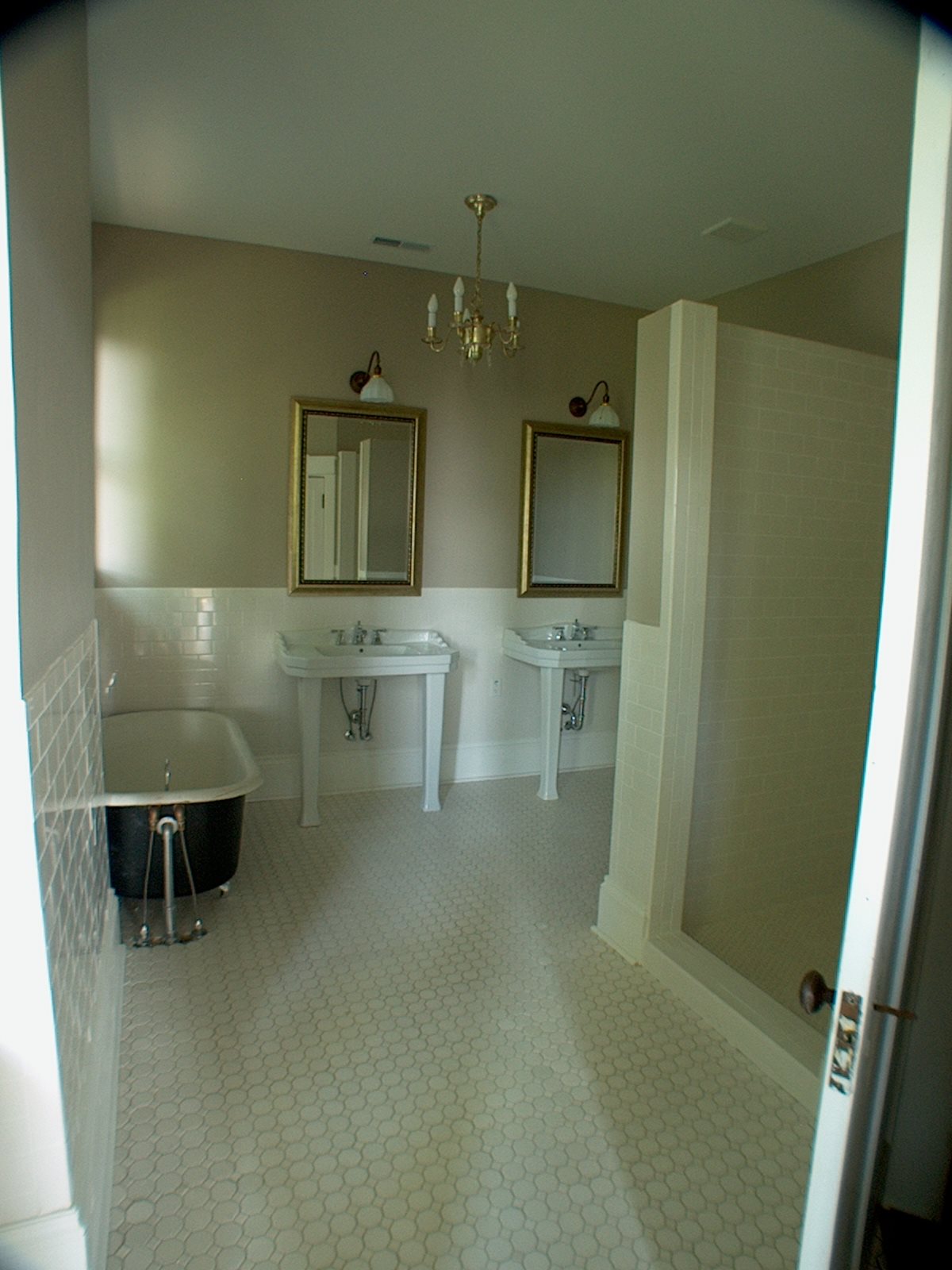
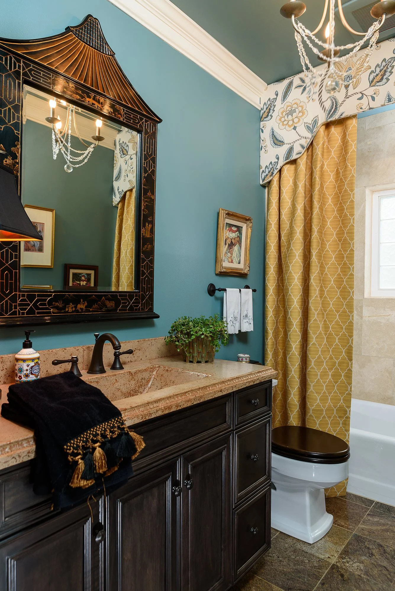
I know - a long name for a post!

Now that all of the work is done , I want to share photos of the room I decorated for the first ever Junior League of Chattanooga Designer Showhouse. Let me tell you this was an exciting/overwhelming/stressful/exhilarating roller coaster of a project, but I'm so pleased with how it turned out! I may have mentioned in a earlier post that I took the installation of my room down to the wire, so I didn't schedule professional photography before the Showhouse opened. As luck would have it, the photography gods smiled upon me because in the late afternoon the day before the Showhouse opened, in walked a vision of loveliness - aka talented local photographer Wagner Abercrombie with her photography equipment and amazing photography skills. Wagner was actually there to photograph the bedroom next door to me by Green and Lofty, but she agreed to shoot my space as well on that very afternoon. Wagner gets and giant THANK YOU and I also want to thank everyone for the kind and supportive comments about my room. And now for those of you who were not able to tour the Showhouse personally, here are some photos of my completed room.

jl bed.jpg

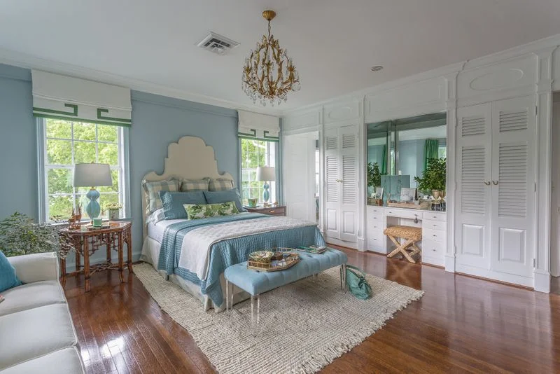
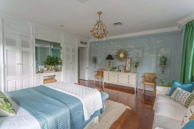
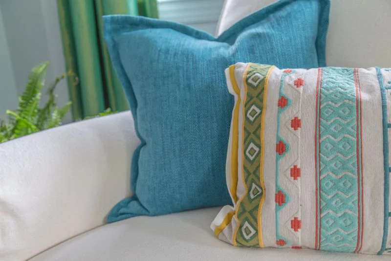
Hello. My name is Kim and I like color. The color palette I landed on for this space is mostly blues and greens. Because blue, green and teal (blue-green) are analogous colors, there's not a lot of contrast between them which helps keep the color palette from becoming overwhelming.

jl bed 2.jpg

The headboard is custom and is piped in blue. The roman shade valances are also custom and are trimmed in the same green taffeta as the curtain panels. Pillows are a quiet mix of buffalo check and Peter Dunham's Fig Leaf. To create more interest, I decided to shake up the symmetry of the bed wall by using non-matching end tables. The Furniture Shoppe here in Chattanooga provided the beautiful end tables, and they work perfectly here. (TIP: If you are using non-matching night stands with matching lamps, make sure your night stands are the same height).

jl bed 3.jpg

If you know me at all, then you know I have a lifelong love of Chinoiserie. I think it's the blend of nature, whimsy and sophistication that speaks to me. In any case, I incorporated a hand painted Chinoiserie inspired mural on the wall opposite the bed. Local artist Lydia Reynolds created this magic for me, and I am so grateful for her talent.

jl mural.jpg

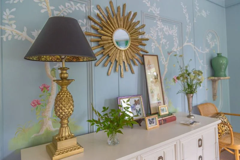
A collection (my own) of framed butterflies is displayed against the mural wall. I am constantly inspired by the beauty of nature and I try to incorporate it into every room I design. I decided to use fresh cut leaves and wildflowers to bring in even more of nature's beauty in a way that's not too fussy.

jl bed 4.jpg

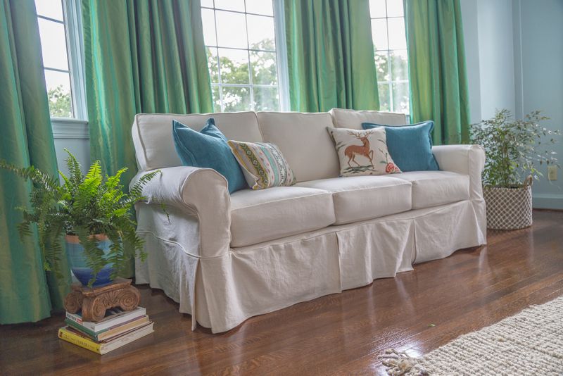
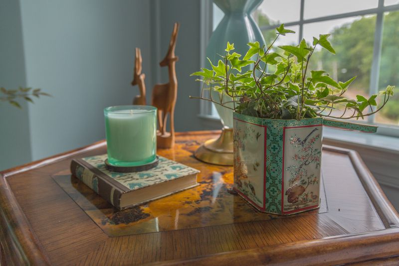
I also love decorating with vintage finds, so I decided to be true to my style and incorporate some vintage pieces into my bedroom. The gilt crystal chandelier is from my own collection and it adds a little sparkle and sophistication. I also like the contrast it provides to the simple, natural fiber rug and the casual slipcovered sofa (generously provided by The Furniture Shoppe Chattanooga). The key to a successful layered/collected look is finding the right balance of high and low, sleek and rough, old and new.

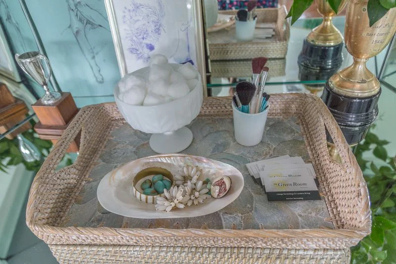
I decided to work with the built-in mirrored vanity wall and only changed out the hardware and styled the vanity. I added the raffia x-bench because the rough texture of the stool was the perfect contrast to the slick mirrored surfaces.

jl bed 5.jpg

More texture and more vintage items were used to style the vanity. Fresh cut branches of greenery bring warmth and life to this area.

greenery.jpg
vanity.jpg

Even though I love color, I like to temper it by incorporating a lot of white. White is a palette cleanser and it provides a clean backdrop for the stronger colors.

jl sofa.jpg

Here's another look at the Chinoiserie inspired wall painting. Wouldn't it be a treat to wake up to this scene every morning?

jl bed 6.jpg
jl end table.jpg
jl pillows.jpg
jl bed wide.jpg

Thank you again to the Junior League of Chattanooga for inviting me to participate and for all of the good work you do in our community! And thank you to the Furniture Shoppe and my drapery / upholstery workrooms for the fine work you do. You guys make me look good!

Also - This is the LAST WEEKEND that the Junior League of Chattanooga Designer Showhouse will be open. If you haven't had a chance to visit yet, I strongly encourage you to take the tour! I promise you'll leave feeling inspired!

What I'm Working On Now - Father Of The Bride House Foyer Plan

You remember the Father of the Bride House project I'm working on? It's a recent purchase of some favorite long time clients. The home was built in the 1920's and my clients are only the second owners.

real father house.JPG

She's quite the charmer, isn't she?

You'll be pleased to know that renovations are complete and my clients have recently moved in. Now we start decorating, which is really the most fun part because we start making the house into their home.

So what about the direction? Right from the beginning we knew that we wanted to honor integrity of the home while bringing it into the now. After all, they're a young family and their modern sensibilities should be represented too.

We're starting with the foyer. And what a foyer it is!

father stairs.jpg

There are so many wonderful period details. The floors are original, as is the mill work, doors, hardware - and it just oozes with charm!

father foyer.jpg

As you can see it's a generously sized space so it's the perfect opportunity to make a statement about the homeowners and what to expect as you go through the rest of the house. The challenge is to marry the classic architecture with modern style so it all makes sense together.

Here's what we came up with, and - happily - my clients have approved the design!

father moodboard.jpg

Currently we're on the hunt for a classic Sheraton style sideboard, which will anchor the design in tradition. The Sheraton sideboard is one of my absolute favorite pieces of furniture. Ever. Even though it's super traditional, the lines are so clean that it feels current, and it will NEVER go out of style. Other classic design elements are seen in the blue and white porcelain and brass/gold accents. To put a modern spin on the foyer, we added the antelope runner (which is installed and gorgeous!) a modern mirror, and a modern gold olive leaf chandelier. My clients wanted the house to feel comfortable and welcoming so we'll knock the formality down a bit with a seagrass rug and a few other natural elements.

I'm so happy with the direction we're taking in this period home and I hope you'll check back to see what we have planned for the other rooms. As we get rooms completed I'll share "after" photos too!

Thanks for stopping by!

If you're in the Chattanooga area and struggling with design decisions for your home, I can cut through the confusion and help you create a home that feels like "you". Call 423.653.3186 for details.

What I'm Working On Now - New Project In Alabama

Most of the clients I work with are in the greater Chattanooga area, but a few weeks ago I got an email inquiry from a potential client that lives in a small town in Alabama - about an hour's drive from Chattanooga. My first instinct was that I probably would have to turn it down, but after a phone conversation with her I knew it was a project I very much wanted to take on. You see, during our conversation my client was so enthusiastic and excited about working with me, and the portfolio photos she saw that spoke to her the most were the ones of my own house.

green4.JPG

Naturally, photos of my own home are the truest reflection of my personal style - a classic/modern mix that is achieved by combining layers of design elements from different time periods.

green3.jpg

I'm very much drawn to the whimsy of Chinoiserie (Asian) design elements, as is my adorable client. How could I resist the opportunity to work with a perfectly lovely gal that shares a similar design style? The short answer is : I couldn't!

And so we agreed to meet. Imagine how delighted I was to see this when I pulled into the driveway:

alabama.jpg

Hello gorgeous!

And while the inside is a blank slate, it's just full of potential! We're starting in the living room, seen below.

alabama2.jpg

Another plus is that my client has really has a vision for the look and mood she wants to create in the space. Well intentioned friends have encouraged her to keep the palette light and neutral, but the heart wants what the heart wants. And her heart wants a rich, moody space with navy walls, built-in bookcases (they have a huge collection!) mid century modern accents, original art, and a little leopard.

Here's the mood board I created for her:

alabama3.jpg

And we've already made our first purchase! I spotted this Chippendale sofa while doing some local vintage shopping and it's currently getting reupholstered in a durable, neutral fabric.

alabama4.jpg

And yes, there will be leopard pillows.

I'll be excited to share our progress here on my blog (and on Instagram (thegreenroominteriors) as work moves forward.

I hope you'll check back in and watch it unfold!

If you're in the greater Chattanooga area and would like some help with the design of your home's interiors, give Kim a call at 423.653.3186 or email thegreenroominteriors@gmail.com

From The Archives - Historic Restoration On Lookout Mountain

Just so you know, this is kind of long post, but it has lots of good pictures so I hope you can take the time to read it through to the end. Today we're going way back to a project we completed 8 years ago. It involved the total restoration of an historic home at the top of Lookout Mountain. Here's how it looked upon completion. From start to finish restoration of this house took about 8 months.

Isn't she lovely? This home was built in the 1920's. When we bought it, it had the original slate roof but it was in poor condition. We replaced the slate shingles with a asphalt and then we replaced the original terra cotta accents to stay as true to the original design as possible.

archive.JPG
Here's a small, not-so-great photo of the house when we purchased it. Not our most horrific beginning, but definitely a house in need of a little love. The biggest change we made was returning this house to a single family home. When we purchased it…

Here's a small, not-so-great photo of the house when we purchased it. Not our most horrific beginning, but definitely a house in need of a little love. The biggest change we made was returning this house to a single family home. When we purchased it, it was divided into an upstairs apartment and a downstairs apartment.

You can't see it in the photo above, but the window on the far right of the lower level had been replaced with a door that led to a stairway to the upstairs apartment.

Another big change we made to the exterior was the redesign and replacement of the front porch. We removed the obsolete brick columns and rebuilt the porch with wood columns, balusters, newel posts and steps. The windows and other architectural details were given more depth with some strategic painting in a cream, olive and black color scheme.

archive3.JPG
archive4.JPG

Yikes! Check out the mold from the old leaky windows and leaky roof on the right side wall. This is what the staircase looked like upon entering from the modified door on the porch. The steps led to the upstairs apartment. We opened up the wall to the left and turned the bottom portion of the staircase, as it was when the home was built in the 1920's. Here's what it looks like now - with the staircase restored and put back in its original location.

archive5.JPG

Most of the other rooms looked like the "before" staircase photo above in terms of damage and neglect. I'll spare you the agony of looking at a bunch of ugly before photos. Instead, feast your eyes on these "After" photos of the completed downstairs rooms.

archive6.JPG

The walls in the main living area are painted Benjamin Moore Grant Beige, one of my favorite neutral colors!

archive7.JPG

The mantel and tile seen here are original to the home. Most of the lighting is antique - it was restored and rewired for safety. Can you see where the original pocket doors slide out of sight in between the living room and dining rooms?

Here is the dining room with it's bank of four giant windows. Although these windows are replacements, they are wood and they were custom made to fit the original openings. Using wood replacement windows in the same size as the original maintains integrity of the home's architecture while making it a little more energy efficient. Isn't the natural light gorgeous in here? The walls are painted Benjamin Moore Hollingsworth Green. I love this color!

archive8.JPG

You can catch a small glimpse of the kitchen through the doorway. More kitchen photos below:

archive9.jpg

The kitchen was completely redesigned with a new layout, cabinetry, flooring, counter tops, and appliances. As you can see the wall oven had not yet arrived when we took these photos. To the right is a small addition we put on the back of the house with a pantry, mud room and laundry room.

In the photo below you can see where the addition begins by looking at the floor of cased opening. Lindsay replicated the original woodwork for a seamless look throughout the house. Walk-in pantry is on the right.

archive10.jpg

In the photo below you can see the addition on the back of the house. Rafter tails, windows, and trim are painted in contrasting earthy colors to bring out the outstanding architectural details.

archive11.JPG

Back inside the kitchen, antique lighting coexists with recessed lighting, modern cabinetry and appliances. Walls are painted Benjamin Moore Man on the Moon.

archive12.JPG

Upstairs, the biggest change we made was the creation of a huge master suite. We redesigned three rooms to include a master bedroom, a master bathroom, a walk-in closet and a sitting room.

Seriously. This is the "Before". (#ohmy!)

archive13.JPG
archive14.jpg

A wider shot is of the space is seen above. This is taken from what is now the master bedroom looking into the master sitting room. The arched opening was eliminated in favor of a wider cased opening. The photo below was taken from the same perspective, after renovation was complete.

archive15.jpg

How's that for an improvement? Floors on the upper level are Heart Pine.

archive16.jpg

This shot was taken inside the sitting area of the master bedroom. Another spectacular original mantel and original tiles were restored.

See those windows across the front of the house? Here's the view from this room:

archive17.jpg

The photo below was taken right inside the entrance to the master bedroom from the hallway. The name of the color I used in the Master Bedroom and the Sitting Room is Benjamin Moore Sweet Dreams. I think it's a perfect name for a perfect bedroom color! The entrance into the master bathroom is on your right. The sitting room entrance is out of range on the left. The chandelier is antique and I bought it on eBay.

archive18.jpg

And below you see the master bathroom we created from another room, which if I recall was being used as the upstairs apartment kitchen when we bought the house. The entrance to the master closet is just out of view on the right.

archive19.jpg

The bathtub is antique and is not original to the home. The sinks are reproduction and sadly no longer available. Lindsay did all of the tile work in this bathroom and throughout the home. This floor tile is available at both Lowe's and Home Depot. It's budget friendly and looks great with gray grout. I use this tile all the time! The lighting is antique and was rewired before it was installed. I love those big antique milk glass shades on the sconces.

archive20.jpg

The final shot from the Master Suite was taken from the entrance of the sitting room through the Master Bedroom and looking into the Master Bathroom.

And here's one last exterior shot:

archive21.JPG

I hope you enjoyed this little house tour as much as we enjoyed transforming this historic beauty!

I wanted write this post to demonstrate how much change is possible and to show of some of the work we have done, the quality of that work, and what we are capable of doing. If you live in the Chattanooga area have a renovation, home improvement or decorating project you're thinking about - large or small - we would love to talk to you about it! Call Kim at 423.653.3186.

What I'm Working On Now - Project Father Of The Bride House

Sometimes I get so excited about a project it keeps me up at night. Not in a stressful, anxious way (well, maybe a little of that too), but mostly it's visualizing the completed space, obsessing about the details, and just the anticipation that builds as the project progresses.

One project that currently has me giddy with excitement is the one I affectionately call "The Father of the Bride House". Why, you ask? Because this house is a classic American beauty, built in the 1920's, and just oozing with period details and charm.

If you've never seen the Father of the Bride movie, here's what the movie house looks like.

father house.jpg

You know that dream house we all keep in our heads - the most perfect house you can ever imagine? Well the one in my head looks like this, and I am so grateful that I've been given an opportunity to work with these clients on this project. And speaking of the clients - here's a little background info. They're long time clients who I adore. I worked with them on their first house and I'm so honored and humbled that they asked for my help on this project too. They're just an adorable little/growing family and the house fits the wife to a "T"!

real father house.JPG

Now you know what I'm talking about. It's classic American Colonial Revival - and it's a D.R.E.A.M. project!

Oh, and amazingly, my clients are the home's second owners. How rare and wonderful is that? It hasn't been stripped of it's abundant architectural details and it was loved by the same family for decades. So special!

Here are a few photos taken from my first tour of the house, immediately after it was purchased by my clients - in other words, the "before"s.

father stairs.jpg

Here's what you see when you walk in the front door. Those doors on the left side are the coat closet and the teeny tiny powder room that will be super special.

father kitchen.jpg

Definitely not original, but here's the circa early 1970's pristine kitchen. The footprint of the kitchen will remain the same, but it will have a completely different look.

master fire.jpg

The master bedroom, seen above and below, is on the main level and has a fireplace with a white marble surround and the most beautiful natural light.

master window.jpg

Just look at those windows!

father library.jpg

Also on the main level, there is a fully paneled library with a wall of bookcases and a wall of windows (not pictured, but completely gorgeous!). We decided this cozy library would be perfect for family time in the evenings and on weekends. Think comfy luxe sectional, an antique rug, a mod light fixture, lots of reading material and a flat screen tv.

living fire.jpg

Here's the original fireplace in the living room proper. You can see the entrance to the master bedroom on the left side of the photo.

Happily, all of the original solid wood doors complete with crystal doorknobs are still in the home. These types of details add so much character!

doorknob.jpg

Below is linen cabinetry in a small upstairs bathroom. This was probably added in the 1960's, but we are keeping it and we'll be updating it with new paint and hardware. This little bathroom is shaping up to be one of my favorite spaces in the house.

upstairs bath.jpg

So this is what we're working with. It's honestly all so good and I'm so excited with where all of this is going.

Over the next few weeks I'll share our plans and some progress photos room by room.

You'll definitely want to check back in -it's going to be good!

Chattanooga Interior Design Project - Downtown Condo On The River Part 2

Today I want to share more photos of a recently completed project in downtown Chattanooga. The condo makeover was cosmetic in nature, meaning we didn't do any extensive remodeling. The new look was achieved with paint, some new furnishings, lighting and styling. If you recall from last weeks post, when I first visited this condo it was decorated with lots of browns, golds, and reds, and my clients were ready for a brighter, happier aesthetic.

Last week I shared the "afters" of the main living area:

condo living.jpg

Today, we'll have a look at the rest of the rooms that were transformed - mainly with paint and fabrics.

I had the guest bath (below) painted Benjamin Moore Aegean Teal (ceiling too). A custom upholstered cornice and custom shower curtain panels were made for the tub area. The mirror was repurposed from another area in my clients' home, and the vanity, granite, flooring and shower tile are original to the space.

bath ceiling.jpg

Below is guest bedroom.

guest bed.jpg

I had the walls painted Benjamin Moore Stratton Blue. The color palette of the guest room is similar to the colors in the guest bathroom to help tie those two spaces together. Most of the furniture in the guest bedroom already belonged to my clients. The transformation was achieved with paint, new bedding, reusing furniture pieces from other areas of their home, and restyling the accessories.

Ready to tour the master bedroom?

master.jpg

In the master bedroom, we wanted to achieve a feeling of quiet luxury. Walls are painted Benjamin Moore Revere Pewter. I can't say enough good things about Revere Pewter! It's gray but still has some warmth. I had the headboard and bed skirt custom made in an oversize medallion print in silver and lavender. The night stands were repurposed from my clients' previous bedroom, and I like the warmth of the wood tones against the gray walls. The faux fur at the end of the bed is a fun and unexpected addition.

nightstand.jpg

Some of the details are more easily seen in this photo. The polished nickel nail heads inset into the headboard, the satiny finish of the mother of pearl lamps (with lucite accents) and the charcoal mohair lumbar pillow all contribute to the feeling of luxury. Did you notice the lavender piping on the pillow shams? They're from Restoration Hardware. The Lladro figurines are part of my clients' collection.

bookcase.jpg

The book case is on the wall opposite the bed. We added all of the mill work around the bookcase and painted it white. Previously the shelves were just inset into the sheetrock with no trim whatsoever. The addition of the trim gives the book case a stronger, more important presence. The backs of the book case are painted Benjamin Moore Elephant Gray, a subtle shade of lavender. The chair custom and sits on a swivel base.

mirror.jpg

The upholstered bench is custom and offers easy access to storage inside for extra blankets and out of season items.

nightstand two.jpg

This was such an amazing opportunity for me and I'm so thrilled with the results! I think it also demonstrates that big changes can be achieved with furniture, paint and fabrics.

Thanks for taking the time to visit me today!

If you live in the Chattanooga area and need some design assistance, please contact me. I'd love to help!

Completed Interior Design Project In Chattanooga - An Open Living And Dining Room

Hello friends!

Today I'm thrilled to share a project that I recently had photographed. We (mostly) completed this installation over a year ago, but due to scheduling conflicts and a few last minute projects that were added, photography was delayed. Finally, I have pictures to share!

Sadly, there are no "before" photos. Well, I took some photos with my phone and when I changed phones I forgot to transfer the photos! What I can do is give you a little background on where we started and what we planned to accomplish.

The condo is located in downtown Chattanooga, and it's home to a lovely, energetic couple. They are empty nesters, and they were craving a big change (music to my ears). When I first visited, the rooms were painted a rich gold and decorated with browns and reds - and while there's nothing wrong with those colors, it just didn't feel right for a space that's flooded with light and offers scenic views of the river and surrounding mountains.

We all agreed that we should try and capture some of the outdoors with a lighter, brighter and more youthful color palette. That being said, my clients still wanted some sophistication - nothing rustic. As is common, there were also some family antiques to be incorporated into the design. This was a bit of a challenge because the antiques are dark and somewhat formal in style, but it was my job to make it all work.

Below you see my clients' antique china cabinet I styled with their Asian figurines (I love them!) and a mint and gold platter (also theirs).

open1.jpg

The main living area is completely open and features a wall of windows, so there is an abundance of natural light - my absolute favorite design element to work with. In order to continue the feel of the sky and water right outside the windows, I chose Benjamin Moore's Gray Wisp for the walls.

open2.jpg

My clients requested sophistication, but they wanted to live casually in this space, so we chose a comfortable sectional with clean, classic lines in a neutral color. Sunbrella fabric was specified so they don't have to worry about stains or fading. A mix of prints on the pillows keeps the mood light. Also, take note of the nesting tables at the end of the sectional. I recommend a set of nesting tables for all of my clients because they're so handy for entertaining.

open3.jpg

The dining area got a new round table in an updated finish. A few leafs can be added to accommodate dinner parties, but for daily use, the small size is perfect for two. We went with an oversize wood bead chandelier over the table. I absolutely love statement lighting and this one certainly delivers! The dark and light tones of the chandelier repeat the dark and light tones in the table and chairs. And speaking of the chairs, my client has had these for years. We gave them an update with new fabric - the chair fronts are outdoor (spill and fade resistant) fabric in a subtle green and blue woven pattern. My client loves red and I accommodated her preferences by using varied shades of red throughout the living area.

open4.jpg

In the photo above, the mint and gold combination seen on the platter in the first image is repeated on the buffet lamps. It's hard to tell in this image, but instead of using a traditional sofa table behind the sectional, I moved my clients' antique sideboard (originally placed in front of the windows) to do double duty as a sofa table and as a sideboard.

open5.jpg

You probably didn't see this coming. A modern concrete console with leopard print stools underneath? It's fun, it's functional (those benches pull out lickety split for parties), and very unexpected - and that's a good thing.

Thanks for taking the tour of the main living area. I hope you like what you saw today, and if you did, you'll want to come back next week when I'll share the master bedroom, guest bedroom and guest bathroom makeovers.

If you're in the Chattanooga area and thinking about changing things up at your house, give me a call at 423.653.3186. I'd love to help!

My "Signature" Style

As a designer, it's my job to focus what makes each of my clients feel the happiest in their homes. I pride myself on having the ability to work within a range of design styles, but - and this is true with all good designers - I have to put a little bit of myself into each one of my projects. Today I thought it might be fun to share a little insight into what you can expect to see in any room I've had a hand in creating.

1. There will be classic design elements. Particularly the anchor pieces. Classic pieces that have been around for centuries and will continue to be relevant as time marches on.

signature.jpg

Here is a perfect example. The antique sideboard and gorgeous Persian rug are timeless design elements that will never ever go out of style, and they provide the foundation for the direction of the space.

2. While I strive to incorporate timeless classics into my projects, I have a reputation for mixing different design styles. There is no formula I use for mixing design styles - it's an intuitive thing - I just "know" what types of seemingly unrelated items would bring out the best in each other.

In my kitchen (above) I've mixed a vintage dining table in a French farmhouse style with sculptural modern dining chairs, and it works!

In my kitchen (above) I've mixed a vintage dining table in a French farmhouse style with sculptural modern dining chairs, and it works!

3. Everyone thinks decorating and design are such serious, high falutin' business. And while it's important to get the scale, mood, and functionality of a space right, I also firmly believe that decorating should be fun, so I like to bring a little whimsy to a space. In my kitchen (below) I've done just that with some unexpected art over the dining table. It makes me smile every time I see it!

signature3.jpg

And (below) in a client's family room, the Greyhound statues are a whimsical accent that's also personal ( my clients are dog lovers!) My client loved these statues so much that she went to 4 pet stores to find collars small enough to fit them!

signature4.jpg

4. Color. I can't begin to describe how much I adore working with color - and I think it shows. Color is everything to a room! Not only is it important to get the backdrop of your space right with the perfect paint color, it also creates the mood you want your space to convey - whether it's tranquility, exuberance, or comfort - color is a major player! Working with pretty color combinations makes my heart happy.

signature5.jpg

but neutrals are colors too, and I enjoy the challenge of working within a neutral palette.

signature6.jpg

5. And finally, there's a feeling of comfort and familiarity to the rooms I design, and yet they feel newer, and younger - fresh!

signature7.jpg

So to summarize, if I had to describe my signature style with just a few adjectives, it would be something like "Fresh, Comfortable and Classic with an Eclectic Twist".

If you're in the Chattanooga area and struggling to find a design direction, I can help you define your signature style too! Call me at 423.653.3186.