
Today I have a fun project to share with you. It's a recent installation of a condo in downtown Chattanooga and it's a good old fashioned decorating project, meaning there was no construction or renovation involved -we just made the space over with new furnishings and finishing touches.
The most noteworthy architectural features of the condo are the high ceilings and the huge windows. This is always a winning combination, fostering a feeling of light and spaciousness.
Before I was hired for the project, the owners had just had the condo painted. Normally I spend a good deal of time searching for the right color; the color that will help convey the mood we're trying to create. But since my clients just spent a small fortune on the paint job, and they selected a neutral, cool gray (Sherwin Williams March Wind), I decided to work with the existing color so we could utilize the budget for new furnishings and accessories. Luckily, the previous owners of this condo invested in custom curtains. With 13' ceilings and lots of windows, curtains alone could have been a budget buster. Thankfully, the curtains we inherited were an easy to work with creamy white and were beautifully made, so we decided to work them into the design.
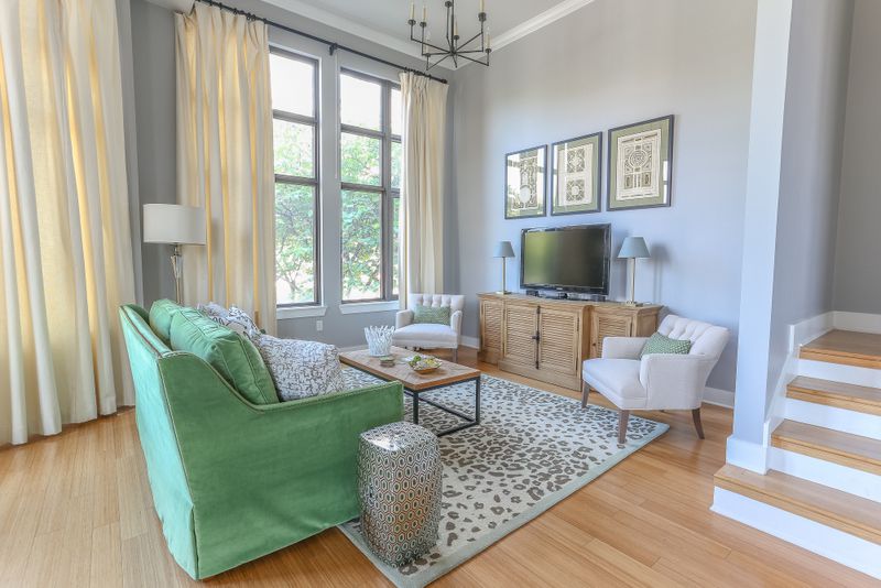
Anyway, the main level is pretty open, with this particular area being the lounging/tv area. How gorgeous are those windows?!?!! Here is how this area appeared when I came on board.

And here's how it looks now:

Isn't it amazing how simply changing the furnishings (and a nice sunny day) can transform a space? I'm so crazy about that green velvet sofa. I love a single seat cushion - it's a nice clean look. It's also more functional because no one has to sit on the crack!

We utilized quite a few neutrals in the space, and I think the green adds some balance and life to the cool gray walls. The sofa color also helps bring a little of the greenery seen outside the windows into the space, making a subtle connection with nature.
The owners struggled with how to address the tall tv wall. This is a common problem. The armoire is tall, but that's about all it has going for it.

And here's the tv wall after:

We opted for a wider tv console to fill the space horizontally, and I flanked it with a pair of wide and low linen tufted chairs. The natural wood finish of the console adds some needed warmth and texture to this cool lofty space.

I hung a series of vintage garden maze prints above the tv fill up the tall wall. If you scroll down to the next photo, you'll see that just because you have 13' ceilings, you don't have to cover the entire wall. Keep things at a comfortable level.
The nearby dining area is completely open to the tv area, so we selected furnishings that would blend together. In a space that's so open, a limited color palette is the usually the best approach. Because you're seeing so much of the space at once, it's best to keep things simple.

The dining table is a mid century piece that was part of my client's collection. I selected these fully upholstered Queen Anne style chairs for an updated traditional look. I like how they straddle the line between modern and traditional. Looks like we're having pine cones for dinner. Haha.

Here's another traditional furniture piece that was culled from the homeowners furnishings. I found the mirror at an antique store and I just love the juxtaposition of the ornate gold frame against the modern architecture.
Below is another "before". I think my client did a fantastic job creating a symmetrical vignette, but I wanted to simplify the look and go with larger pieces. Can you guess which piece of theirs I repurposed?
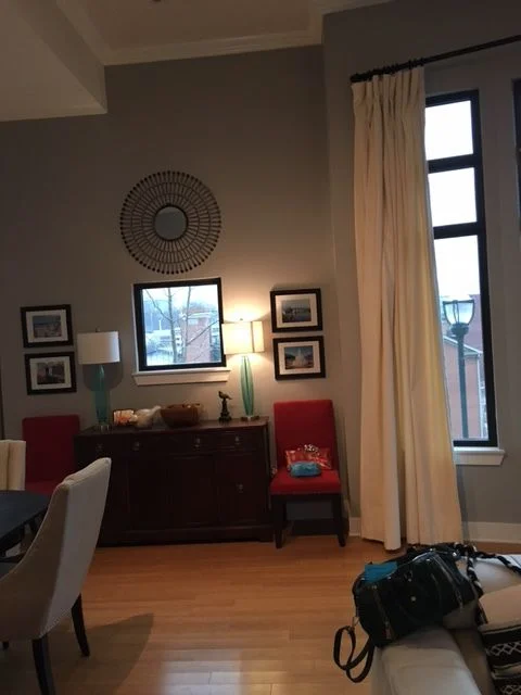

Naturally, I reused their antique sideboard. I solved the awkwardly placed window situation by simply hanging a large piece of art over the window, and I edited down the furnishings and accessories. A pair of modern lamps and a floor plant in a basket finish off this area in a simple, sophisticated way. I'm crazy about the pinks and greens against the cool gray walls and I added a little more warmth with a gold floating frame around the abstract art.

Again, in the image above, notice that the painting above the sideboard is placed at a comfortable level.

I think this photo gives you a good sense of how open the floor plan is.


The coffee table is a textural mix of rough wood, slick ceramic coasters, and a touch of gold.
Thanks for taking the tour with me today! This was such a fun project with trusting, open minded clients.
As an aside, if you look at the "before" photos you'll notice that the trees outside the windows are dormant. This is because we started the project in very late winter and just finished up a few weeks ago. Not because there were any problems, but because things take time. Design plans have to be developed, custom sofas have an 8-10 week lead time, and design is a multi-step process. We all agree it was worth the wait!