
Using Color Heroes - Chartreuse
“It is an explosive green, that if one could watch it moment by moment throughout the day, would grow in every dimension.” - Amy Seidl

Chartreuse is one of those colors that most people have a strong opinion about. And the majority of those opinions are not favorable.
Chartreuse straddles the fence between green and yellow. It’s an acid-y color - and yes, it can be a little bossy.
Chartreuse is the color of the freshest spring bud, sprigs of baby grass, and in our neck of the woods, the pollen that wreaks havoc with our sinuses and coats every surface during March and April.

No other color enlivens a space like chartreuse can - even a small dose of chartreuse will energize a calm space!

A few accents of chartreuse freshen up this mostly blue bedroom.

Just look how stunning those silk chartreuse drapes are against the navy velvet settee in this room by Paloma Contreras Design.
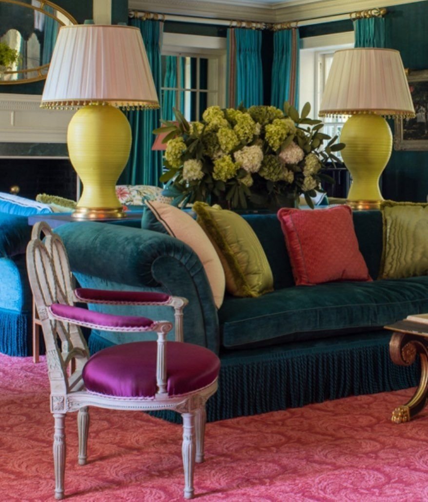
Accents of chartreuse are like little punctuation points in the layered and colorful room by Richard Keith Langham.
For those of you willing to throw caution to the wind and “go big”, you can take inspiration from this incredible room from Matthew Carter. It’s one of my favorite rooms of all time and the chartreuse walls are just brilliant.


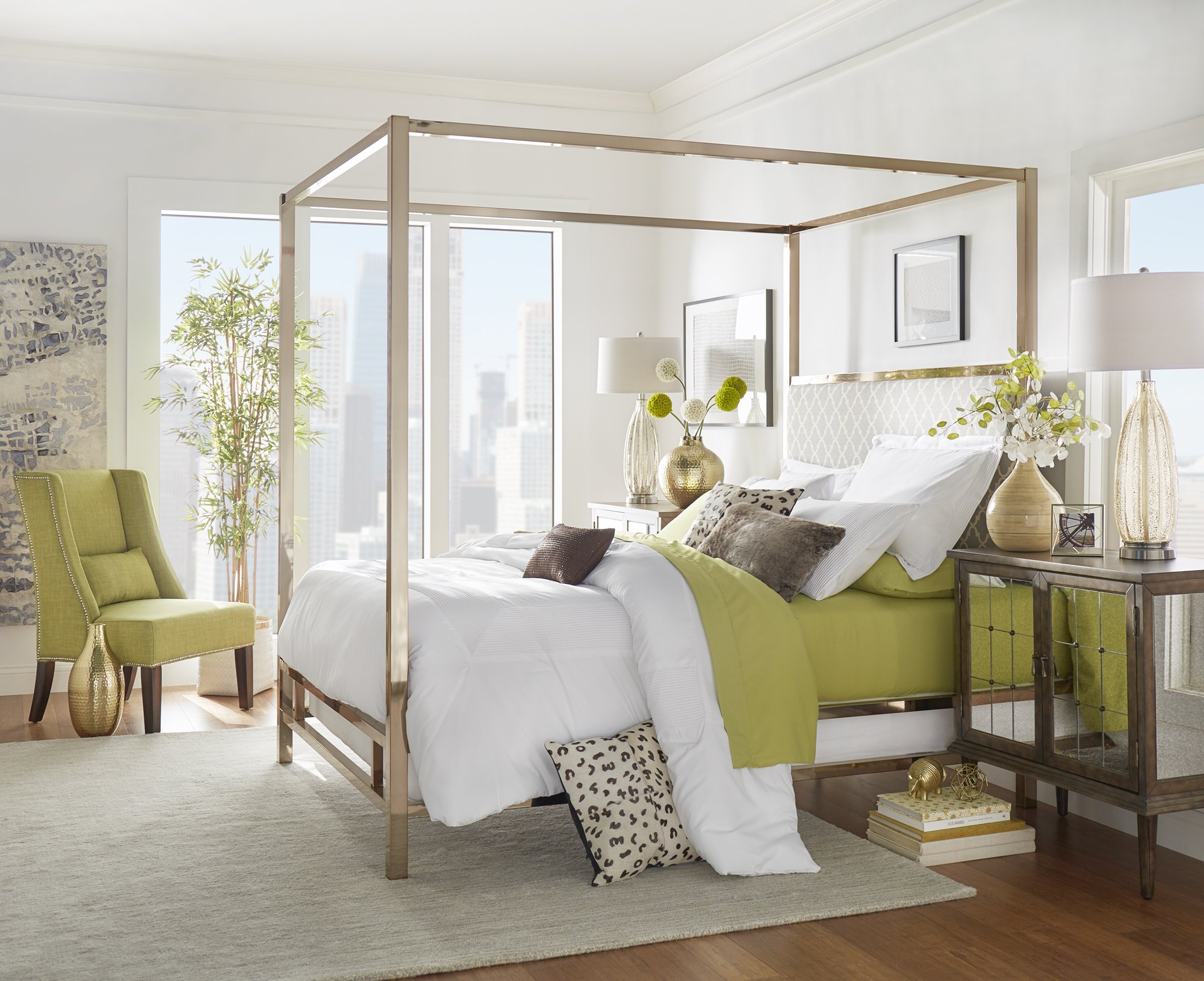
Modern chartreuse. It’s an unexpected color selection for this bedroom but it works so well!

Bravo fans will have no trouble recognizing this breathtaking chartreuse room that was done by Mario Buatta for Pat Altschul. If I’m not mistaken, the wall color is Benjamin Moore Chic Lime.
AND, if you’re looking for a more toned down Chartreuse paint color, give Benjamin Moore’s Castleton Mist a look.

Photo by Emily Folowill for Atlanta Homes & Lifestyles magazine.
Would you add chartreuse to your list of unexpected and chic colors?