
Project Reveal - Charlotte Highrise
I think the biggest compliment a designer receives is when a past client invites us back for additional projects.
This is the case here. We’ve worked with this wonderful family for nearly 10 years. Their first home was done in small and manageable phases, tackling a few areas at a time as relationships and trust were built.
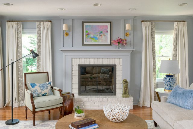
First home - living room. I still love it so.
When they moved to a new construction home in another part of Chattanooga, we furnished the entire home. Since much of their former furniture didn’t fit with the vision they had for the new home, they bravely lived on camping chairs and made do with bare bones pieces for several months as we designed each space and waited for new custom furnishings to arrive.
Luckily, the main bedroom furniture (seen below) was perfect for the new home, so they were able to utilize that space for rest and relaxation as soon as they moved in.
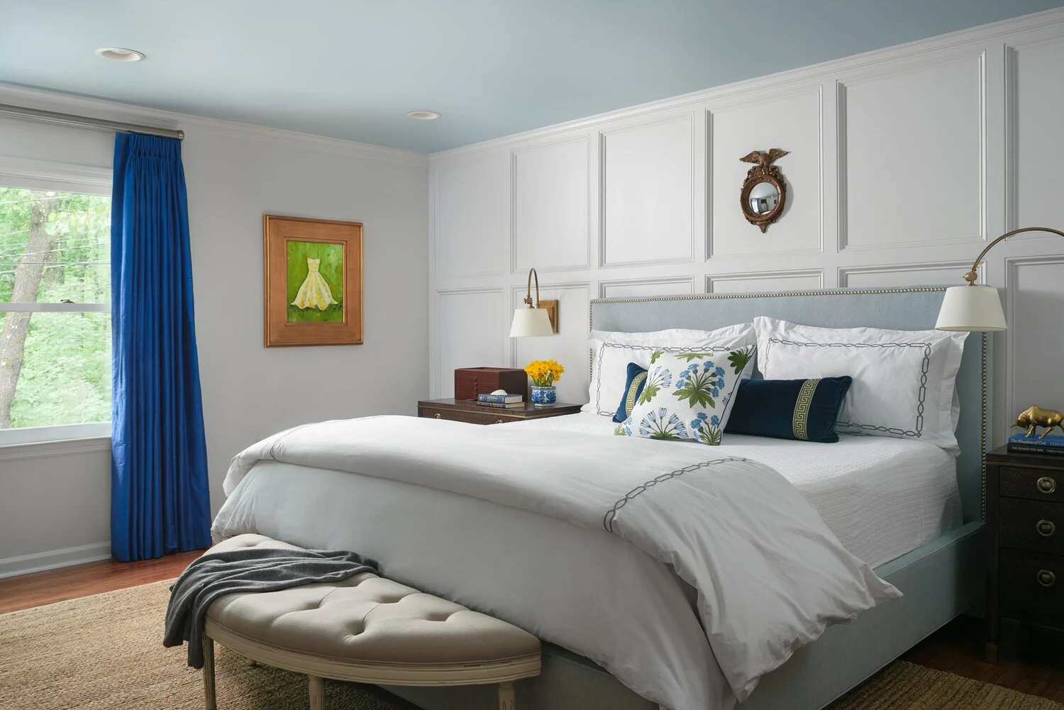
Main bedroom in House 1
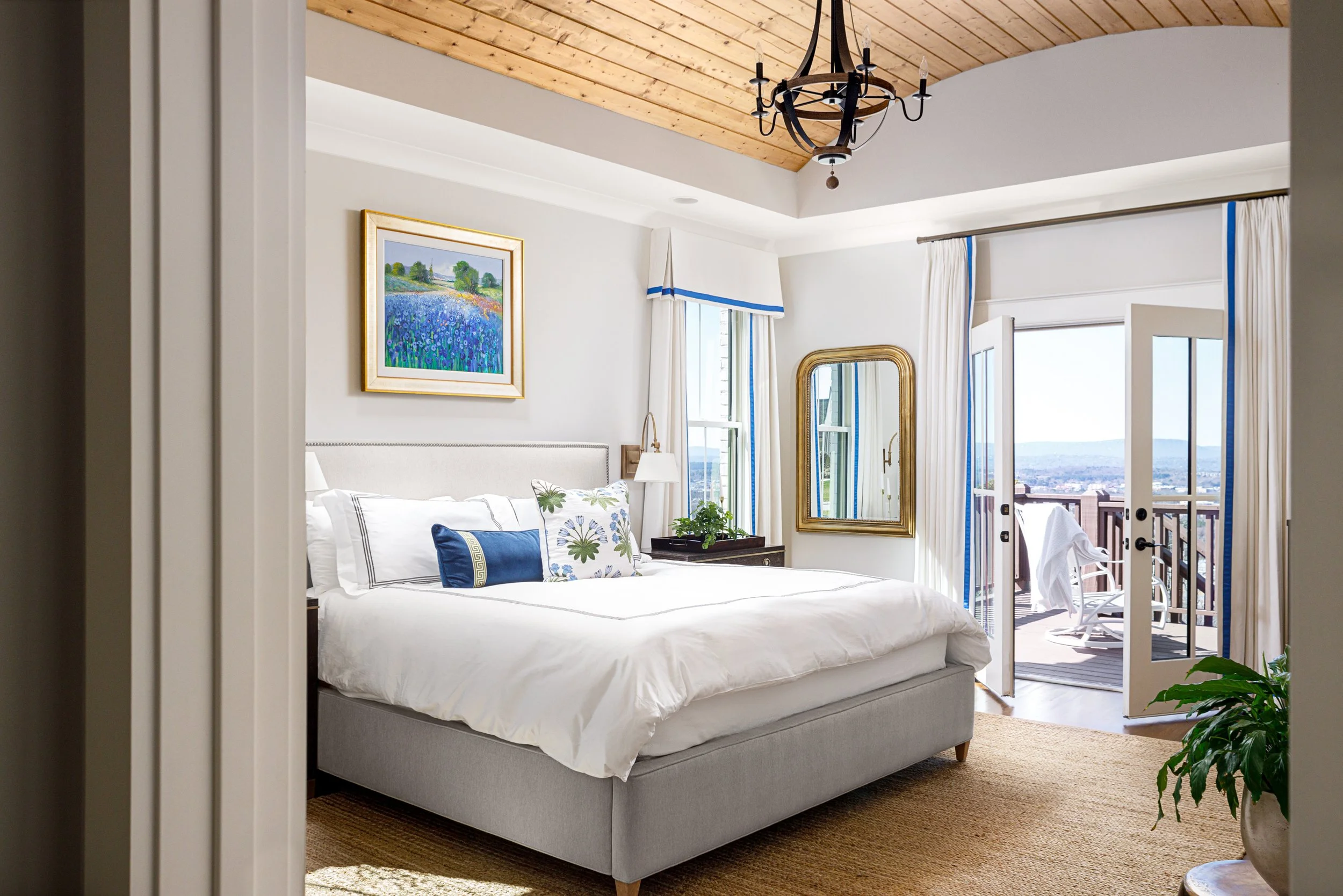
Main bedroom in house 2 (not sure why the bed fabric looks washed out in the photo, but it’s the same bed.
This project was a completely different animal. For one thing there was the distance. Chattanooga to Charlotte requires some planning and detailed documentation of the new space, as we had only planned to visit Charlotte once before designing the apartment.
The other challenge was the apartment itself. It’s much different than anything my clients have lived in before and much different than the majority of the spaces I work within. But plain white boxes offer so many possibilities, and I wanted to help them create a place in Charlotte they would be excited to come home to.
Because the highest priority was creating a comfortable home within an urban setting, we decided to work toward a “citified” Ralph Lauren aesthetic. We aimed to create something rich and sophisticated but with all the comforts of a welcoming home.
This direction was a bit of a departure to the light and bright aesthetic they favored for their previous homes, but they were open and willing to exploring this new direction.
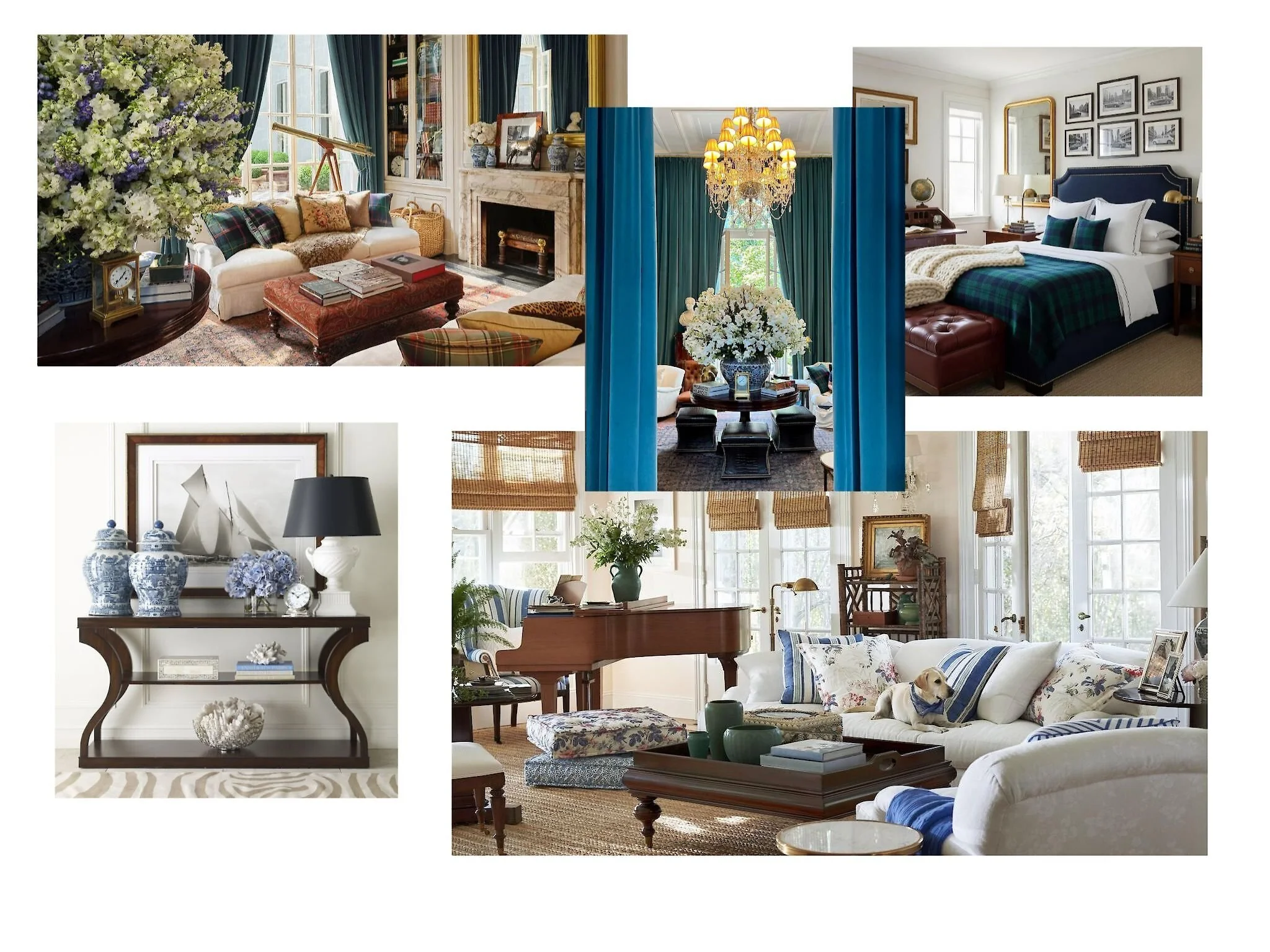
The Design Direction
Luxe + cozy. I adore the rich jewel tones. It’s just what we need to add depth and interest.
And the views were to be taken into consideration and incorporated into the overall design. These views are just as beautiful at night!
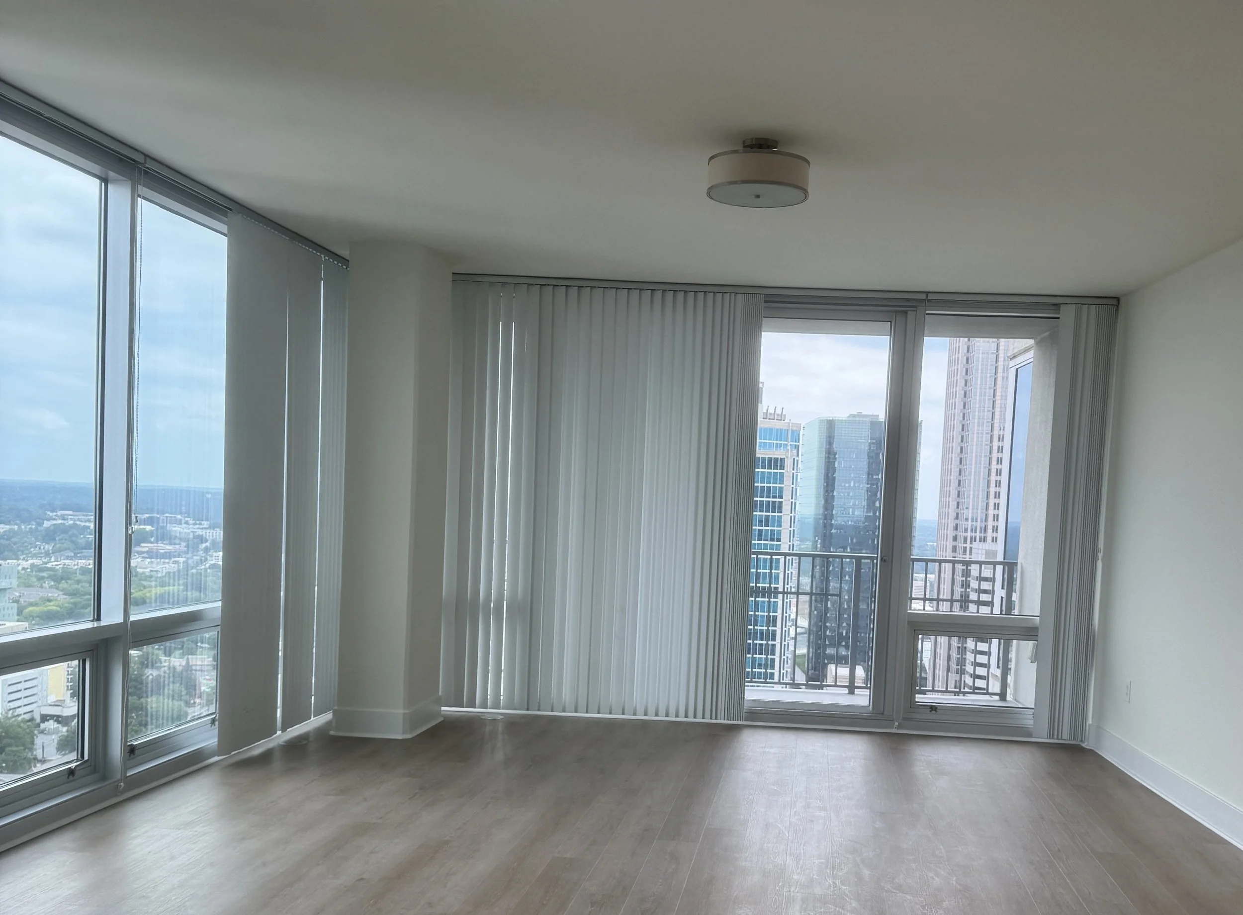
Here’s the main living area as we found it on our measuring/documenting/visualizing/”before” photographing visit. Other than blocking intense late afternoon sun, those vertical blinds aren’t doing this apartment any favors either. Full disclosure - I felt a little overwhelmed by the task at hand on our first visit.
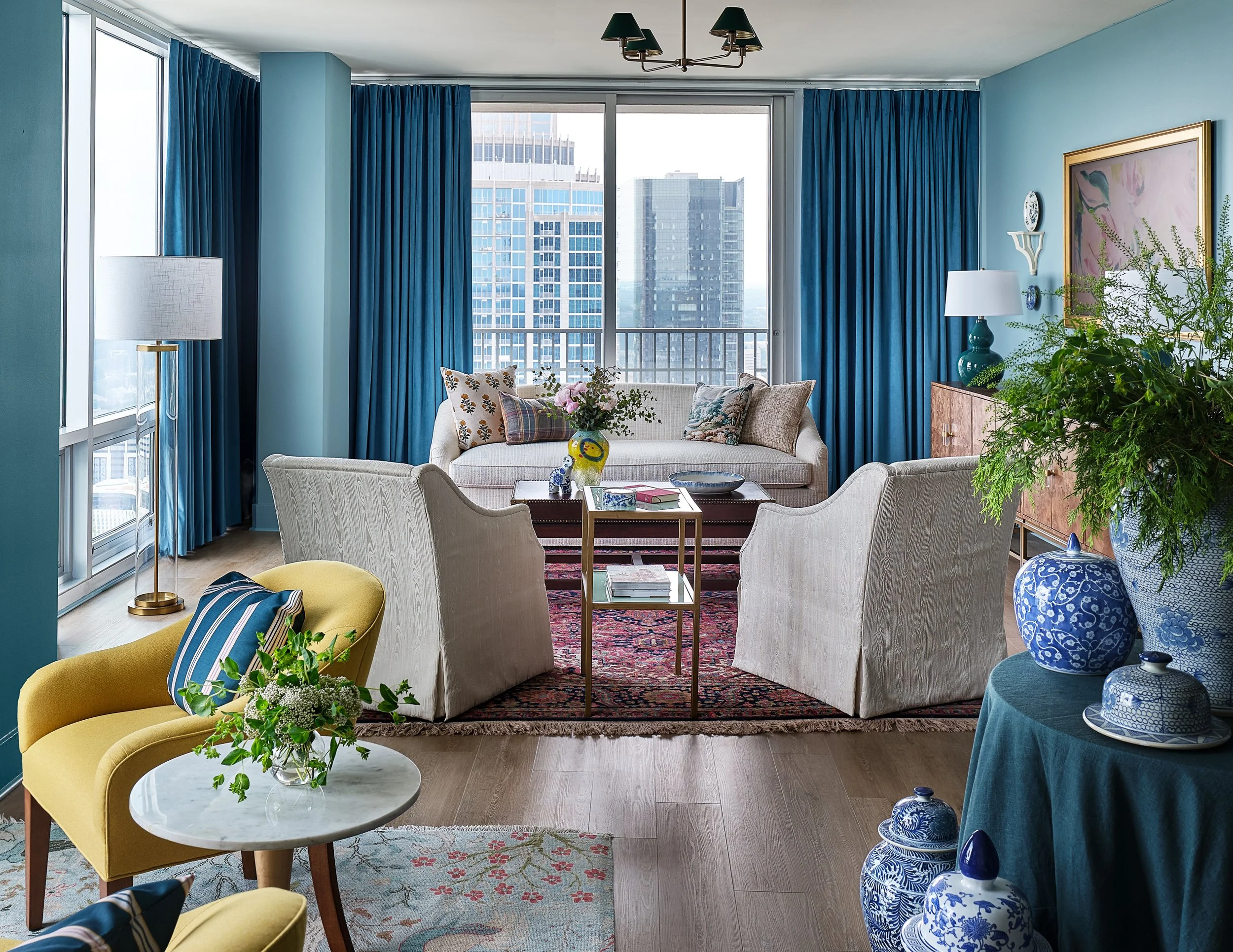
It’s hard to believe, but this space was completely transformed through the magic of paint, lighting, creative visioning and a carefully considered mix of furniture. Key players here include the antique Serapi rug and those incredible velvet curtains. Not only do they frame the view beautifully, they add a dynamic layer of luxury and warmth that is key to creating a feeling of comfort.
We were unable to add moldings in here, due to the window height and concrete walls, but stand by to see our clever solution for adding architectural interest.
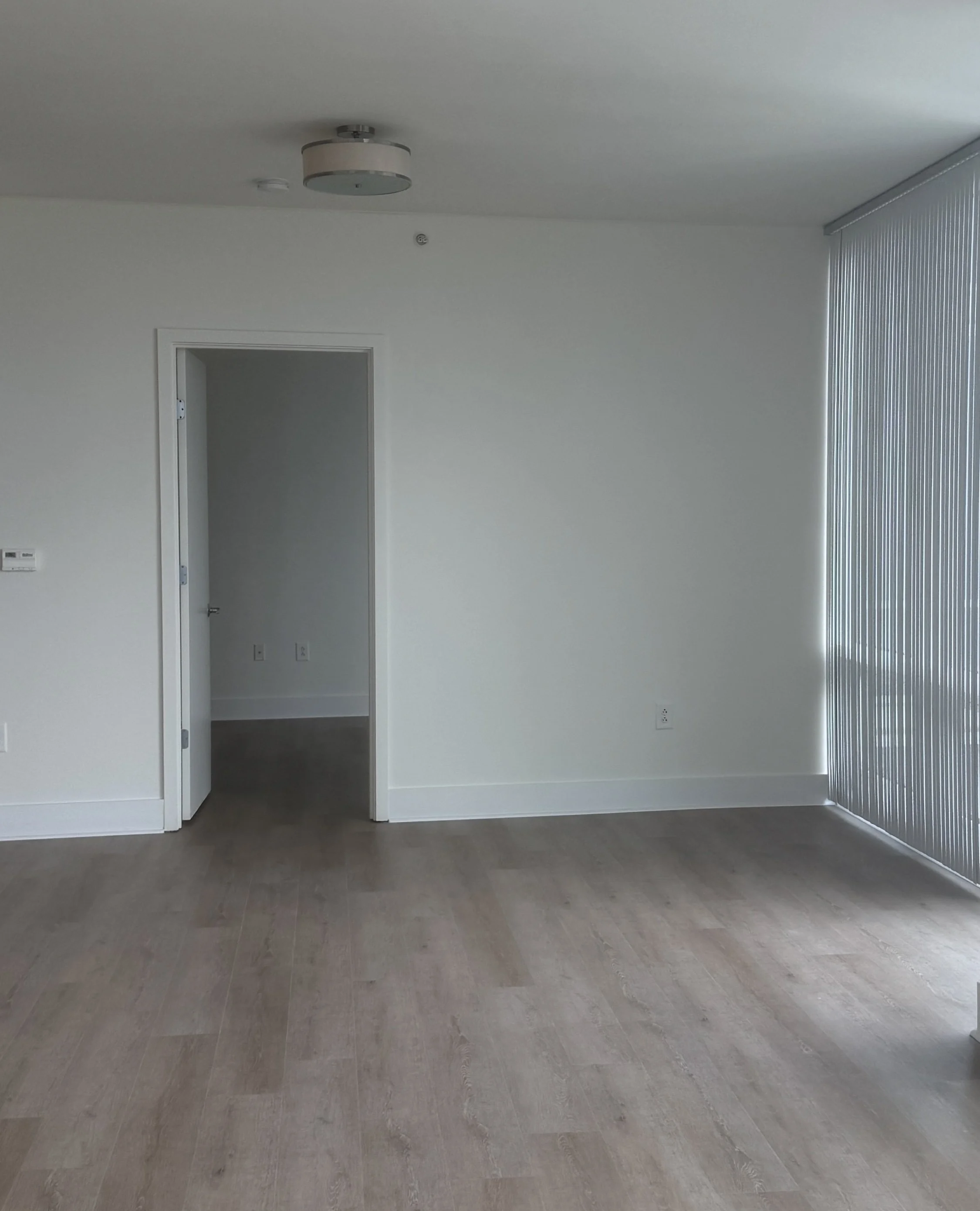
This shot shows the opposite side of the same room. Note the door into the bedroom.
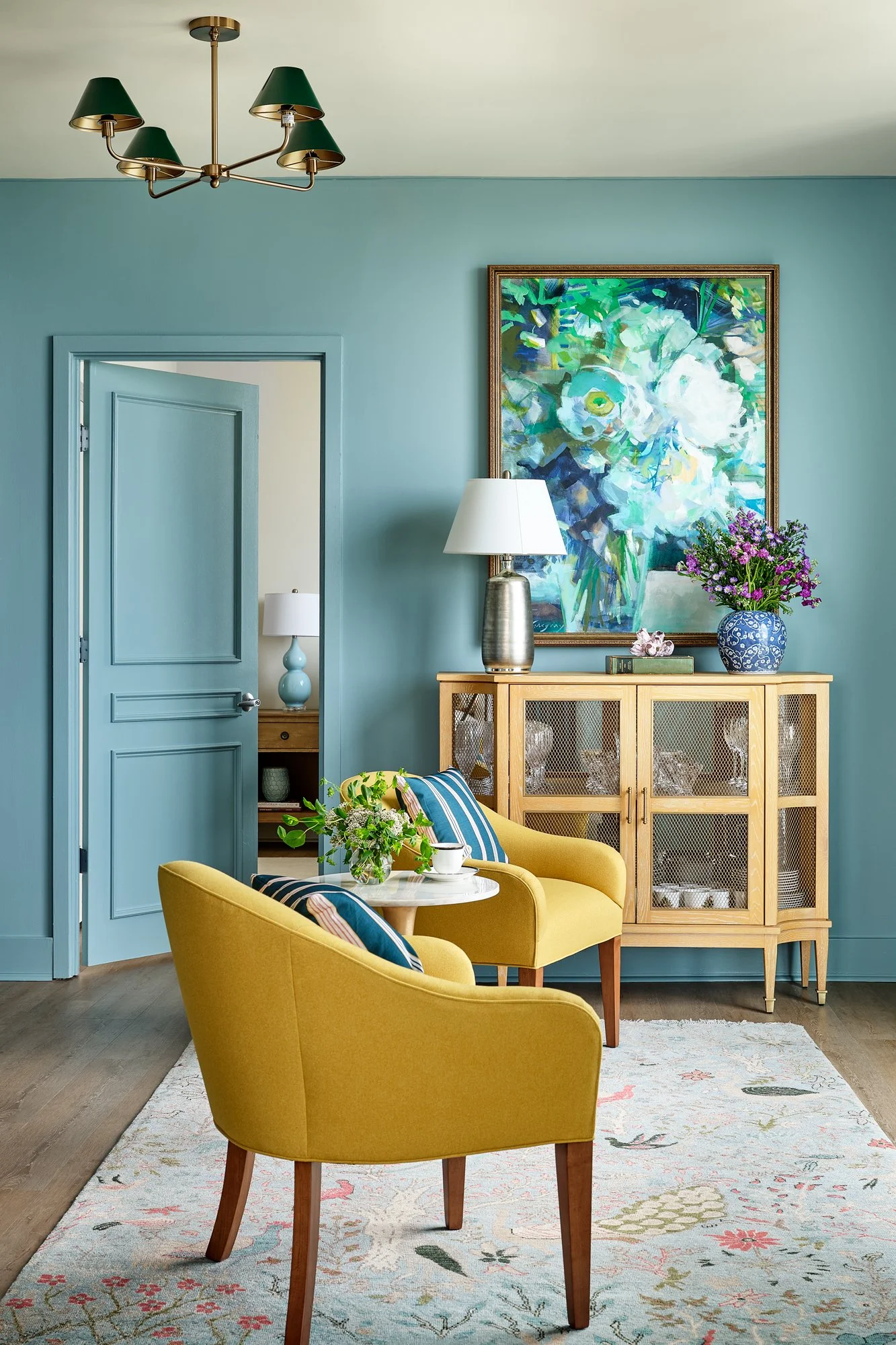
We could not add molding to the walls, but we could easily apply molding to the slab doors. And we did. I love.
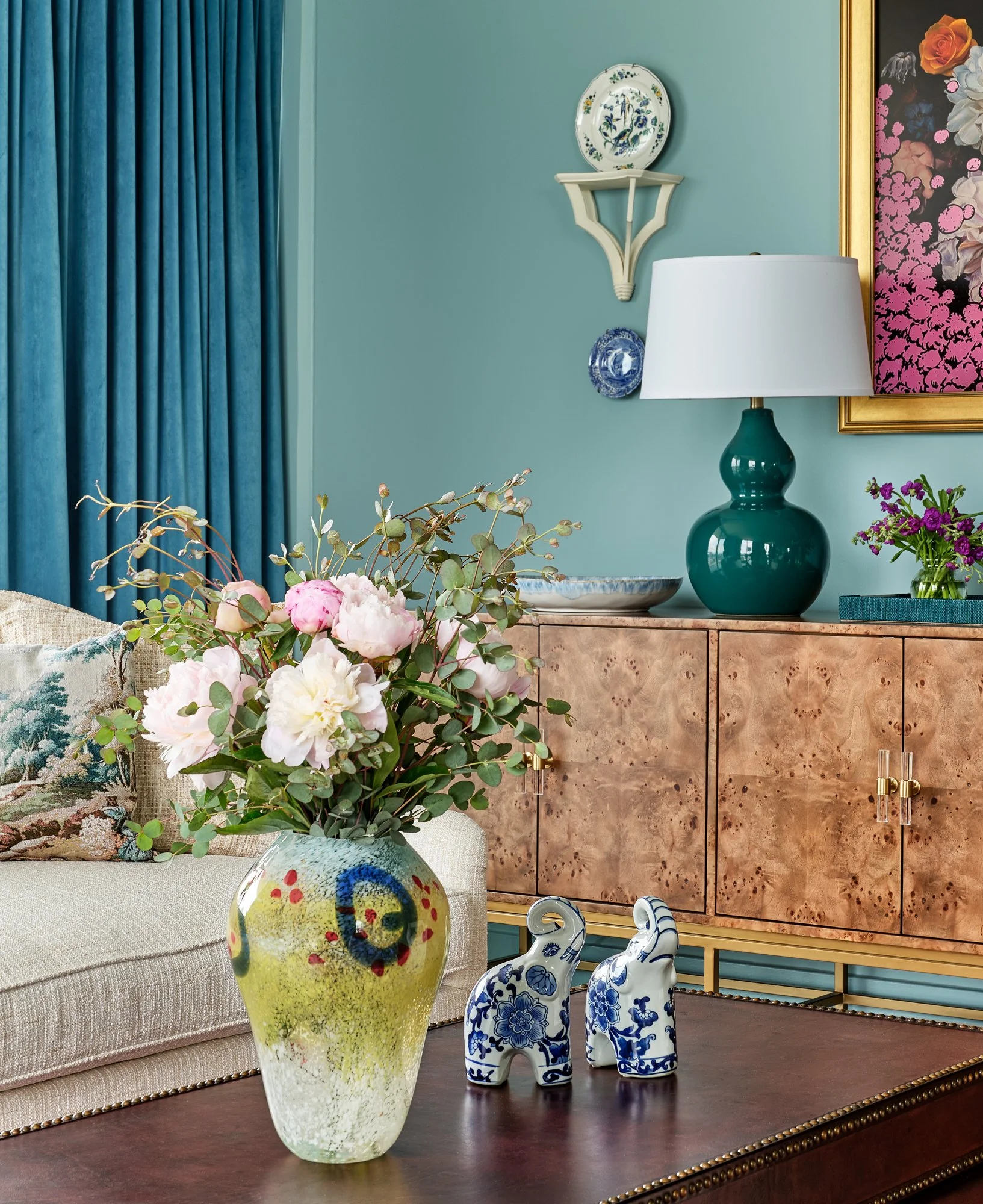
Another angle of the living room.
While I don’t have a complete shot of the tv wall, we added additional storage by butting 2 of the same size and style media consoles (the burled wood pieces seen here) together to create the illusion of one long piece that anchors the television and provides practical and chic storage solutions.
Shall we have a look at the dining room?
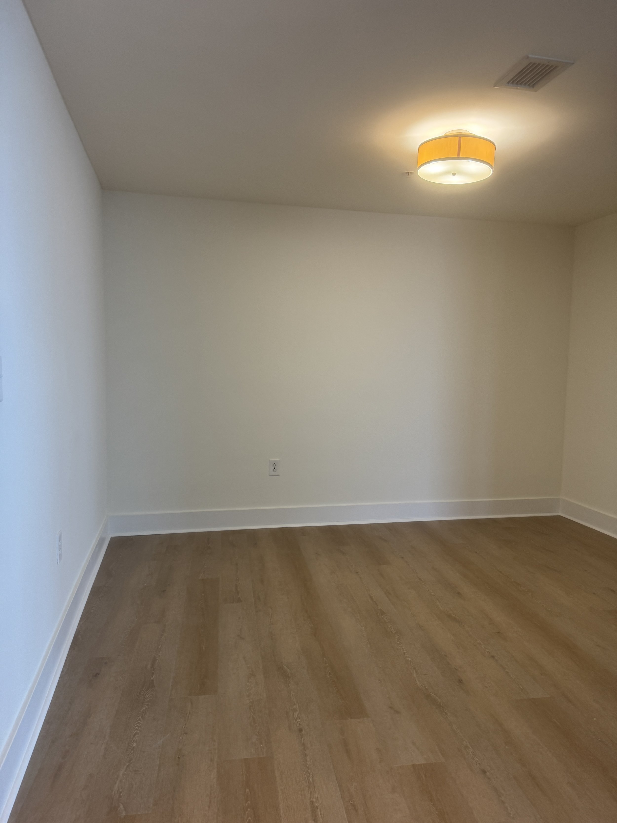
Nary a detail (or even a window) to be found. And the sad little light fixture.
The concrete walls were a worthy opponent, but Lindsay (husband/contractor) put in the muscle a lot of determination to make some millwork happen for our clients. Wainscoting and crown molding create a sense of tradition and add a layer of detail that feels homey and classic.
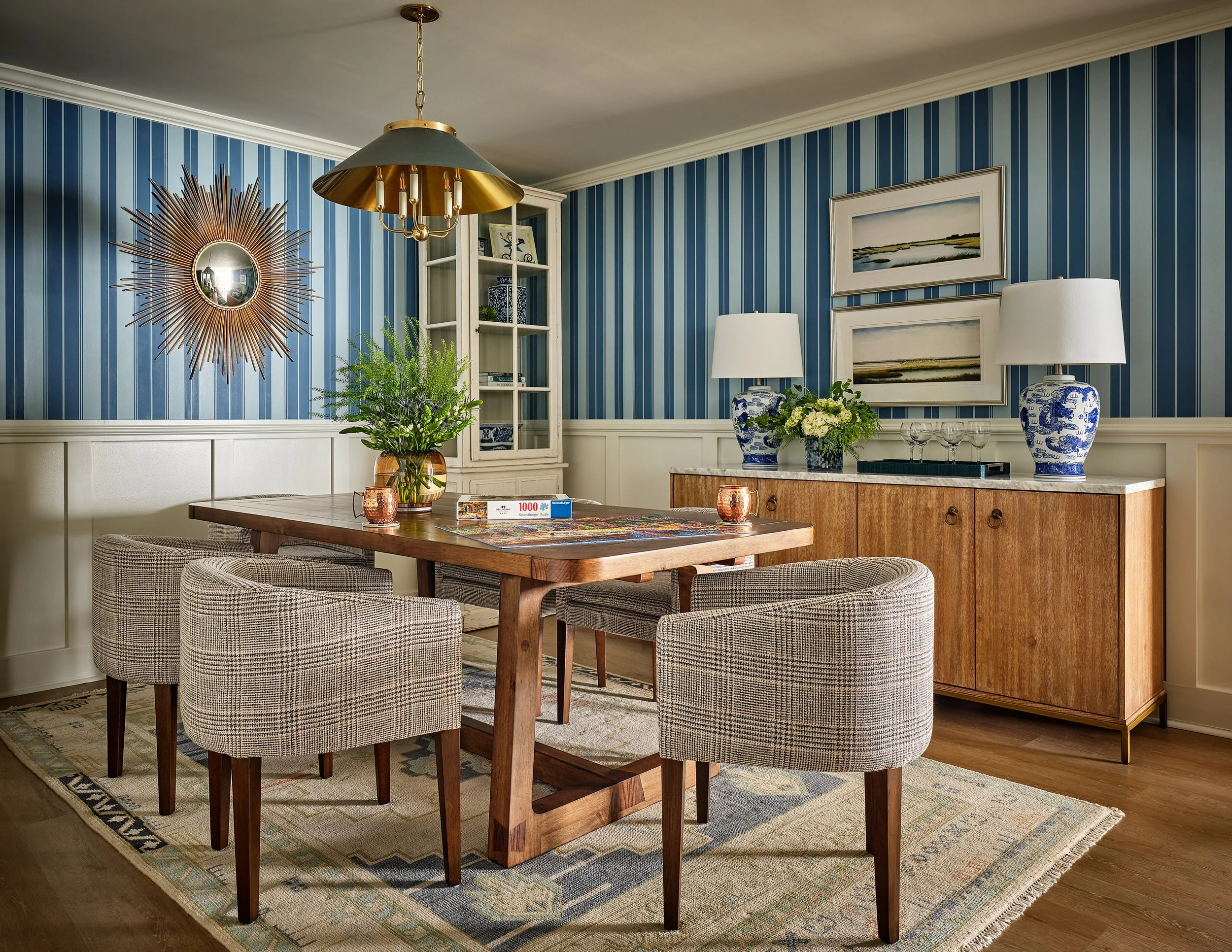
I’m calling this the Ralph Lauren meets Madmen dining room.
This is the only space in the apartment for dining, aside from the kitchen island. Comfort was a priority, and these swanky tattersall dining chairs are comfortable and a brilliant counterpoint to the striped walls. More storage is found in the sideboard and in the glass cabinets - there’s one in each corner.
While I don’t have a “before” of the entryway, we made the most out of this tiny space so that my clients’ style is felt immediately upon entering their unit.
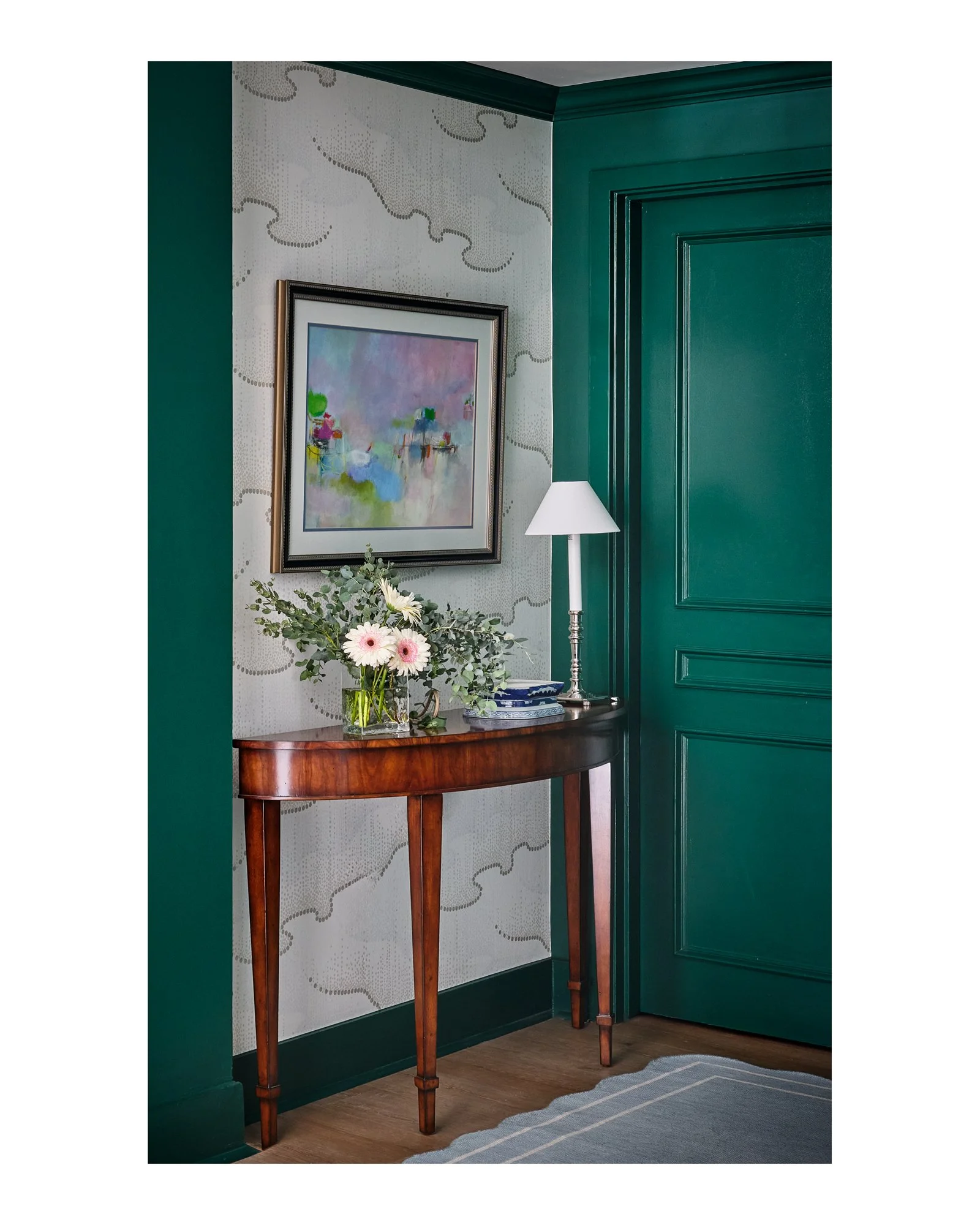
The entryway. Once just plain white walls and white slab doors. It now speaks volumes and creates a real sense of arrival.
We applied molding to the slab doors here, and the slightly recessed wall was crying out for wallpaper. The demilune table and original art are from their previous home. (Congratulations if you noticed that the abstract art is the same piece that hung over the mantel in the living room of their first home seen above).
I am crazy about this shade of green, too! (Sherwin Williams Hunt Club for those who are interested)!
In my next post, I’ll share the bedrooms, and I hope you’ll come back to see more of this transformation!