Giving Thanks

It's hard to believe that the Thanksgiving holiday is already upon us. Here in Chattanooga we've had a very hot and very dry fall this year, so it's been hard to mentally transition into the holiday season.

Thanksgiving is easily my favorite holiday. Around here, the weather is usually perfect this time of year. Cool sunny days give way to cooler fall nights.

bb9d26c6-2caa-422a-89e2-079c5826160d.jpg

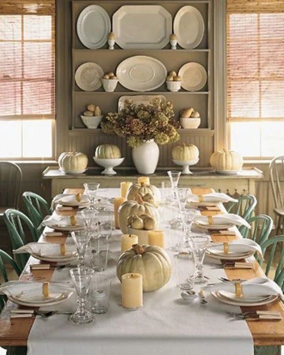
There's none of the hype of Christmas, what with trying to the find the perfect gifts for family and friends. Instead, it's a day that's about food and family (and football).

f5c9d10d-3d81-4d9c-9ca4-51a32a5edff7.jpg

Thanksgiving is a day set aside just to stop and reflect on the blessings we enjoy every day. Here is what I'm most thankful for:

1. Faith - I am thankful to be the child of a Kind and Loving God who hears and answers prayers. There have been times in my life where things were provided that could have come from no other place than from God. Things that couldn't be explained yet could be felt in my heart. God's love and presence is constant - and I am thankful for that.

b19443fa-8b07-4503-8ce0-a8ab5e19230a.jpg

2. Family. I have a beautiful family that I'm thankful for. I have an amazing husband that makes me feel loved and important every day. I am the proud mama of 2 beautiful daughters that are healthy, smart, and kind. I have a 3 year old grandbaby that brings so much joy to our lives that sometimes I think my heart will burst! I am blessed to still have my wonderful parents - both of them in their 80's and of strong minds and bodies. They have nurtured me my entire life and continue to do so. My two brothers are good, caring men and we all share a strong family bond.

c5d599de-ac39-4bf3-afc4-ce026b170d09.jpg

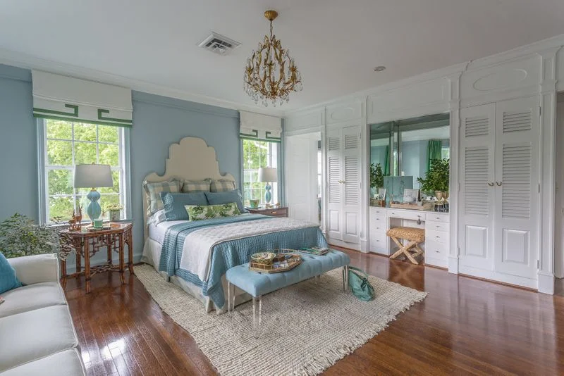
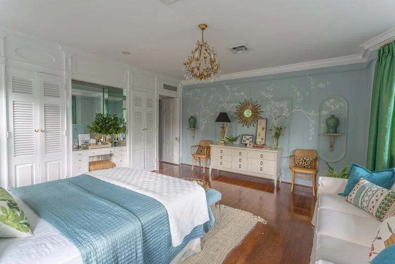
3. Home. More than just a roof over my head and shelter from the elements, I'm thankful for my cozy little house. It's my most favorite place that has all of my most favorite people in it. We laugh here, we cry, we argue, we make up, we celebrate, we make plans, we cook, we connect here.

b87dd799-c3ec-40e3-a7a4-54cbea5d7566.jpg

4. Work. What an amazing gift it is to be able to get up every morning and be excited to go to work! I love what I do and it's such a blessing to have the opportunity to share my God given talents with others.

5. Country. I'm thankful to be an American. I'm thankful to have the freedom to work hard, pursue my dreams and raise my family in a country where we can control our destinies. As Americans, our dreams can be achieved through determination, hard work, and smart choices. We have the freedom to succeed and prosper, yet we also have the freedom to make mistakes and start over.

434376d2-48f6-47c1-b737-747077703969.jpg

I wish you a Happy Thanksgiving full of love, blessings, and great food!

16d82a46-ea8e-467d-becc-65cc4994168b.jpg

Chattanooga Interior Design Project - Home Office Makeover

It's been a while since I've posted anything here because I've been busy participating in an online linking event called The One Room Challenge. The premise of this event is that participants make over a room of their choice over a six week period updating their progress once a week. On the final week of the event, everyone posts photos of their completed room.

The room I decided to make over was a room in my own home - a much needed home office. A bedroom in our house became available when my oldest daughter moved out and my youngest daughter claimed her upstairs bedroom.

My biggest priority from a functionality standpoint was getting more storage. I desperately needed storage for rolls of fabric and wallpaper, samples from vendors, and a place to store materials for upcoming installations.

Here's a look at the space before. I wont's sugarcoat it - it's pretty bad. My intentions were good but finding the time to plan and execute the design was rather elusive.

one room before.jpg
one room before2.jpg
one room before3.jpg

Regarding space planning, I knew I wanted two workstations. One area where I could work at my computer and have easy access to client files. The second workstation needed to be a place where I could spread out materials used in the development stages of designs for my clients.

Once my needs were determined and the layout was decided that would best address those needs, it was time to focus on the aesthetics - my favorite part. Since this is an office in my own home where I will mostly be working alone or with an assistant, I felt free to really personalize the space. And that's what I did. I envisioned a space that felt fresh, feminine and full of beautiful color. The color palette I landed on was lavender and red with metallic gold accents.

one room collage.jpg

As you can see in the moodboard I created above, there are a mix of design styles - mostly traditional with a few modern accents. The paint color I used on the walls is Benjamin Moore's Touch of Gray. It's a very subtle shade of lavender that changes with the light. Somehow, this color manages to feel energetic and restful at the same time.

Want to see the finished space?

one room after.jpg

It's quite a change, isn't it? I relied heavily on vintage items - I love pieces that are a little rough around the edges and don't mind showing their age.

one room after2.jpg

To address my storage needs, I bought two metal garage shelving units from Home Depot and spray painted them with a metallic gold. The loveseat provides a nice perch for family members who want to hang out with me while I'm working. Ok, mostly it's the dog.

one room after3.jpg

In the image above, you can see how I gained more storage by removing the bifold doors from the closet and installing long shelves. It's the perfect solution for holding multiple bolts of fabric and wallpaper! Open storage below the shelves is useful for storing lamps and other accessories waiting for installation in my clients' homes. The vintage French dining table is wondeful place to lay out fabrics, trims and wallpapers as I work through the design process, particularly with the natural light from the big window.

one room after4.jpg

Here's the other workstation. My computer, printer and client files are housed here. I also had a little fun creating an inspiration board.

one room after5.jpg
one room after6.jpg

I really enjoy working with color and I find it energizes me and lifts my spirits.

one room after7.jpg

My fabric storage is seen in the background of the photo above, and a big tray on my work table keeps pencils, paint decks, notepads and supplies both tidy and close at hand.

one room after8.jpg
one room after9.jpg

The vintage elephant seen above provides a little whimsy and ups the "happy" factor. Fun touches like this can really lift your spirits!

one room after10.jpg

This little Windsor chair was my husband's chair from his grandparents house, and it now has a new purpose - holding all of my magazines and keeping inspiration within easy reach!

one room after11.jpg

If you're really paying attention you noticed the pillows on the sofa are different from the pillows in the first images. I love that my color palette gives me the flexibility to change things up like this!

one room after12.jpg
one room after13.jpg

One last note. I am a huge proponent of splurging on custom window treatments. There is simply no substitute for the beauty and sophistication of hand crafted window treatments that are made to fit your particular windows and your aesthetic. This room would not feel the same without these custom curtains. They're made of a simple cotton linen blend with velvet accents and they transformed this space into a cozy retreat. Curtains out of a bag just can't do this! (Speech over.)

I'm so thrilled with how my office turned out! It's nice to have a space that is organized, comfortable, and "me". And isn't that what it's all about?

Thanks for stopping by - and if you're in the Chattanooga area and could use some design assistance, I'd love to hear from you! Call Kim at 423.653.3186 and tell me about your interior dreams!

Project Reveal - Interior Decoration Of A Downtown Chattanooga Condo

Today I have a fun project to share with you. It's a recent installation of a condo in downtown Chattanooga and it's a good old fashioned decorating project, meaning there was no construction or renovation involved -we just made the space over with new furnishings and finishing touches.

The most noteworthy architectural features of the condo are the high ceilings and the huge windows. This is always a winning combination, fostering a feeling of light and spaciousness.

Before I was hired for the project, the owners had just had the condo painted. Normally I spend a good deal of time searching for the right color; the color that will help convey the mood we're trying to create. But since my clients just spent a small fortune on the paint job, and they selected a neutral, cool gray (Sherwin Williams March Wind), I decided to work with the existing color so we could utilize the budget for new furnishings and accessories. Luckily, the previous owners of this condo invested in custom curtains. With 13' ceilings and lots of windows, curtains alone could have been a budget buster. Thankfully, the curtains we inherited were an easy to work with creamy white and were beautifully made, so we decided to work them into the design.

Anyway, the main level is pretty open, with this particular area being the lounging/tv area. How gorgeous are those windows?!?!! Here is how this area appeared when I came on board.

condo1.jpg

And here's how it looks now:

living green.jpg

Isn't it amazing how simply changing the furnishings (and a nice sunny day) can transform a space? I'm so crazy about that green velvet sofa. I love a single seat cushion - it's a nice clean look. It's also more functional because no one has to sit on the crack!

condo2.jpg

We utilized quite a few neutrals in the space, and I think the green adds some balance and life to the cool gray walls. The sofa color also helps bring a little of the greenery seen outside the windows into the space, making a subtle connection with nature.

The owners struggled with how to address the tall tv wall. This is a common problem. The armoire is tall, but that's about all it has going for it.

condo3.jpg

And here's the tv wall after:

condo4.jpg

We opted for a wider tv console to fill the space horizontally, and I flanked it with a pair of wide and low linen tufted chairs. The natural wood finish of the console adds some needed warmth and texture to this cool lofty space.

condo5.jpg

I hung a series of vintage garden maze prints above the tv fill up the tall wall. If you scroll down to the next photo, you'll see that just because you have 13' ceilings, you don't have to cover the entire wall. Keep things at a comfortable level.

condo6.jpg

The nearby dining area is completely open to the tv area, so we selected furnishings that would blend together. In a space that's so open, a limited color palette is the usually the best approach. Because you're seeing so much of the space at once, it's best to keep things simple.

condo7.jpg

The dining table is a mid century piece that was part of my client's collection. I selected these fully upholstered Queen Anne style chairs for an updated traditional look. I like how they straddle the line between modern and traditional. Looks like we're having pine cones for dinner. Haha.

condo8.jpg

Here's another traditional furniture piece that was culled from the homeowners furnishings. I found the mirror at an antique store and I just love the juxtaposition of the ornate gold frame against the modern architecture.

Below is another "before". I think my client did a fantastic job creating a symmetrical vignette, but I wanted to simplify the look and go with larger pieces. Can you guess which piece of theirs I repurposed?

condo9.jpg
condo10.jpg

Naturally, I reused their antique sideboard. I solved the awkwardly placed window situation by simply hanging a large piece of art over the window, and I edited down the furnishings and accessories. A pair of modern lamps and a floor plant in a basket finish off this area in a simple, sophisticated way. I'm crazy about the pinks and greens against the cool gray walls and I added a little more warmth with a gold floating frame around the abstract art.

condo11.jpg

Again, in the image above, notice that the painting above the sideboard is placed at a comfortable level.

condo12.jpg

I think this photo gives you a good sense of how open the floor plan is.

condo13.jpg
condo14.jpg

The coffee table is a textural mix of rough wood, slick ceramic coasters, and a touch of gold.

Thanks for taking the tour with me today! This was such a fun project with trusting, open minded clients.

As an aside, if you look at the "before" photos you'll notice that the trees outside the windows are dormant. This is because we started the project in very late winter and just finished up a few weeks ago. Not because there were any problems, but because things take time. Design plans have to be developed, custom sofas have an 8-10 week lead time, and design is a multi-step process. We all agree it was worth the wait!

HGTV Vs. Real Life Design

HGTV - does anyone even watch it anymore? They seem to have gone from decorating/gardening/home improvement shows to the Real Estate channel with seemingly non stop episodes of House Hunters that we have seen a hundred thousand times.

But I digress, because this is not really the main beef I have with HGTV.

What annoys me is how that they facilitate unrealistic expectations for what real life decorating and renovation projects entail. Within 30 minutes, they visit some sad room in need of an update, come up with a design plan for the space, and implement the entire design culminating in the big reveal to the overjoyed homeowners. And what about budgets? I would love to know how they arrived at these figures. Renovation/construction costs are the magical unicorn at HGTV. Apparently those Property Brothers are independently wealthy and don't need to charge for their services, nor do the designers who come up with the plan (you don't really think the Property Brothers design those spaces do you?). And someone has to shop for everything in the space and style it. All within 30 minutes and for less than $1,000.

Let me walk you through what goes into a real life bathroom renovation, as we have several going on right now. The image below is not mine, but I do love how collected and timeless it feels.

hgtv1.jpg

First, there's the Design Process. It involves a few hours to meet with the clients, have a look at the space, find out what's not working, and what they would like to see in the space (this info is used to guide the Design, not necessarily to take a work order) The room is then measured and photographed so we know what we have to work with.

hgtv2.jpg

Next we start figuring things out. Sure, the design process is creative, but in most cases there is some problem solving that requires knowledge of structural, plumbing and electrical code requirements. Safety first! To arrive at a functional floor plan, a to-scale footprint of the room must be created so that the space plan can be determined. Once the layout is decided upon, we begin sourcing materials for the room. Keep in mind that everything that is sourced for the design must first be researched by reading the product specifications to ensure that everything is of the proper scale. And that is true for each and every item sourced for the space, from vanities to mirrors to light fixtures to plumbing fixtures. And now try to wrap your mind around how many products are available for each of the design elements I just listed. There are literally thousands of faucets, sconces, toilets, tiles, mirrors and sinks to choose from. And then once, say, a tile is decided upon, how do you want that laid? On the diagonal? Herringbone pattern? Offset? What about borders? How wide, how high, etc. It's a ton work that has been researched and edited before it gets presented to the client. So (assuming you're the client) what you get on presentation day makes perfect sense and looks completely effortless - just like this Design Concept Board I did for an historic home powder room renovation.

hgtv3.jpg

And so while we're making sure everything will fit, we're also making sure that we'll arrive at a cohesive look when it's all said and done. Oh, and there's that budget thing too. We'll need to be certain that what we're creating is aesthetically pleasing, fits the space it's intended for, and fits the budget. Got it? Good

Once the design is finalized, another client meeting is schedule to go over the Design Plan. If we've done our job properly, we've come up with a plan that speaks to the client's personality. That being said, it's not out of the question for clients to request a small tweak here or there, and then it's back to the studio where the plan is fine tuned. This often entails another trip to the tile/fabric/lighting/ showroom so alternate selections can be made. Once all of the design elements are approved by the client, implementation begins. Yay! During this time materials are ordered (and managed), subs are scheduled (and managed) and clients' hands are held as they face the anxiety and exhilaration of witnessing the destruction and recreation of their new bathroom. And we're there the whole time. Answering text messages. Sending updates. Calming fears. Giving pep talks. Sharing little victories - like the light fixtures that were on back order but have shipped 2 weeks earlier than expected.

An average bathroom gut renovation takes about 4-6 weeks. If the footprint of the bathroom is altered, or if problems are uncovered during renovation, it could take longer. During this process, visits to the site by the designer are necessary to make sure everything that has been specified is being implemented, and many times to make little adjustments or on the spot decisions that sometimes come up during construction.

And then the moment we've all been waiting for arrives - the completion of the project. This is where we shine! The vision has come to life and has been executed with the highest attention to detail. The new bathroom functions flawlessly and all of the little touches are in place that create those special moments that capture the personality of our clients. Happy dances all around!

So if you've read this entire post up to this point - congratulations - and thank you. I guess what I'm trying to communicate here is that unlike what you see on HGTV, the entire design experience is a complex process that takes a lot of time and effort to deliver a seemingly effortless look. And just like on HGTV, that's what we're after. Something that makes sense when it all comes together, fits your budget, and makes your heart go pitter patter every time you see it!

Thoughts On Creating A Home Office

After 5 years in this home, I've decided it's high time to get serious about creating a home office for myself. Since my oldest daughter left the nest and my youngest will graduate high school in the spring, there's really no excuse for not taking advantage of the real estate that's available. I do have a bedroom I've claimed as the office, but it's a far cry from my ideal workspace. Rather than share sad pictures of this space, let me paint you a picture of current office conditions.

I have an old desk for my computer on and a bunch of cardboard filing boxes, some/most of them on the floor. And speaking of things on the floor, that's where a lot of things end up due to a lack of proper storage pieces and shelving. I also have one of those useless shallow closets with a rod, a shelf above it and bifold louvered doors. Not exactly ideal.

The first step in designing any space is getting the layout right. Form has to follow function, particularly in an office where the goal is be organized and productive. (So basically, you have to figure out the room's layout before you start thinking about pretty things, like paint colors, fabrics, and art.)

The image below doesn't represent my own office space, but you can see how drawing out the room to scale is key to getting furniture placement right before any purchases are made.

white1.jpg

Here are few things I will be keeping in mind as I start to plan my office space.

Work Surface - As I collect fabric, wallpaper, paint, tile and flooring samples for a project, it's helpful for me to spread them all out and play around with the options until I come up with the most pleasing mix.

office2.jpg

There are many things I love about the setup above. I like the long work table, the wall of inspirational art, dual workstations, and the books stored below the desk for easy access. I could see the lower area being used for fabric and wallpaper samples and catalogs.

Storage - there is a huge need for storage in my line of work. There are product samples, accessories and furnishings that need to be stored until installation day, and the massive amounts of paper that come with each job (order confirmations, receipts, packing slips, spec sheets, client profiles, and on and on.)

office3.jpg

Have you seen these shelves that Windsor Smith put in Tracy Anderson's headquarters? They're your basic big box store metal shelving units that she had brass plated, added wheels, and replaced the shelves with slabs of marble. I probably would not go to the expense of brass plating and adding marble shelves, but I think this shows how humble materials can be used in exciting ways. I think you could get the same effect with a little spray paint and some wallpaper. And there's tons of storage for larger items.

Here's another storage idea I love:

office4.jpg

Brooke Gianetti used an old built in china cabinet for storage in her office. I like that there's a little bit of display on top and closed storage on the bottom.

Below is another antique used for home office storage. See the framed bulletin board with a grass cloth surface? It's an easy modification that looks a little more personalized that a plain cork board. You could do this with a favorite fabric too!

office5.jpg

One area that could be valuable to me is the 1972 shallow closet with bifold doors. I would like to remove the doors and fill the closet with shelves (sans the work station seen below). This would be an ideal storage solution for bolts of fabric, wallpaper and client accessories as they await installation day.

office6.jpg

I think the office below is my favorite and it was designed by Myra Hoefer.

office7.jpg

Here's what I find so appealing. The giant work table in the center of the room means you could be working on multiple projects at once. Seating can be accessed from any side of the table which really gives you some flexibility. Added storage is found on the shelf below the table, so materials are easily accessible while not being used. I also adore that antique storage piece. It provides tons of storage and gives the space so much personality!

Style - even though offices are viewed as utilitarian spaces, I think it's important to bring the pretty. Your surroundings have a big impact on your state of mind, and you should feel good in your work space.

This one feels about right for my style:

office8.jpg

Soft colors, simple floral window treatments, and stylish seating feel comfortable to me.

So to summarize, when planning your home office

1. Assess your needs. What pieces do you need to perform your daily tasks?

2. Measure your room, and create a drawing (to scale) to determine the best way to utilize the space that makes sense for your work process.

3. Source the furnishings for your office that will meet your needs, fit your floor plan and reflect your personality. As long as the piece is addressing the function it's meant to address, the sky is the limit! Have fun with the pieces and add some personality.

Chintz In Modern Interiors

Most people think "Chintz" and Modern" don't belong in the same sentence, much less that they can coexist in the world of interiors. And I get it. If you grew up in the 80's when Laura Ashley and Waverly polished cotton chintz fabrics were all the rage and window treatments looked like this:

chintz1.jpg

then you probably have an anti-chintz clause in your Decorating Plan.

I, on the other hand, happen to still like a pretty and colorful fabric that's inspired by nature's biggest and boldest blossoms.

chintz2.jpg

The key is to have a very light hand when using floral chintz fabrics. I think the image above demonstrates just how effective and relevant these fabrics can be in today's interiors. The white walls and graphic stripes on the table skirt take the space out of the 80's and put it firmly into the right now. In case you're wondering, the fabric on the curtain is Scalamandre's China Rose. It's been in production for decades and is still highly sought after.

chintz3.jpg
chintz4.png

I love the floral chintz headboard above - and - oh my - peach walls! It's so refreshing to see something other than gray, isn't it? Can you imagine how different this room would feel if there were lots of other patterns used with the floral headboard? The Decorator kept the other design elements simple and clean, which gives takes the room in a modern direction.

chintz5.png

Here Miles Redd takes an old school chintz, (Althea by Lee Jofa) and ups the ante with forest green lacquered walls. Would I call this space Modern? Not in the sense that it's modern in style, but Miles Redd has a knack for using old school materials in a way that makes them feel "of the moment". Bottom line is that this room is timeless, and will be relevant decades into the future. And speaking of old school, pleated lamp shades (above) are also enjoying a resurgence in popularity. This makes me happy.

chintz5.jpg

Chintz upholstery + antiques + oversize modern art = forever timeless. Note the seagrass rug and the baskets. Those design elements go a long way to bring the formality of the space down to a more casual/comfortable level, which is how we're decorating now.

The bedroom below? Well, this is me. Not my work, that credit goes to Megan Rice Yager. But this is a bedroom I would be totally comfortable with for myself. The soft color palette, the feminine feel, and the Chinoiserie accents all add up to my idea of perfection. The headboard and the valance are done in Colefax & Fowler's Bowood, an iconic print that has been around for decades.

chintz6.png

OK, I got one more for you. Below is Lee Radziwill's Paris apartment circa I'm-not-sure-when, but I would say at least 10 years ago. And doesn't it feel Modern? Yes, there is chintz upholstered everything, but the white walls, simple curtains, natural fiber rug and edited accessories make it could have been done yesterday.

chintz7.png

So the takeaway here is that you CAN use chintz today. You just need to pick a pattern you love and don't layer lots of additional busy patterns with it. Keep your backdrop simple, and mix in a few modern design elements - like a lucite table or a piece of modern art. Remember, the most memorable interiors are those that have an interesting mix of styles and materials - if you keep these guidelines in mind, there's no reason a bit of chintz can't be part of your mix!

My Junior League Of Chattanooga Designer Showhouse Bedroom Reveal

I know - a long name for a post!

Now that all of the work is done , I want to share photos of the room I decorated for the first ever Junior League of Chattanooga Designer Showhouse. Let me tell you this was an exciting/overwhelming/stressful/exhilarating roller coaster of a project, but I'm so pleased with how it turned out! I may have mentioned in a earlier post that I took the installation of my room down to the wire, so I didn't schedule professional photography before the Showhouse opened. As luck would have it, the photography gods smiled upon me because in the late afternoon the day before the Showhouse opened, in walked a vision of loveliness - aka talented local photographer Wagner Abercrombie with her photography equipment and amazing photography skills. Wagner was actually there to photograph the bedroom next door to me by Green and Lofty, but she agreed to shoot my space as well on that very afternoon. Wagner gets and giant THANK YOU and I also want to thank everyone for the kind and supportive comments about my room. And now for those of you who were not able to tour the Showhouse personally, here are some photos of my completed room.

jl bed.jpg

Hello. My name is Kim and I like color. The color palette I landed on for this space is mostly blues and greens. Because blue, green and teal (blue-green) are analogous colors, there's not a lot of contrast between them which helps keep the color palette from becoming overwhelming.

jl bed 2.jpg

The headboard is custom and is piped in blue. The roman shade valances are also custom and are trimmed in the same green taffeta as the curtain panels. Pillows are a quiet mix of buffalo check and Peter Dunham's Fig Leaf. To create more interest, I decided to shake up the symmetry of the bed wall by using non-matching end tables. The Furniture Shoppe here in Chattanooga provided the beautiful end tables, and they work perfectly here. (TIP: If you are using non-matching night stands with matching lamps, make sure your night stands are the same height).

jl bed 3.jpg

If you know me at all, then you know I have a lifelong love of Chinoiserie. I think it's the blend of nature, whimsy and sophistication that speaks to me. In any case, I incorporated a hand painted Chinoiserie inspired mural on the wall opposite the bed. Local artist Lydia Reynolds created this magic for me, and I am so grateful for her talent.

jl mural.jpg

A collection (my own) of framed butterflies is displayed against the mural wall. I am constantly inspired by the beauty of nature and I try to incorporate it into every room I design. I decided to use fresh cut leaves and wildflowers to bring in even more of nature's beauty in a way that's not too fussy.

jl bed 4.jpg

I also love decorating with vintage finds, so I decided to be true to my style and incorporate some vintage pieces into my bedroom. The gilt crystal chandelier is from my own collection and it adds a little sparkle and sophistication. I also like the contrast it provides to the simple, natural fiber rug and the casual slipcovered sofa (generously provided by The Furniture Shoppe Chattanooga). The key to a successful layered/collected look is finding the right balance of high and low, sleek and rough, old and new.

I decided to work with the built-in mirrored vanity wall and only changed out the hardware and styled the vanity. I added the raffia x-bench because the rough texture of the stool was the perfect contrast to the slick mirrored surfaces.

jl bed 5.jpg

More texture and more vintage items were used to style the vanity. Fresh cut branches of greenery bring warmth and life to this area.

greenery.jpg
vanity.jpg

Even though I love color, I like to temper it by incorporating a lot of white. White is a palette cleanser and it provides a clean backdrop for the stronger colors.

jl sofa.jpg

Here's another look at the Chinoiserie inspired wall painting. Wouldn't it be a treat to wake up to this scene every morning?

jl bed 6.jpg
jl end table.jpg
jl pillows.jpg
jl bed wide.jpg

Thank you again to the Junior League of Chattanooga for inviting me to participate and for all of the good work you do in our community! And thank you to the Furniture Shoppe and my drapery / upholstery workrooms for the fine work you do. You guys make me look good!

Also - This is the LAST WEEKEND that the Junior League of Chattanooga Designer Showhouse will be open. If you haven't had a chance to visit yet, I strongly encourage you to take the tour! I promise you'll leave feeling inspired!

A Bunk Room For Everyone

Today we'll take a look at a design trend that continues to gain momentum. Bunk rooms. They're functional. They're fun. They're here to stay, and style-wise, there's a bunk room for everyone!

I certainly don't consider myself a minimalist, but I find this bunk room from Thorp Designs in the UK so appealing! It feels clean, breezy and restful - a true retreat!

bunk.jpg

Is your style more Modern Glam? Then I think you'll love the bunk room below by Sophie Metz in Nantucket! The suspended bed is a great use of the space under the sloped ceiling.

bunk2.jpg

There are no bunk beds in the bunk room below. Under bed storage provides the platform for each bed, which is so smart and clean looking. To me, this room has textural appeal with just the right amount of color.

bunk3.jpg

The bunk room above and below are both from Tracy Hardenburg of Dallas. I love the use of color in both of these spaces.

bunk4.jpg

If you're reader of design blogs, then you've surely seen the bunk room created by Grace from A Storied Style in the last round of the One Room Challenge. It's bold and fun and no doubt a huge hit with the kids!

bunk5.jpg

Remember at the beginning I said there was a bunk room style for everyone? Here's one that's a little more grown up and sophisticated/romantic. I love how the drapery panels provide privacy and softness. Every little detail was planned out - did you notice the sconces above each bed?

bunk6.jpg

Did you ever think it would be possible to sleep 6 in a single room so stylishly?

bunk7.jpg

I'm currently working with 2 different clients on new construction homes that have incorporated bunk rooms into their new homes. And although this isn't a bunk room proper, we recently built and installed bunk beds as part of a Signal Mountain client's basement renovation.

bunk8.jpg

So I think bunk rooms are here to stay. Would you consider a bunk room in your home?