Thoughts On Creating A Home Office

After 5 years in this home, I've decided it's high time to get serious about creating a home office for myself. Since my oldest daughter left the nest and my youngest will graduate high school in the spring, there's really no excuse for not taking advantage of the real estate that's available. I do have a bedroom I've claimed as the office, but it's a far cry from my ideal workspace. Rather than share sad pictures of this space, let me paint you a picture of current office conditions.

I have an old desk for my computer on and a bunch of cardboard filing boxes, some/most of them on the floor. And speaking of things on the floor, that's where a lot of things end up due to a lack of proper storage pieces and shelving. I also have one of those useless shallow closets with a rod, a shelf above it and bifold louvered doors. Not exactly ideal.

The first step in designing any space is getting the layout right. Form has to follow function, particularly in an office where the goal is be organized and productive. (So basically, you have to figure out the room's layout before you start thinking about pretty things, like paint colors, fabrics, and art.)

The image below doesn't represent my own office space, but you can see how drawing out the room to scale is key to getting furniture placement right before any purchases are made.

white1.jpg

Here are few things I will be keeping in mind as I start to plan my office space.

Work Surface - As I collect fabric, wallpaper, paint, tile and flooring samples for a project, it's helpful for me to spread them all out and play around with the options until I come up with the most pleasing mix.

office2.jpg

There are many things I love about the setup above. I like the long work table, the wall of inspirational art, dual workstations, and the books stored below the desk for easy access. I could see the lower area being used for fabric and wallpaper samples and catalogs.

Storage - there is a huge need for storage in my line of work. There are product samples, accessories and furnishings that need to be stored until installation day, and the massive amounts of paper that come with each job (order confirmations, receipts, packing slips, spec sheets, client profiles, and on and on.)

office3.jpg

Have you seen these shelves that Windsor Smith put in Tracy Anderson's headquarters? They're your basic big box store metal shelving units that she had brass plated, added wheels, and replaced the shelves with slabs of marble. I probably would not go to the expense of brass plating and adding marble shelves, but I think this shows how humble materials can be used in exciting ways. I think you could get the same effect with a little spray paint and some wallpaper. And there's tons of storage for larger items.

Here's another storage idea I love:

office4.jpg

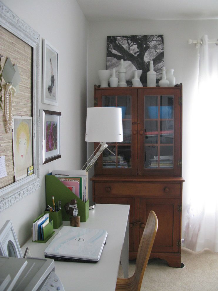
Brooke Gianetti used an old built in china cabinet for storage in her office. I like that there's a little bit of display on top and closed storage on the bottom.

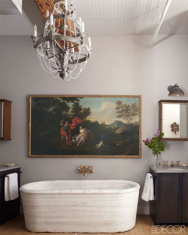
Below is another antique used for home office storage. See the framed bulletin board with a grass cloth surface? It's an easy modification that looks a little more personalized that a plain cork board. You could do this with a favorite fabric too!

office5.jpg

One area that could be valuable to me is the 1972 shallow closet with bifold doors. I would like to remove the doors and fill the closet with shelves (sans the work station seen below). This would be an ideal storage solution for bolts of fabric, wallpaper and client accessories as they await installation day.

office6.jpg

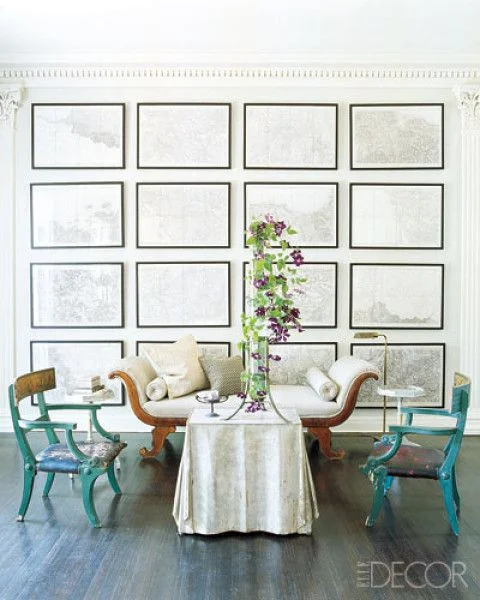
I think the office below is my favorite and it was designed by Myra Hoefer.

office7.jpg

Here's what I find so appealing. The giant work table in the center of the room means you could be working on multiple projects at once. Seating can be accessed from any side of the table which really gives you some flexibility. Added storage is found on the shelf below the table, so materials are easily accessible while not being used. I also adore that antique storage piece. It provides tons of storage and gives the space so much personality!

Style - even though offices are viewed as utilitarian spaces, I think it's important to bring the pretty. Your surroundings have a big impact on your state of mind, and you should feel good in your work space.

This one feels about right for my style:

office8.jpg

Soft colors, simple floral window treatments, and stylish seating feel comfortable to me.

So to summarize, when planning your home office

1. Assess your needs. What pieces do you need to perform your daily tasks?

2. Measure your room, and create a drawing (to scale) to determine the best way to utilize the space that makes sense for your work process.

3. Source the furnishings for your office that will meet your needs, fit your floor plan and reflect your personality. As long as the piece is addressing the function it's meant to address, the sky is the limit! Have fun with the pieces and add some personality.

Chintz In Modern Interiors

Most people think "Chintz" and Modern" don't belong in the same sentence, much less that they can coexist in the world of interiors. And I get it. If you grew up in the 80's when Laura Ashley and Waverly polished cotton chintz fabrics were all the rage and window treatments looked like this:

chintz1.jpg

then you probably have an anti-chintz clause in your Decorating Plan.

I, on the other hand, happen to still like a pretty and colorful fabric that's inspired by nature's biggest and boldest blossoms.

chintz2.jpg

The key is to have a very light hand when using floral chintz fabrics. I think the image above demonstrates just how effective and relevant these fabrics can be in today's interiors. The white walls and graphic stripes on the table skirt take the space out of the 80's and put it firmly into the right now. In case you're wondering, the fabric on the curtain is Scalamandre's China Rose. It's been in production for decades and is still highly sought after.

chintz3.jpg
chintz4.png

I love the floral chintz headboard above - and - oh my - peach walls! It's so refreshing to see something other than gray, isn't it? Can you imagine how different this room would feel if there were lots of other patterns used with the floral headboard? The Decorator kept the other design elements simple and clean, which gives takes the room in a modern direction.

chintz5.png

Here Miles Redd takes an old school chintz, (Althea by Lee Jofa) and ups the ante with forest green lacquered walls. Would I call this space Modern? Not in the sense that it's modern in style, but Miles Redd has a knack for using old school materials in a way that makes them feel "of the moment". Bottom line is that this room is timeless, and will be relevant decades into the future. And speaking of old school, pleated lamp shades (above) are also enjoying a resurgence in popularity. This makes me happy.

chintz5.jpg

Chintz upholstery + antiques + oversize modern art = forever timeless. Note the seagrass rug and the baskets. Those design elements go a long way to bring the formality of the space down to a more casual/comfortable level, which is how we're decorating now.

The bedroom below? Well, this is me. Not my work, that credit goes to Megan Rice Yager. But this is a bedroom I would be totally comfortable with for myself. The soft color palette, the feminine feel, and the Chinoiserie accents all add up to my idea of perfection. The headboard and the valance are done in Colefax & Fowler's Bowood, an iconic print that has been around for decades.

chintz6.png

OK, I got one more for you. Below is Lee Radziwill's Paris apartment circa I'm-not-sure-when, but I would say at least 10 years ago. And doesn't it feel Modern? Yes, there is chintz upholstered everything, but the white walls, simple curtains, natural fiber rug and edited accessories make it could have been done yesterday.

chintz7.png

So the takeaway here is that you CAN use chintz today. You just need to pick a pattern you love and don't layer lots of additional busy patterns with it. Keep your backdrop simple, and mix in a few modern design elements - like a lucite table or a piece of modern art. Remember, the most memorable interiors are those that have an interesting mix of styles and materials - if you keep these guidelines in mind, there's no reason a bit of chintz can't be part of your mix!

A Bunk Room For Everyone

Today we'll take a look at a design trend that continues to gain momentum. Bunk rooms. They're functional. They're fun. They're here to stay, and style-wise, there's a bunk room for everyone!

I certainly don't consider myself a minimalist, but I find this bunk room from Thorp Designs in the UK so appealing! It feels clean, breezy and restful - a true retreat!

bunk.jpg

Is your style more Modern Glam? Then I think you'll love the bunk room below by Sophie Metz in Nantucket! The suspended bed is a great use of the space under the sloped ceiling.

bunk2.jpg

There are no bunk beds in the bunk room below. Under bed storage provides the platform for each bed, which is so smart and clean looking. To me, this room has textural appeal with just the right amount of color.

bunk3.jpg

The bunk room above and below are both from Tracy Hardenburg of Dallas. I love the use of color in both of these spaces.

bunk4.jpg

If you're reader of design blogs, then you've surely seen the bunk room created by Grace from A Storied Style in the last round of the One Room Challenge. It's bold and fun and no doubt a huge hit with the kids!

bunk5.jpg

Remember at the beginning I said there was a bunk room style for everyone? Here's one that's a little more grown up and sophisticated/romantic. I love how the drapery panels provide privacy and softness. Every little detail was planned out - did you notice the sconces above each bed?

bunk6.jpg

Did you ever think it would be possible to sleep 6 in a single room so stylishly?

bunk7.jpg

I'm currently working with 2 different clients on new construction homes that have incorporated bunk rooms into their new homes. And although this isn't a bunk room proper, we recently built and installed bunk beds as part of a Signal Mountain client's basement renovation.

bunk8.jpg

So I think bunk rooms are here to stay. Would you consider a bunk room in your home?

Don't Neglect This When Designing Your Space

When designing a room, most people focus their attention on the color palette, furniture, fabrics, rugs, and window treatments. Granted, these are all important design elements that deserve careful consideration. But there's one design element that is often overlooked - something that adds ambiance and greater functionality to any space.

It's lighting. And it's not just important for utilitarian purposes.

lighting.jpg

In the dining room above by designer Jenny Komenda, the mid century inspired chandelier is a major contributor to the eclectic feel of this dining room.

But a more refined fixture can be just as effective, as seen below in our Signal Mountain dining room project:

lighting2.jpg

In the bedroom, why not consider removing your "builder's special" ceiling fan for a chandelier? (I have to admit that this one's a hard sell in this part of the country due to our long, sultry summers!)

Bedroom above by Sarah Richardson

Bedroom above by Sarah Richardson

And you don't have to limit your lighting options to ceiling fixtures and lamps. Swing arm lamps are wonderful for reading in bed and they free up space on your night stands.

Bedroom above by Lindsay Speace

Bedroom above by Lindsay Speace

In the image below, we used swing arm lamps on these bookcases in our Alabama living room project in lieu of table lamps.

Image above via my Instagram account (The Green Room Interiors)

Image above via my Instagram account (The Green Room Interiors)

I also love seeing lamps in the kitchen!

lighting6.jpg
lighting7.jpg

The lamps in the two images above stand in for pendant lighting. They're just as functional, but an unexpected choice for lighting. Lamp light feels more intimate, too!

So, when it comes to selecting lighting for your home, give it the time and care it deserves. Choose something that feels right for the mood you're going for in your space - and never settle for builder basic!

The Green Room Interiors provides Interior Decorating Services in the greater Chattanooga area. If you'd like some help turning your house into your haven, call Kim at 423.653.3186

My Best Tips For Selecting Art For Your Home

Art can be intimidating. Because art is subjective, there are no rules to follow (mostly) and what appeals to one may not appeal to someone else. And so we get paralyzed. Mostly because we don't want anyone to think we have bad "taste", so in most cases we go with something safe (as in, the colors in this painting go with the colors in my pillows). Where's the joy in that? The art in your home should be so much more! Art should elevate how you live. A favorite piece of art will bring a smile to your face every time you see it, so it's worth taking a step outside of your comfort zone to go with something unique that really speaks to you. Choose art that touches you.

And so that leads us to the subject of today's post. Today I'm going to give you my favorite tips and suggestions for selecting art for your home.

1. Create Tension with Art.

I'm talking about the good kind of tension. Where opposing design styles are used together to bring out the best in each other.

art.jpg

This traditional living room by Lindsay Coral Harper features a modern abstract painting over the fireplace. Unexpected and beautiful!

art2.jpg

My favorite is modern art with traditional furnishings or antiques. What appeals to me in the image above is how simple the abstract painting is in contrast to the ornate French writing desk.

By the way, this also works in reverse:

art3.jpg

Antique painting in a modern bathroom. Opposites truly attract.

art4.jpg

Here's more of that good tension in the image above. The ornate frame and classically styled portrait provide such amazing contrast to the minimalist decor.

2. A collection of related framed art makes a beautiful statement.

art5.jpg

It can be framed maps, as above

art6.jpg

Botanical prints

Or black and white photography.

art7.jpg

When installing an art wall of related subject matter, hang them close together in a grid pattern with same sized simple frames and mats. If you like things neat and orderly, a grid wall of art is a good option for you.

3. Create Your Own Art

Truly. This is personalization at it's best. Observe:

In the image below I hung a wall of oversized family photos taken by my client. Not only is it a great and colorful way to add interest to this large wall, but it's an ever present reminder of the the good times they shared when the photos were taken.

art8.jpg

Children's art is another great way to personalize your space with meaningful and colorful art. Children don't have the inhibitions we adults carry, and it shows in their paintings. The image below is an iphone photo I took of some children's art we used in a powder room makeover

art9.jpg

And more framed children's art below found via Pinterest

art10.png

4. Think Outside the Box

I hate overused expressions like that, but it's late and I couldn't think of a better way to say it. It simply means that wall art doesn't have to be a picture or a painting. In the image below we used a framed flag in my clients' family room. It's graphic and it references their love of sailing.

art11.jpg

Fast forward to their new home, and the framed flag has found a home over their fireplace.

art12.jpg

Image above via my Instagram (The Green Room Interiors).

5. Create a Random Gallery Wall

My taste in art is diverse and I love to collect vintage art. I also have a very white very long wall in my family room that is the perfect candidate for displaying said diverse art collection. All of this combined adds up to the perfect scenario for a floor to ceiling gallery wall of collected art. This approach to wall art is collected, quirky and organic.

white2.jpg

I think diverse is the key word here, don't you? A few of the pieces are original paintings. The black horse portrait was a Christmas gift from my horse's former owner (over 20 years ago). There are framed vintage posters and Picasso print that was the first piece of art my parents bought as a young married couple.

art13.jpg

I don't know who to credit for the image above, but it's a stellar execution of a gallery wall. It's collected, interesting and nicely laid out.

I hope this has been helpful to you if you're struggling with what type of art to hang on your walls or the best way to install it. The most important tip is to always buy what you love and it will bring you happiness for year to come!

The Green Room Interiors provides Interior Decorating and Design Services in Chattanooga, TN. If you'd like some help turning your house into your haven, contact Kim at 423.653.3186 or email thegreenroominteriors@gmail.com

Pretty Kitchens That Are NOT White + Gray + Marble

Honestly, I do understand the appeal of a white kitchen! They're timeless, simple, bright, and clean looking, so I would never say it's "wrong". But with the saturation of the white/gray cabinets +white marble countertops + brass hardware + subway tile formula, I feel like there's a bit of a herd mentality going on where kitchens are concerned. Today we'll look at the colorful side of kitchens.

kitchen1.jpg

I love the warm, collected feel of this kitchen. The lower cabinets look like pine, which I love. And it proves you don't have to have all color everywhere to make an impact.

kitchen2.jpg

Above, a favorite kitchen by Andrea Schumacher. Yes, there's white cabinetry and marble countertops here, but there's also an infusion of color and personality!

kitchen3.jpg

I featured this HGTV kitchen last week when I blogged about scallops (note vent hood). I came back to it this week because the color palette is not the norm for a kitchen, and I like that.

kitchen4.jpg

I think yellow and kitchens are perfect together. Again, a little bit of color goes a long way!

kitchen5.jpg

Here is mostly white/marble kitchen with a very unexpected green painted floor, which takes it from sterile to friendly. And fresh.

kitchen6.jpg

Love the mint colored cabinetry with the rustic beams and chrome fixtures. Feels farmy and sophisticated at the same time.

kitchen7.jpg

Kitchen above by Nick Olsen. No white or gray cabinetry, marble countertops OR white subway tile to be found, and it's a little bit city mouse and a little bit country mouse. AND it doesn't look like every other kitchen on Pinterest.

kitchen8.jpg

Kathryn Ireland's kitchen. Mint cabinetry with touches of pink and mismatched lighting. Feels approachable,doesn't it?

kitchen9.jpg

I'll leave you with this image, because it proves that kitchens don't have to be all white and gray to feel modern.

The point I'm trying to make here is there is no right or wrong (mostly) when it comes to the design of your kitchen/home. If you love a gray/white/marble kitchen, by all means, you should have one! However, if you're happier surrounded by color, don't let what is trending on Pinterest dictate what you have in your home! Make it your own with no apologies!

The Green Room Interiors provides Interior Decorating and Design Services in Chattanooga, TN. If you would like some help turning your house into your haven, call Kim at 423.653.3186 or email thegreenroominteriors@gmail.com

Pretty Little Details - Scallops

I'm sure you've heard it over and over again, but it bears repeating.

scallop.jpg

Details are the fun, unexpected touches that can take a space from run of the mill to noteworthy. The details are not always the first thing you notice, but they reveal themselves upon closer inspection, allowing you to experience their unique moments of brilliance a little at a time.

Today we're going to look at scallops - a fun detail that adds interest, movement and whimsy to a space.

scallop2.jpg

The pink and orange color palette seen above is so crisp against the white walls and white upholstery, and the scalloped edge along the top of the side table adds movement and charm to an otherwise boxy design.

scallop3.jpg

The scalloped edges on the bedding above don't immediately jump out at you, but they add another layer of interest to this eclectic bedroom.

scallop4.jpg

In the image above, I love the softness the chandelier's scalloped form brings to this neutral bedroom.

scallop5.jpg

These whimsical chandelier shades are from Chattanooga-based Stray Dog Designs and they come in a rainbow of colors. This lively kelly green is my favorite!

scallop6.jpg

Above, the scalloped hood is the perfect finishing touch for this charming cottage style kitchen. (Extra points if you noticed the scalloped edges on the ends of the upper cabinets.) If I'm not mistaken, it looks like the cabinet hardware is scalloped too!

scallop7.jpg

Finally, a scalloped matelasse slipcover relaxes the formality of this antique sofa. Other noteworthy details are the white piping and buttons inset into each one of the scallops.

If you're in the Chattanooga area and would like some help creating a home that celebrates the details and makes your life a little bit sweeter, call Kim at 423.653.3186 or email thegreenroominteriors@gmail.com

In The Kitchen: Statement Hoods

Today I thought I would do an inspirational post about kitchen hoods. Although utilitarian by nature, hoods can also be decorative and can add lots of personality to your kitchen.

hood.jpg

First, let me just say this kitchen by Rebekah Zaveloff is a favorite! The black, white and wood finishes are timeless. But that hood?!? Total scene stealer. I love the simple, strong shape and that band of brass around the bottom takes it to the next level. Side note: if you're still on the fence about mixing metals, this image should give you the confidence to forge ahead! (chrome/brass/copper)

hood2.jpg

Another gorgeous black and white kitchen from Rebekah Zaveloff. This time the tapered hood is covered in subway tile. The white tile lends a tidy, orderly feel to a kitchen. I love this look and we recently created a custom hood for a client that was covered in subway tile. Below is a photo taken during renovation:

hood3.jpg
hood4.jpeg

Just the addition of the wood on this kitchen hood above (from HGTV Magazine) adds a wonderful textural contrast to all of the slick surfaces in the kitchen above. I probably would have chosen a different stain color for the wood, but I do appreciate the softness and warmth the wood brings to the space.

hood5.jpeg

Another thing to keep in mind that statement hoods don't have to be loud and showy. I adore the simplicity of the hood above, and it's tapered, curvy form is nice contrast to the surrounding boxy cabinetry.

hood6.jpg

In the image above, the hood is simple in form, but the copper makes a strong statement and the weathered finish underscores the rustic feel of the kitchen. This is such a warm, comfortable kitchen!

hood7.jpg

I could not love this hood or this entire kitchen from Design Manifest more! The shape of the hood reminds me of a pagoda, and the brass band around the bottom is a little unexpected. I love how a classic material like brass feels so modern in this application.

Planning a kitchen renovation? I say forego the conventional microwave /fan combo and upgrade to a custom hood - and have some fun with it. Whether it's with shape, scale, materials used or a combination of these options, a great looking hood will add interest and personality to your kitchen.

The Green Room Interiors provides Interior Decorating Services in the Chattanooga, TN area. If you'd like some assistance with the design of your interiors, call Kim Lemmon at 423.653.3186 or email thegreenroominteriors@gmail.com.